
I decided to use the Whit weekend to write an article on a series of photographs which I had shot in parallel with the Leica M240 and the film M6. The object was to show how analogue and digital images can successfully complement each other. But the development of the colour photographs was delayed because of the several holiday days in May and I had to put back the experiment.
“De gustibus non est disputandum”, in matters of taste there can be no dispute, is a truism as old as mankind. The perception of colour, form, music, odour, and generally all of creation varies in every person. It depends on ethnic influence, education, age and sex, to mention just a few criteria, and there is much more.
But there are also standards that at any a particular time have general currency.
Let’s say I’m in a good restaurant and have ordered a bottle of wine. The scruffy sommelier, missing a front tooth, pulls out a Tetra-Pak of sweet Lambrusco and makes a great fuss of opening it with a pair of rusty scissors hanging from his neck.
The first sip, which he had poured into a crystal glass, glued my tongue to my palate. As I freed it with a sucking sound, I stuttered my thanks and ran out of the restaurant. You can say, in this case, that certain standards were lacking.
But do we know of such things happening in photography? And, if so, who sets these standards. What is good, what is bad and what is taste?
I do not pretend to decide, but I have drawn some personal conclusions.


Almost all pictures in this post fall into one of three categories:
- One version with the colour data, the tone values set in Lightroom with only exposure, highlights (moderate), white, black, nothing more.
- One version of the photograph from Silver Efex, the settings of the DNG in Lightroom included. In Silver Efex the only changes are: Film simulation Agfa APX Pro 100 (with light grain), white slider +14%, black slider +42%
- One version of the picture converted in Lightroom, tonal values the same as with the colour data, tone valve curve set to middle contrast, standard black-white mix.
Note that in all galleries of pictures in this article the images are cropped for consistence. Click on individual images to see them full size.
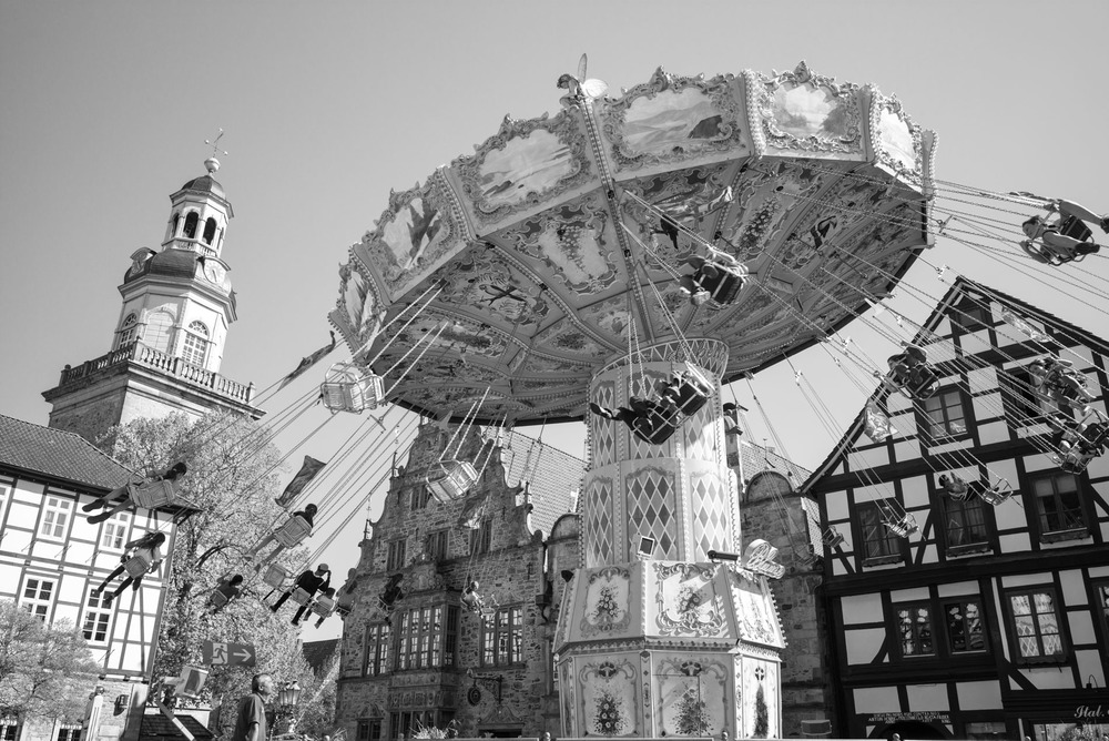
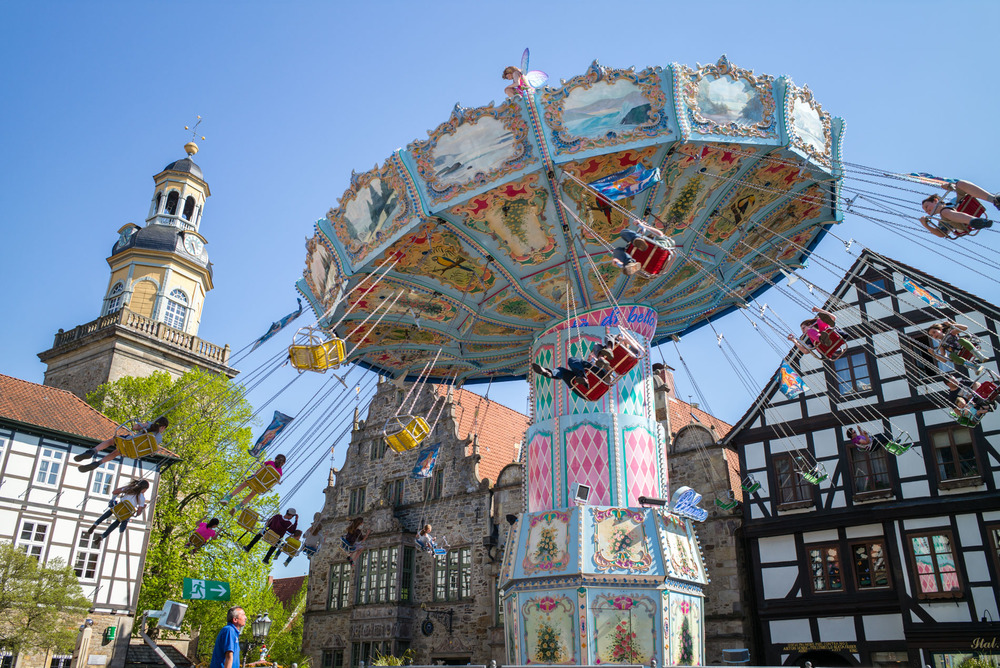
Which of these images you prefer depends entirely on personal preference. It is interesting that it is almost impossible to achieve identical black/white data in both Lightroom and Silver Efex. Always something or other differs: Either the grey values, the contrast or the overall brightness of the picture. Also, it should be borne in mind that it is the program that decides the end result.

Since I have been spending more time with analogue photography in recent times I should emphasise the tremendous possibilities that modern digital processing offers. An analogue, scanned image (naturally also dependent on the quality of the scan) provides only very restricted opportunities for adjusting TIFF data. One can correct the tonal values within narrow confines, but the picture should at the very least be halfway correctly exposed in the first place. Otherwise the result of the adjustments, let’s put it carefully, is sub optimal.
RAW data from almost all modern cameras, on the other hand, points to a flexibility that is little removed from the mercury state of the Terminator—the essence of fluidity. In the first place that is naturally a good thing; who cannot take advantage of that inherent dynamic?
Often enough I am grateful to be able raise the data a couple of stops simply because I was too lazy to check the exposure parameters accurately and relied on the camera’s automatic system which offered up a darker picture. Yet correcting the brightness is often insufficient.
Now I am beginning to tread on thin ice. Let he who is without sin cast the first stone. Since 2001 I have been photographing in digital and, in this time, I have committed every sin in the photographic book. In this respect, were there an Inquisition, I would go to the stake with the words “I repent” on my cracked lips.
In the time of Lightroom 1 and 2 (which I also used) I often enough employed DxO Optics Pro and there it was possible to perform highlight recovery until the doctor was past due (even though he was already there). When I look back to my processing skills from that time—skills that, incidentally, I found to be good—I shake my head and am eternally grateful that, from an early stage, I resolved to make and keep RAW data. None of these photos of yesteryear do I ever now use without fresh processing.
Then there came a phase during which I made great use of HDR techniques. And as I dilly-dallied with the dark forces, a hoarse voice whispered in my ear: Give yourself the power (gasp) to forsake bracketing. Towards the end of this era my minimal objective was to produce HDR pictures that were not obvious. Shortly afterwards the dynamic range of sensors was so advanced that HDR, for my purposes, was wholly superfluous.
As I have already said, thin ice. Yet everything in this area is a matter of pure taste. Whoever loves to play with HDR, let him play, without me looking over his shoulder.
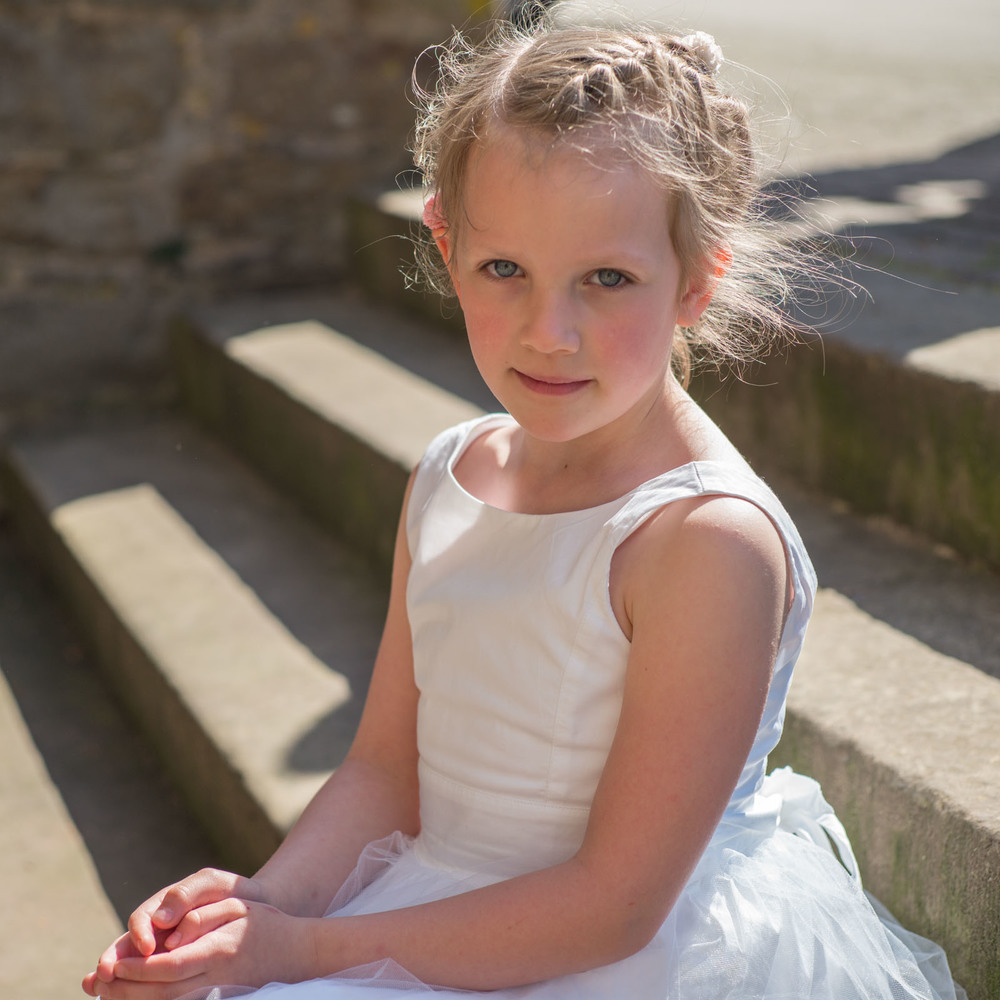
Caption (I treasure my M9 photos to this day. They have something special. The M9 floundered in the depths of the DxO Sensor Rating. Since then I have realised how much this said of the camera. Simply, nothing.)
Now I have sufficiently castigated myself, it must be said that in the year 2010, when I first met the M9, I had already left many of my excesses behind me. Of course there is always a bit of to-ing and fro-ing going on, such as when I made my first experiments with Silver Efex.
Intoxicated by the possibilities of this program I naturally indulged in exaggeration. The results were black and white pictures with such an elegant digital signature that nowadays they make my eyes water. Whoever delves deeply enough in my blog on the old website will see some egregious examples. But I recount this story not to highlight my aberrations in taste. Perhaps everyone has to go through such a phase. For me it was a learning process, a process that continues to this day.
Yet the images from the M9 brought me closer to what I had lost sight of: A look, a look that reminded me of analogue film. I soon realised that these images were at their best when left in peace. Naturally, I had to continue to pay my learning dues. And when the M240 came, with a completely different DNG signature, I had to employ new criteria. The M240’s DNGs are flatter, requiring more tonal adjustment. But even here, we mustn’t get too carried away.
Since I have already in this text made several dark hints, I can let the cat out of the bag: When the processed photo looks as though it could have been taken with a film camera, at the very least under ideal conditions, I am happy. Before the lynch mob of analogue fetishists (in part, I confess, I am a one of them) descends on my home with pitchforks and scythes, let it be said: A digital image can never look exactly as though it were from film. But we can get near enough.
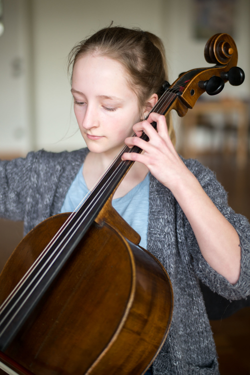
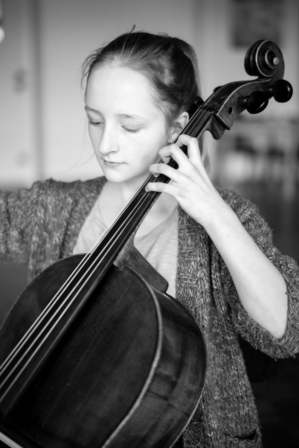
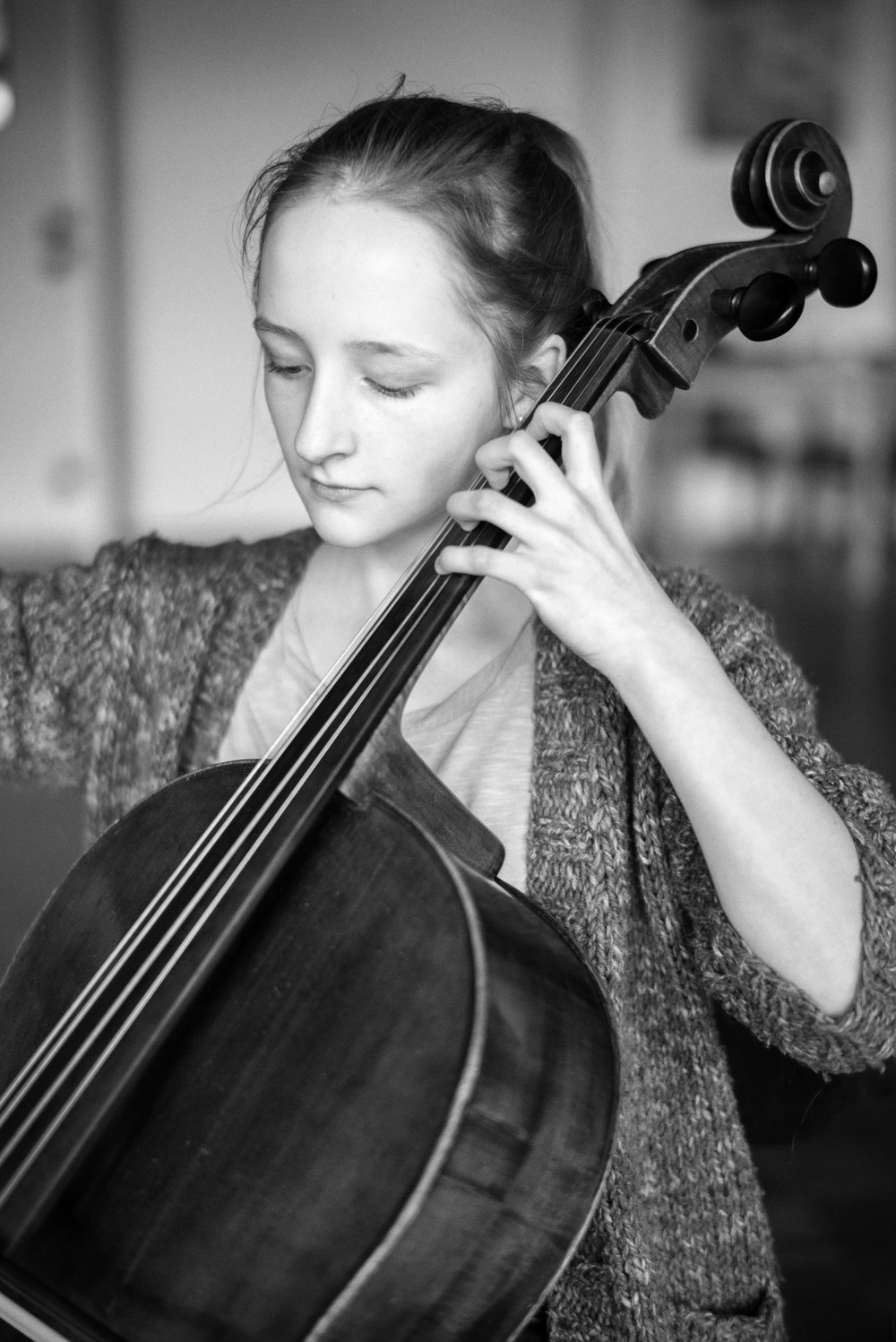
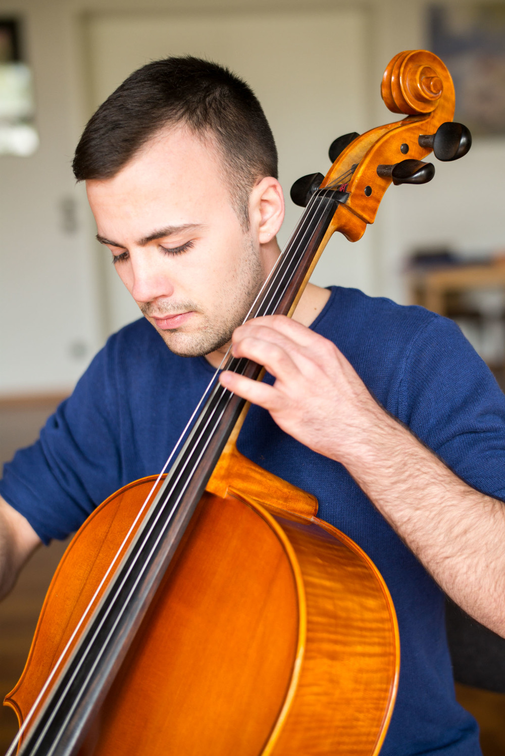
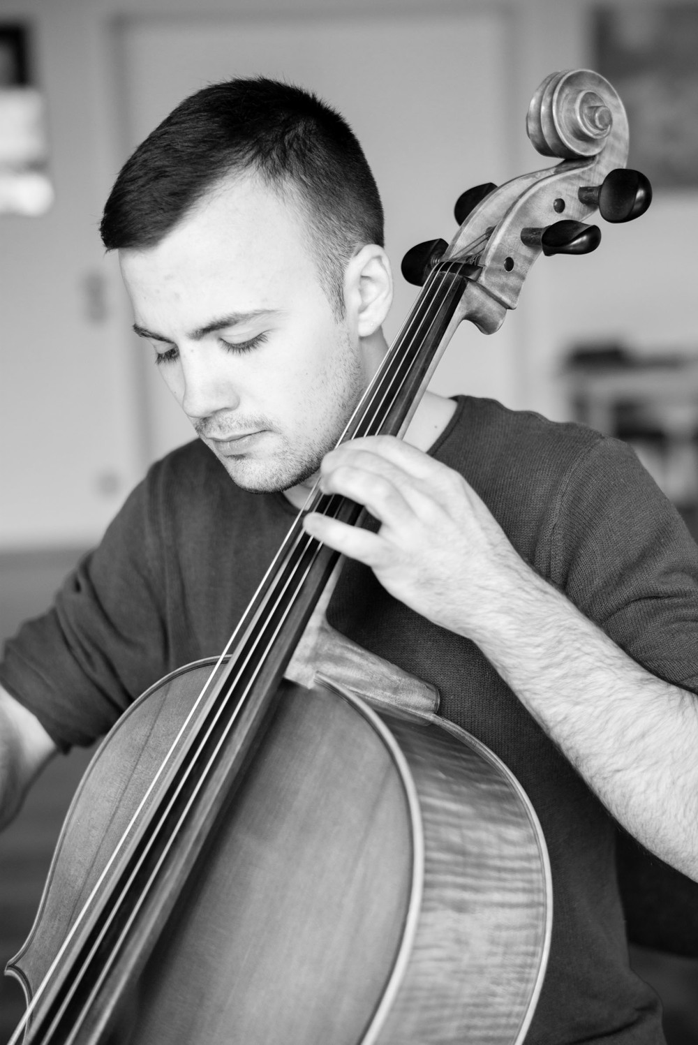
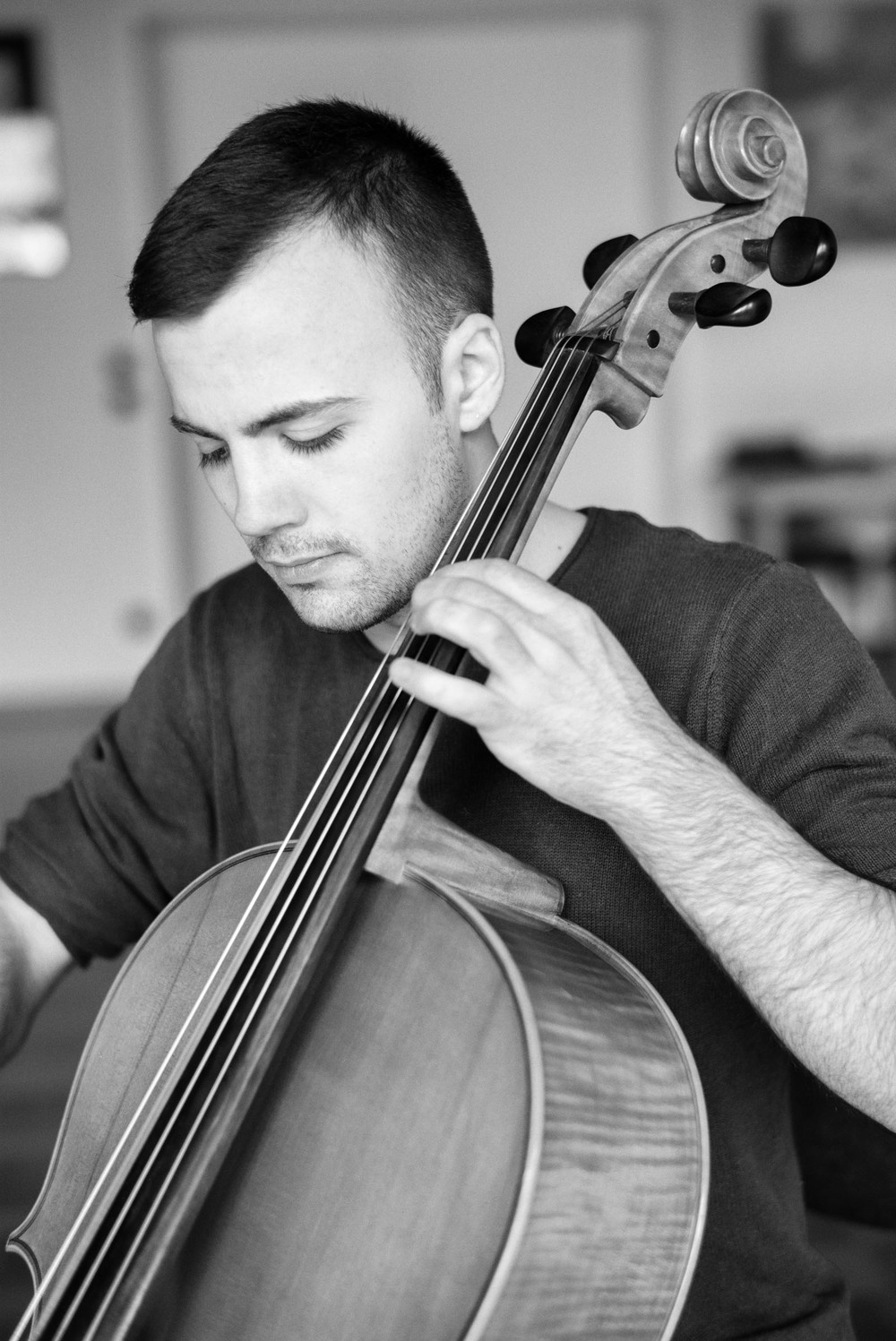
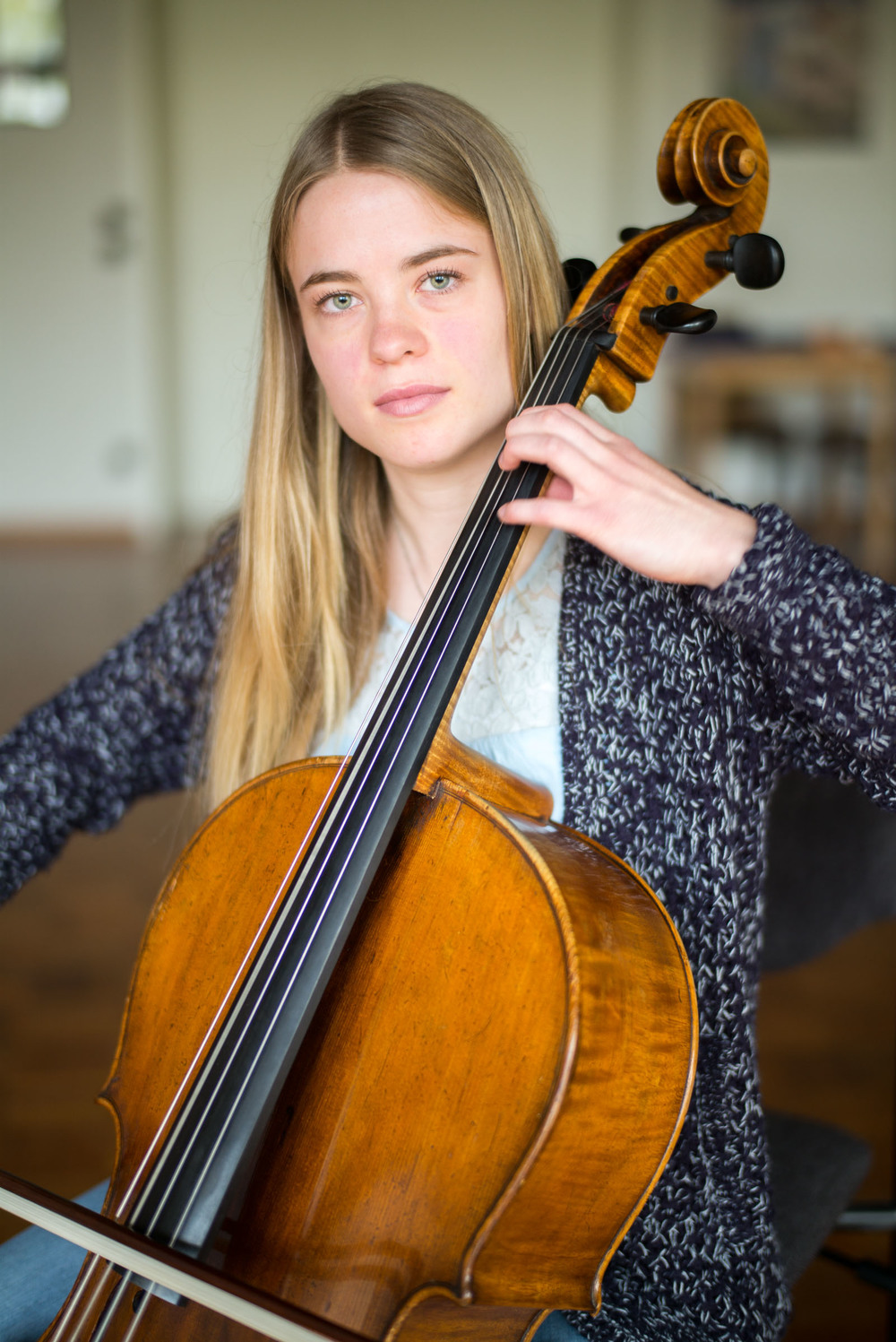
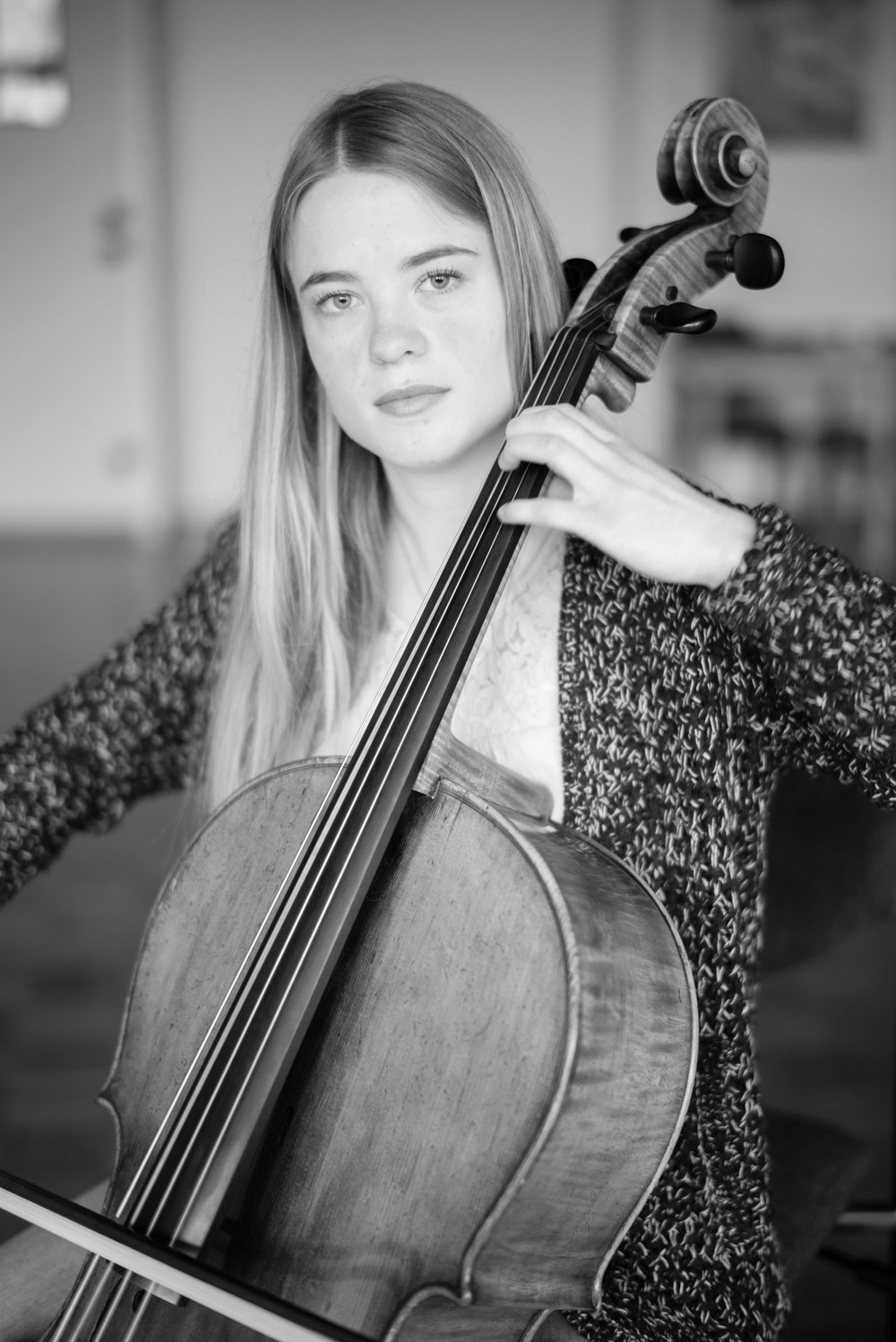
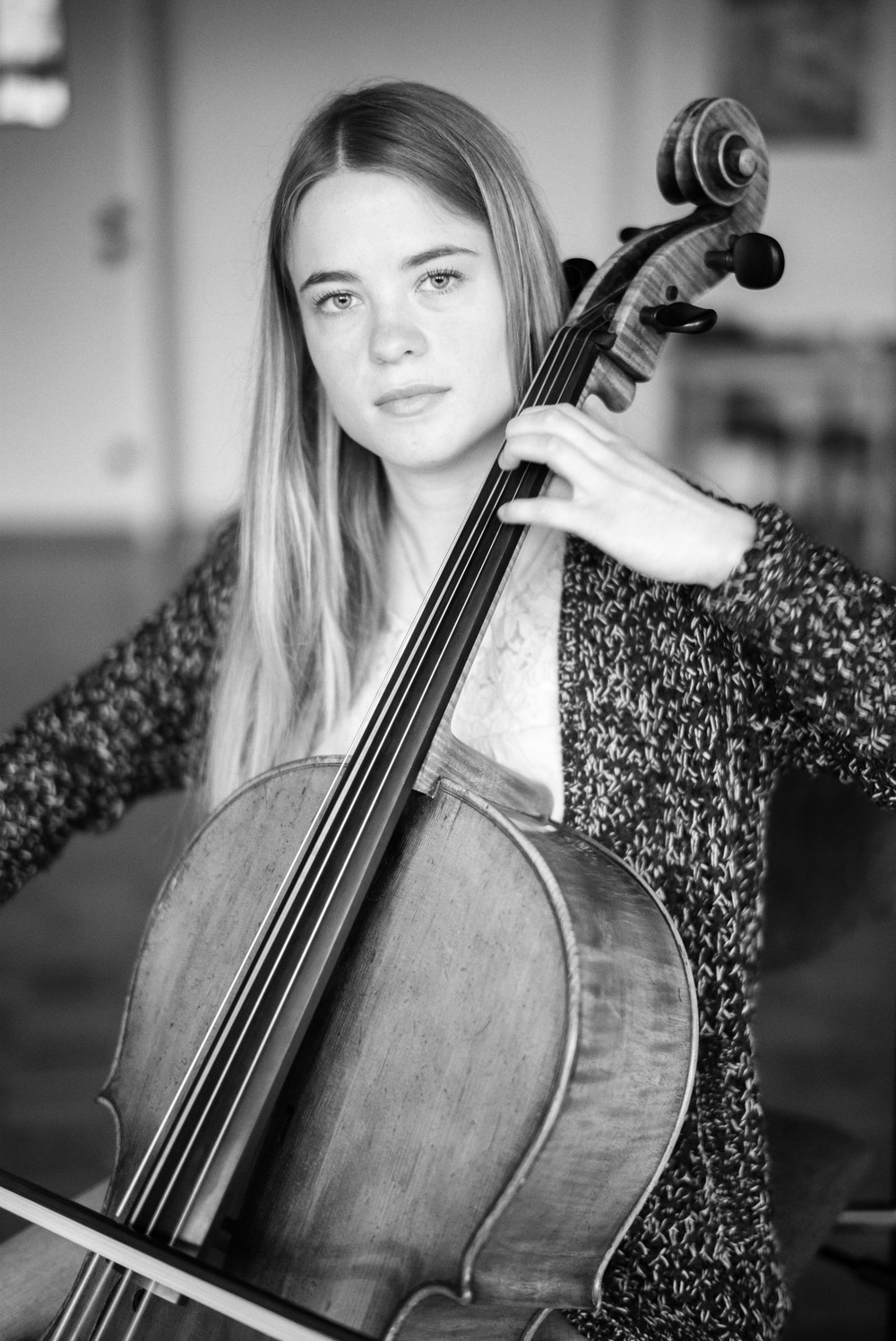
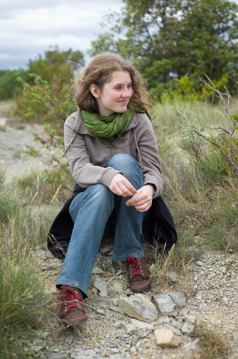
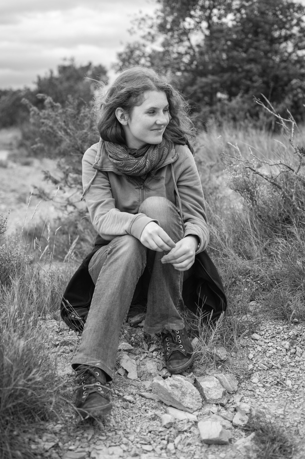
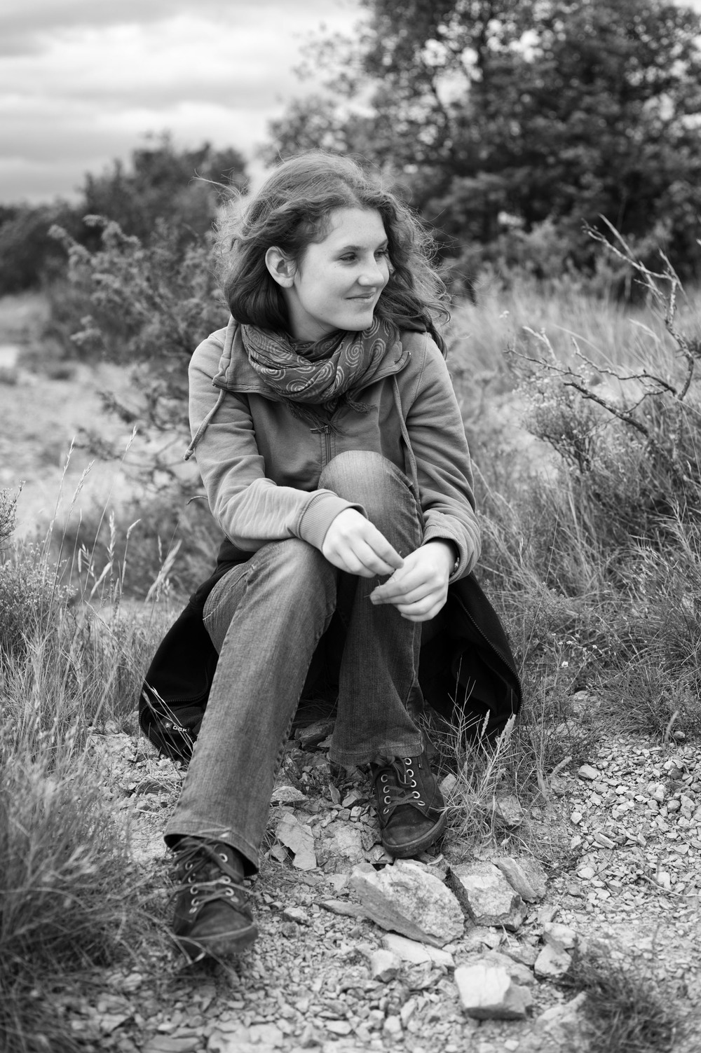
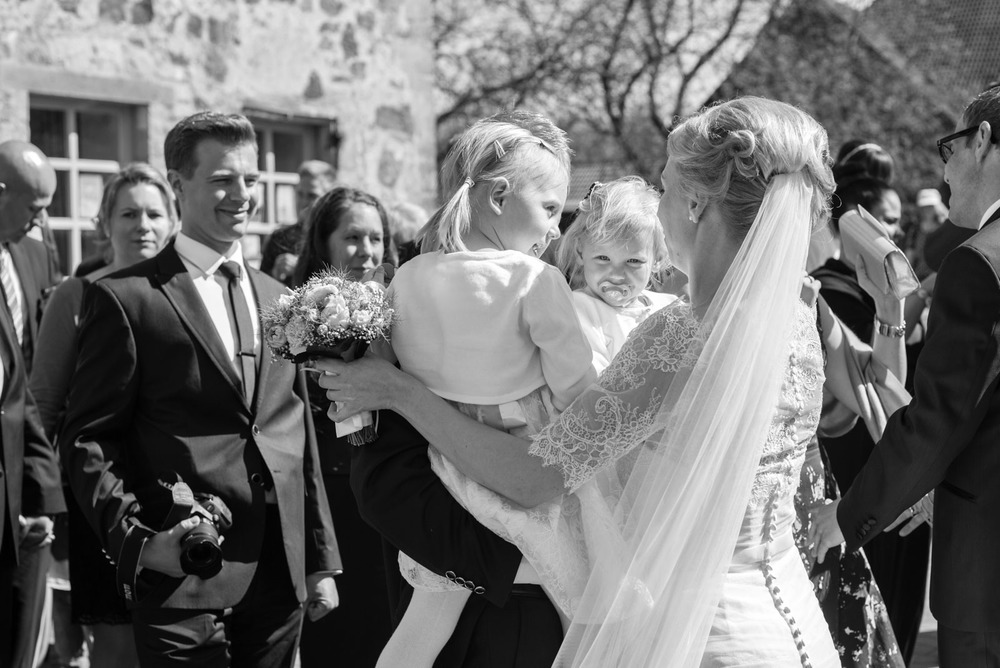
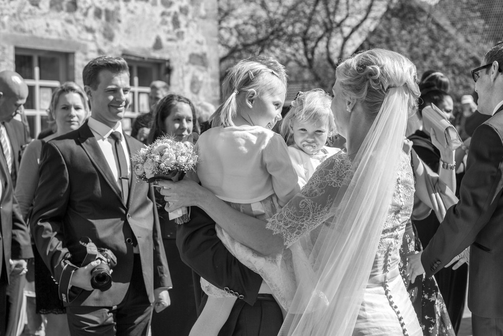
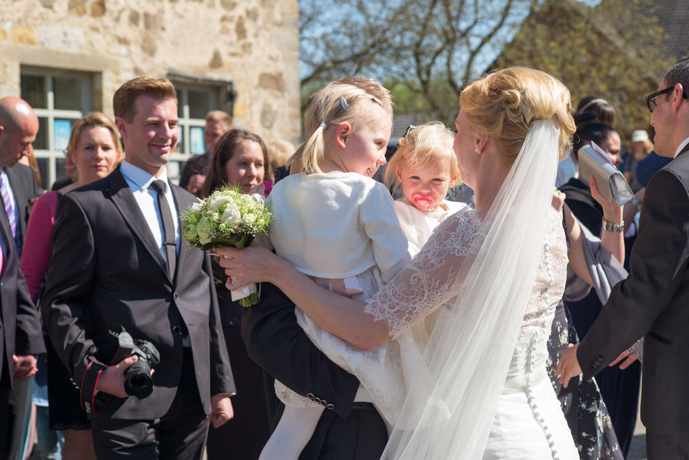
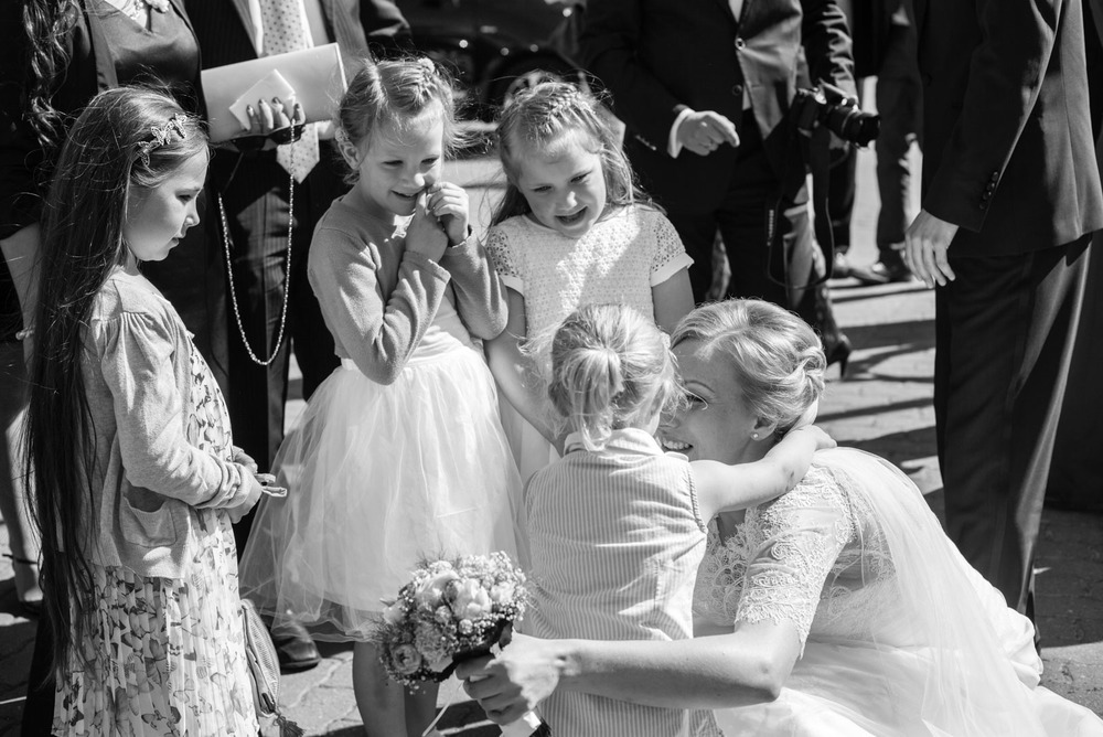
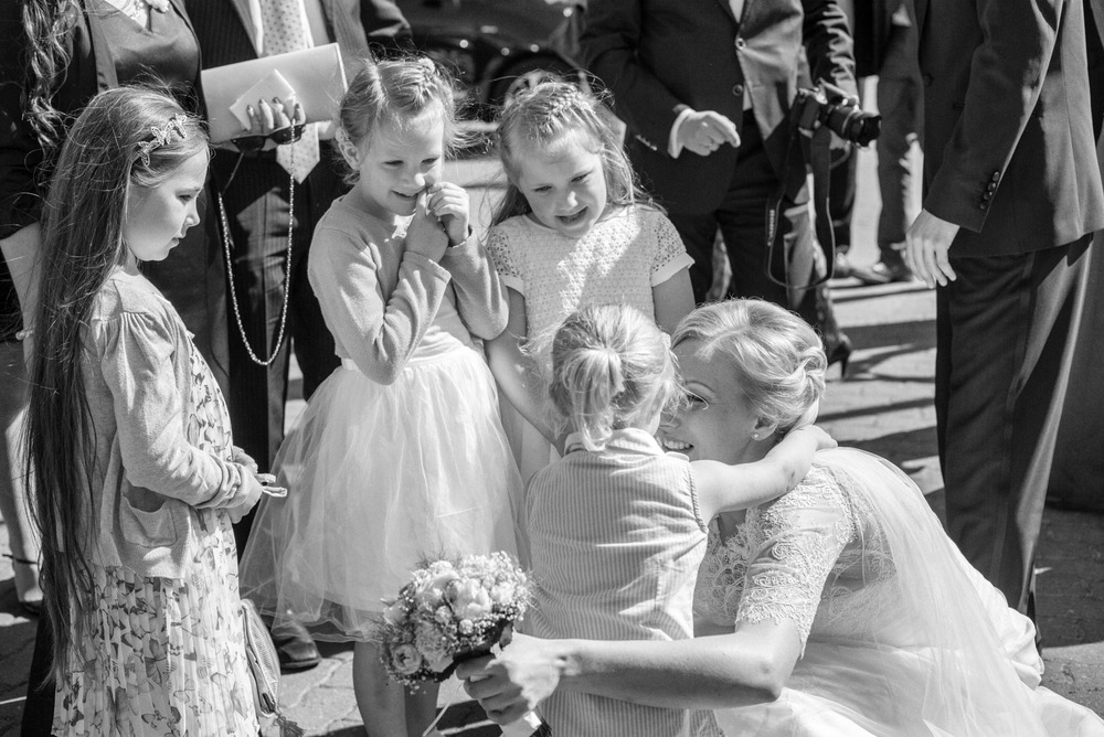
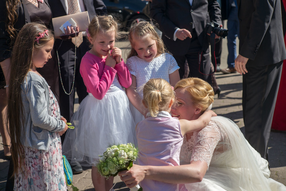
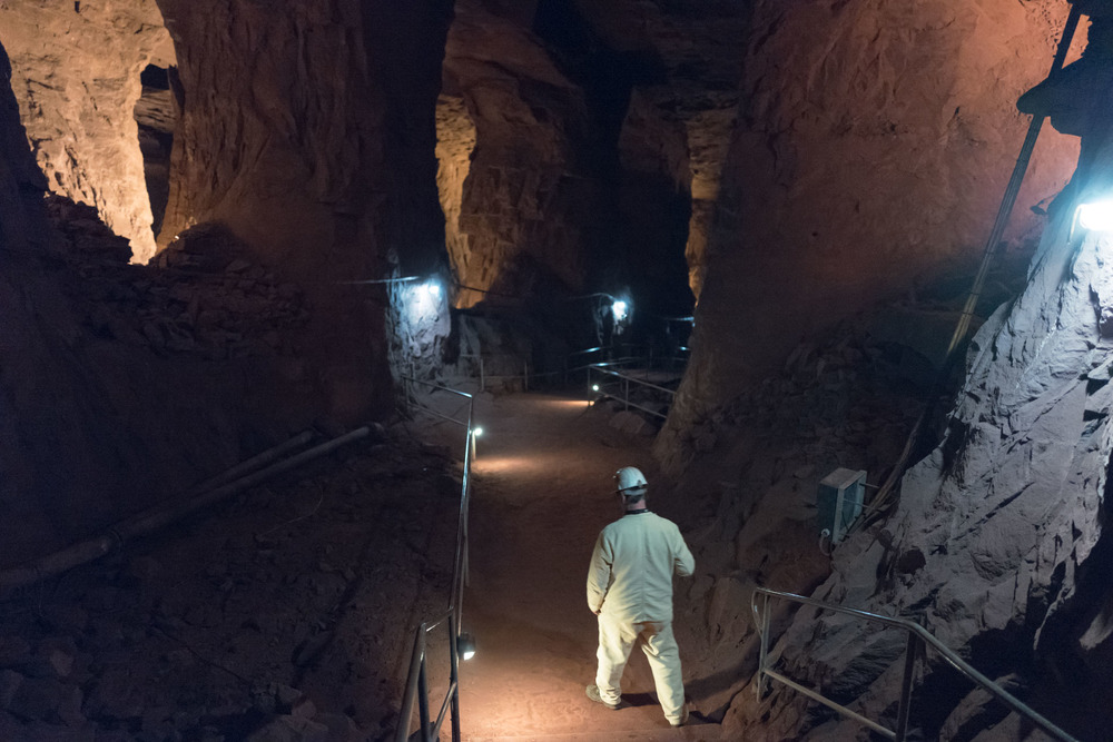
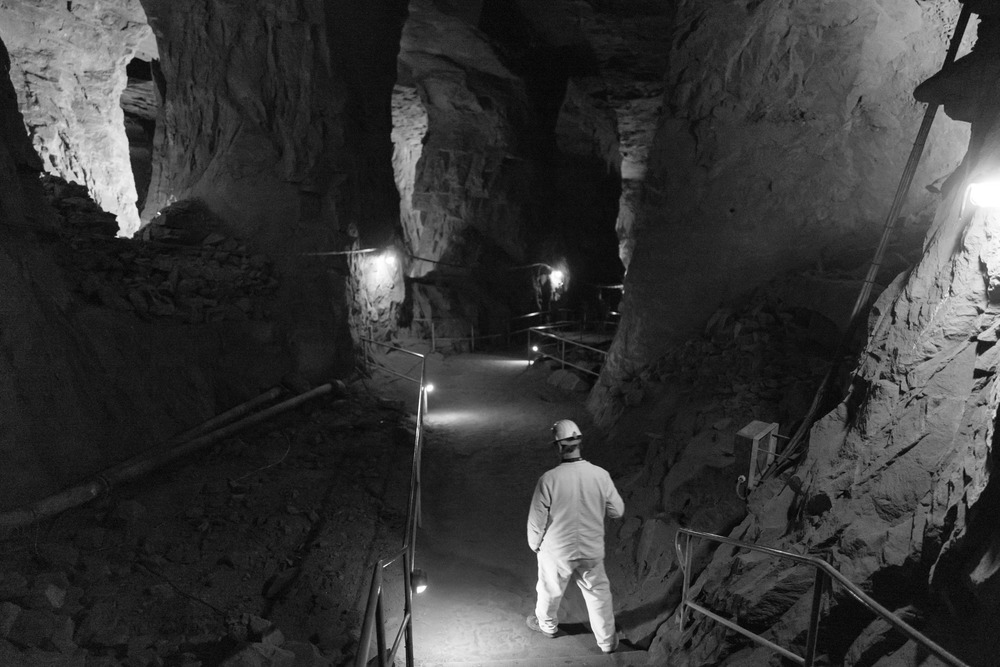
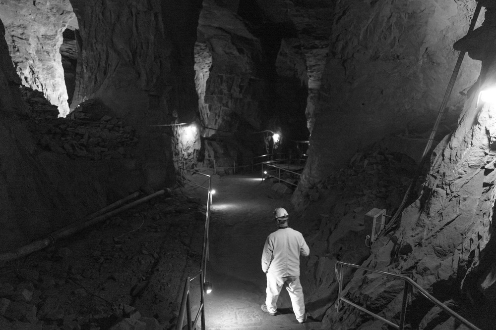
Above: Series from “Cellissimo”, portraits with the M240 and 50mm Summilux at f/1.4. In the black-and-white version I prefer the Silver Efex Pro results in the right-hand column. It is easier, particularly with little effort, to retain more grey values
What are the principal sins of digital processing? How is it that the images are so far from what we would expect from analogue film? The most striking difference is the inherent sharpness of the digital files. We have become used to it; we know how to appreciate it. Yet why are we tempted to to over sharpen or to push the micro-contrast (“Clarity” in Lightroom speak) into the grotesque?
The next point: The dynamics (not to be confused with the dynamic slider in Lightroom which is a special type of saturation) especially in highlights and lows. Analogue film possesses a myriad of subtle graduations but it is not so obvious as with a digital file. A RAW file with the shadow slider to 100% suddenly lacks real shadow and begins to take on an unwanted pseudo HDR look.
Fiddling with the saturation has always been considered bad taste, but cases of “eye cancer” are common.
Yet, with the exclusion of the saturation aspect, the situation remains essentially the same for black and white digital imagines.
Above: In this photo series I find the black-and-white versions from Lightroom (left) better than those from Silver-Efex (centre). They have more punch. The stronger shades of grey in Silver Efex have the effect of flattening the images. Incidentally, this is not simply a matter of increasing the contrast in Silver Efex to align the images.
Incidentally, when dealing with analogue photography I often now convert the colour images in Lightroom. I find the results (apart from the saving in Silver Efex processing time) more authentic, especially when handling with portraits. I have nothing against Silver Efex. It is simply a question of how you handle the sliders. In Lightroom, for instance, I find the operation of the colour channel adjustment somewhat deficient; the function in Silver Efex is much better. On the other hand, in Silver Efex there is a much greater tendency to create artefacts when you do too much adjustment.
In the final analysis, the choice between Lightroom and Silver Efex is by no means clear; both have their strengths and weaknesses.
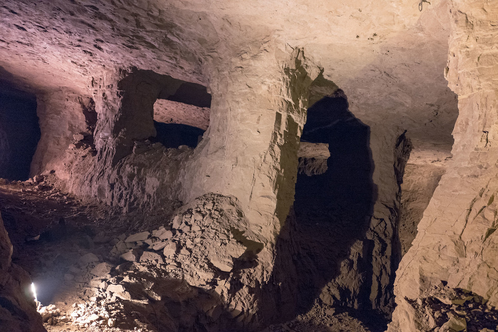
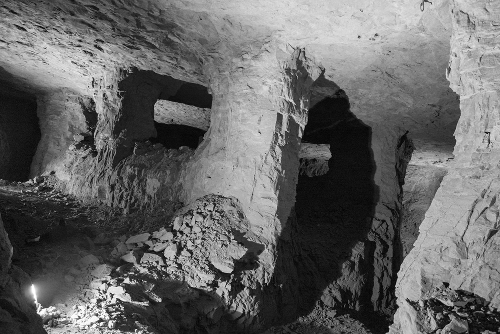
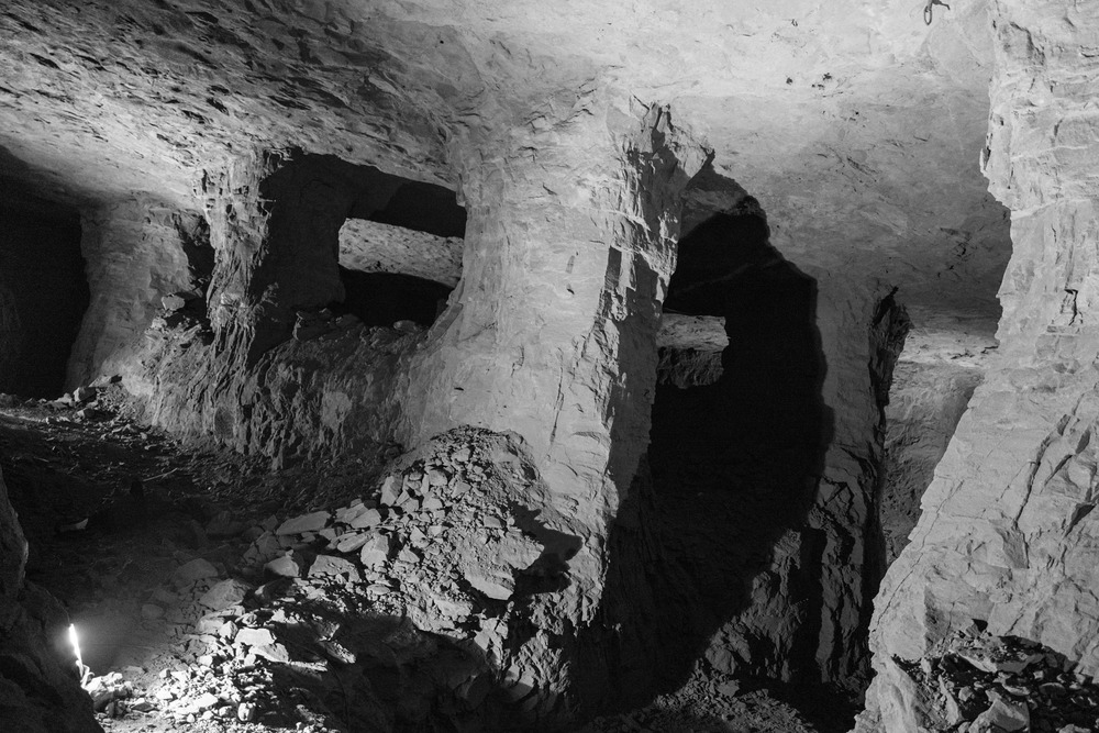

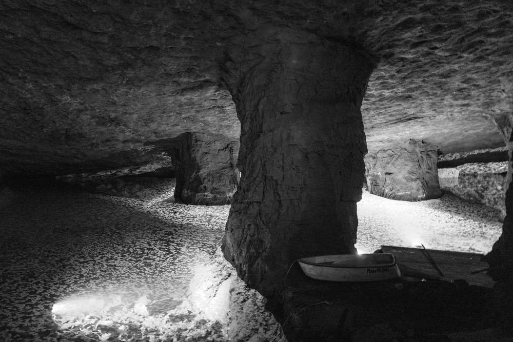
Above: Series with the Leica Q at the ore mine at Kleinbremen. Here I much prefer the black-and-white pictures from Silver Efex (centre)
You can also consider how much reworking black and white images need in any case. For instance, Nichole Struppert takes her Leica Q black and white images straight from camera with the parameters of high contrast and medium sharpness. That is a refreshingly simple approach and, incidentally, a typically feminine solution—and I intend this comment in an entirely positive sense. A man, by contrast, would fiddle endlessly with the RAW data, forgetting that, especially for street work, the image effect plays much less of a role.
For me, however, especially with the M240, jpegs from the camera are not an option. It has to be admitted that the jpeg engine of the 240 is just not good; with Fuji I am less sure.
My current attitude to the entire post-processing shenanigans is to thank God that there are RAW images to compensate for my shortcomings in initial exposure.
But let’s get back to the range of tonal values. Although I often tentatively prod the conveniently provided “auto” button in Lightroom, I almost always pull back the deeper tones that are invariably raised too high. Otherwise, this can be a good starting point except with the low-light photos where Lightroom’s auto feature does not seem to understand the requirements of processing such shots. In such instances not only are the darker areas raised, the whole picture is pulled up by two or even three EV to bring it to daylight level. Utter nonsense.
“Clarity”, as stated previously, is a very dangerous slider. I never go to a higher value than 14 but mostly leave it alone or, even, go into negative territory.
“Dynamic” requires very little or no adjustment depending on the camera. For example, with Fuji if I want to raise saturation I simply choose the Provia embedded profile which is more intense than Adobe’s standard settings.
I never use the “Saturation” slider.
I like to set the tone on middle contrast (there’s a drop-down menu) but leave the contrast slider in the range above zero.
And that’s about it when it comes to global adjustments.
Naturally, I don’t scorn all the correction possibilities offered by such advanced programs as Lightroom. White balance changes, removal of dust spots, distortion reduction, noise suppression or dodging of certain imagine areas can be invaluable in isolated cases. That said, the average DNG requires no more than 20 seconds for post processing.
None of this is dogma. At this moment it represents my personal point of view. And none of this precludes the occasional dalliance with film emulations or special filters. If so, however, it is clear that the genre and the subject should be fitting. A street photo with exaggerated open shadow is somehow not just right.
I realise that I am going out on a limb when I recount all my personal processing peccadillos. Probably on my blog you can point to examples that go contrary to my recommendations: “Because he didn’t follow is own principles”. But my point is panta rhei, everything flows: It is my perception that counts. What I have set out here is the current state of play. Let’s see how it looks in two years’ time.
_________________
- Translated from the German by Mike Evans
- You can find Claus Sassenberg at Messsucherwelt
- This article appeared originally as Wo Licht ist, ist auch Schatten
- Subscribe to Macfilos for free updates on articles as they are published. Read more here
- Want to make a comment on this article but having problems? Please read this
Nice article and an enjoyable read, thank you Claus. I like both your call to modest processing and the idea that different images require different treatments.
Firstly, to Claus. These are lovely photos. In some cases the Silver Efex editions are better and other cases they are not. Silver Efex will generally increase contrast and you may have to use noise reduction to counteract the more extreme effects. I suggest that you play around with settings in Silver Efex to find something that works. In other cases Lightroom is better and it tends to be easier on the image if less dramatic than Silver Efex. I tend not to use pre-sets either in camera or in Lightroom as each image is different and I have developed an instinct for what works over time.
Secondly, to Stephen. I started using Iridient Developer last year because of my acquisition of the Fujifilm X-T 1 . Lightroom does not ‘like’ Fujifilm RAW (RAF) images, particularly when they contain foliage. You can easily end up with a green mush instead of foliage. This does not apply to Fujifilm JPEGs, which are probably the finest ones produced by any camera at the moment. In addition to using Iridient, I also reduce the amount of processing which I do with Fujifilm RAW images in Lightroom and this also helps. The X-Pro 2 has improved the possibilities with Lightroom and produces more natural foliage and the images can tolerate more processing. I usually still use Iridient with the X-Pro 2, but not always. I never use Iridient with Leica or other makers RAW images as it is not necessary to use it; it is an extra unnecessary step. Those RAWs can tolerate a lot of processing in Lightroom or with NIK filters. Software products like Lightroom are only tools and I only use as much of them as I need. In the same way that I never read digital camera manuals unless I really have to (life’s too short!), there are many features in Lightroom that I am quite ignorant about. I assume that is because I don’t need them.
I changed my iMac yesterday and transferred most things across using Migration Assistant. I will be attempting later to use Lightroom on the new computer. I am not sure if my Iridient or Nik filters have transferred across. An interesting day lies ahead.
William
Dear William,
thanks for the compliment regarding the photos. As to your experience with presets in LR or Silver Efex it’s exactly the same with me. I don’t use them, if so, I invariably change them one way or other, because each photo has other requirements.
I experimented a lot with both programs over the years (as stated in the article, with sometimes doubtful results) and have drawn my own conclusions, parts of them are subject of this article.
But, in a way, the journey is the destination.
Best,
Claus
A very nice piece Claus, it is clearly the case that as with the cameras themselves, so for post processing (development)… "less is more".
I do not like Lightroom, it annoys me in several ways… Firstly it comes from a massive corporate/bureaucratic organisation and trying to talk to a human being at Adobe is not easy. Secondly, unless one knows everything there is to know about the product(s) they will happily strew files all over your hard disk (SSD) and waste significant amounts of space and time trying to find and organise them.
When I first started to read Macfilos, I was struck by a comment from William Fagan. He was talking about how under certain circumstances (Fuji photography), he tends to use a program called "Iridient Developer"… I thought that I would have a look.
What I found was something really good (thanks William), it is simple, once you get the hang of it, it is reasonably priced, it does nothing to your files regarding placement, the user does that himself, and best of all when you send an enquiry to them, that enquiry will probably be read by the man who wrote the program and he, that’s Brian Griffith will personally reply to you.
Even better, the temptation to get really excited and move roadsigns, remove smiling passengers or inconvenient footballers doesn’t enter into the discussion, such tools are not available. If there are lubricant spots in the sky (something that I suffered from with my Leica M8), these can be removed with something like Apple Photos (in those days, I used Aperture) at the last minute (I don’t like that program either, but it is present on the Apple OS FOC), it is also quite good for screen-shows since it is linked into the AppleTV, IOS and macOS environments.
As for Iridient, one processes one’s file and saves it as a JPG/TIFF (either singularly, or in batch) and stores it in the same place as the original DNG file, so simple, even I can understand it… 🙂
Finally choose a program to display, print, organise or whatever the files, there are hundreds of them. Photos is free.
From what I can see with Silver Efex, it is pretty simple too and worth a look, thanks Claus.
Stephen, thanks for your kind comment and the recommendation of Iridient Developer, which already came to my attention and is indeed very attracting. Like you I’m not pleased with Lightroom’s totalitarian claims on my hard drive…