
.jpg&description=Death+of+a+typeface%3A+The+secret+of+the+Doves+Press)
.jpg)
The mystery of the Doves Type was first published on Macfilos in January 2014. New readers may enjoy a journey along the Hammersmith Mall
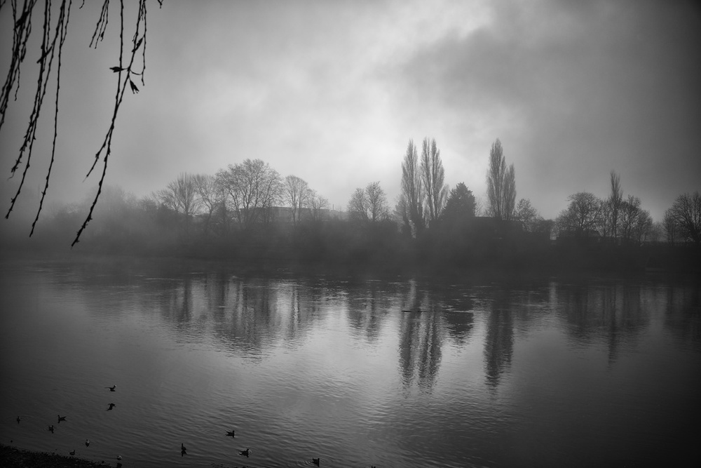
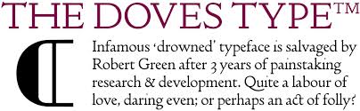
A misty night at Hammersmith Mall in 1916 and an elderly gentleman can be seen shuffling towards the bridge with a heavy bag. His mission is to cast the final 12lb load of lead type into Thames. The world was at war — but in west London a bitter dispute over a simple type face was in full cry. Since 1913 the man had been gradually drowning the renowned Doves Type and in total he consigned 2,600lb of metal to the depths. Not a slug of was discovered until 2014.
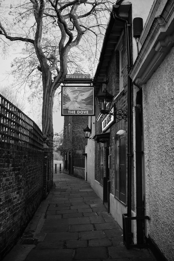
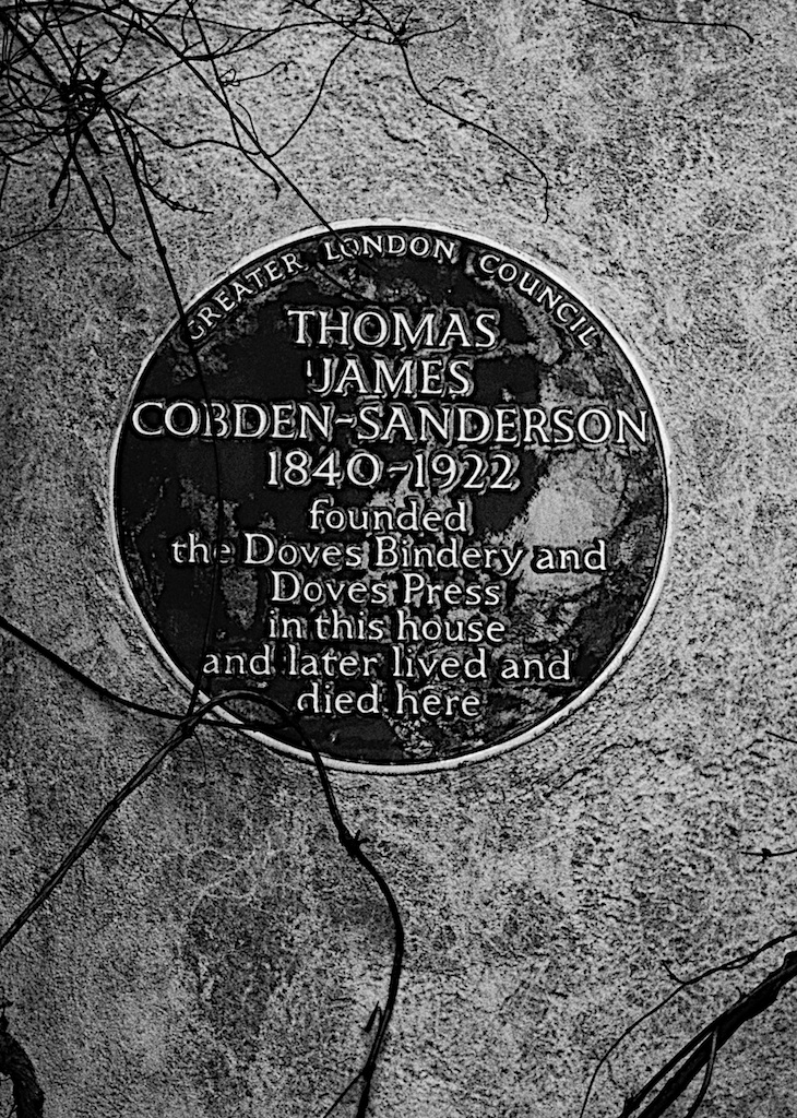
The old gentleman was Thomas Cobden-Sanderson who had founded the Doves Press in 1900 with his partner, Sir Emery Walker. They set up shop in a small house in Hammersmith Mall, next door to the famous Dove Tavern, and a few steps away from the London home of William Morris, Kelmscott House The press produced all its books in a unique typeface, designed in 1899 and known as Doves Type, which existed in only one size, the equivalent of 16pt. Yet during the First World War Cobden-Sanderson pitched the whole lot into the Thames simply to spite his partner.
Cobden-Sanderson had fallen out with Walker because he felt he was not getting sufficient working support. It became an acrimonious dispute and the partnership was dissolved in 1909 with the legal proviso that Emery Walker should have access to the Doves Type.
This restriction clearly festered in Cobden-Sanderson’s mind and within four years he had determined that no one, least of all Emery Walker, would ever use the typeface again. In an act of unprecedented vandalism he cast the type, including all the tools and jigs needed to replace it, into the mud of the Thames.
Both Cobden-Sanderson and Emery Walker has been close to William Morris, the renowned designer who lived nearby. It was Cobden-Sanderson who in 1887 suggested a committee to be called the Arts and Crafts Exhibition Society which in turn gave its name to the A&C movement. In the following year Emery Walker gave a lecture on fine printing to a distinguished audience which included Oscar Wilde and William Morris. Morris was inspired to found the Kelmscott Press which subsequently depended heavily on Emery Walker’s experience and knowledge of printing.
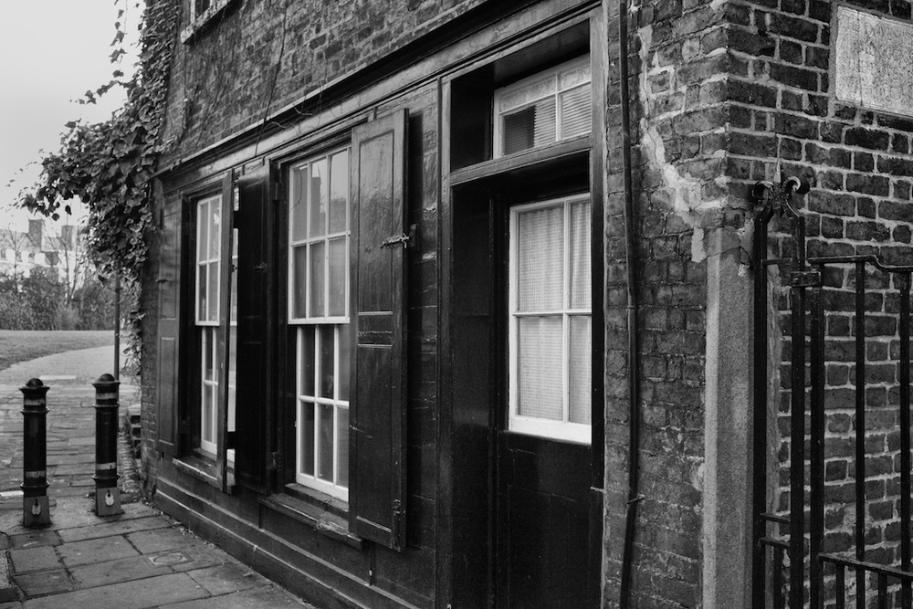

After Morris died in 1896 Cobden-Sanderson encouraged Walker to go into partnership to establish a private press of their own. Funding was provided by Anne Cobden-Sanderson but, crucially, it was agreed that Emery Walker could take for his own use a fount of the type they intended to design, something that never happened. They found premises in the terraced house next to the Dove, across the road from Morris’s old home.
Initially this was an idyllic partnership. Between 1902 and 1905 work was concentrated on a five-volume English Bible which is thought to be the firm’s masterpiece. The opening of Genesis is now considered to be one of the world’s finest printed pages.
One hundred years later and the Doves Type has made a reappearance, not from the bottom of the Thames but on an iPhone near you. The typeface has been meticulously salvaged in digital format by designer Robert Green and can be purchased for £40. Cobden-Sanderson would probably have approved of this new arts and crafts movement in typeface design. It is booming thanks to digital compilation with none of the disadvantages and costs that go with producing traditional lead type.
Typefaces are now safe from vandalism and no one can again spite the world by tipping a load of lead over Hammersmith Bridge. Until late 2014, however, it had been assumed that we would never again see any of this discarded lead.
But typographer Robert Green, after three years working on his digital facsimile of the Doves Press Type, decided to take matters into his own hands.
Working with a salvage team from the Port of London Authority, Mr Green recovered part of the trove from the muddy riverbed around Hammersmith Bridge.
Some of this metal type will be donated to the Emery Walker Trust as a small recompense for Cobden-Sanderson’s vandalism. But recovery of the type has also enabled Mr Green to create a more accurate facsimile and the digital fount has now been republished.


Thanks Mike for a fascinating story and evocative photos!
Thanks, Kevin
I have no comment about typefaces, but your top picture reminds me of several paintings of bridges on the Thames in fog by Whistler and Turner. Bill Strayhorn composed ‘Chelsea Bridge’ for Duke Ellington after what he thought was a painting by Whistler, but it turned out that what he was thinking of was a painting of Battersea Bridge by Turner. Anyway, you’re in good company with that Hammersmith Bridge shot.
William
Thanks, William. I remember going out deliberately on a misty morning to try to create the impression of the bridge in 1916.
Incidentally, I just noticed that comments were blocked on this article so I apologise to readers who tried to leave comments but without success. It is now open for business, as William has proved.