
Here I am in Terrigal, Australia, in the fourteenth week of the current Covid lockdown in New South Wales. The vaccination numbers are steadily climbing after a very late start, but new daily Delta variant infections are staying stubbornly high.
Most of us are feeling locked in, ground down and burnt out and experiencing feelings of indifference, boredom and stagnation. I am no exception. The death of my wife back in early April, just two months before the current lockdown started, has made the restrictions particularly difficult for me to endure.
We are not permitted to travel except for essential journeys and essential shopping, so a trip south to Sydney to see my children and grandchildren is not possible. I can only walk to exercise so I cannot walk around with a camera. The steady stream of new photos from my travels has dried up. International travel is a distant memory and I was very fortunate to have done a three-week-long domestic road trip back in April immediately after the death of my wife.
Mono opportunity
I came back from that road trip with a good haul of photos, including one of an opal miner in Lightning Ridge in far western New South Wales. I have only shot colour in recent years — after a long time shooting monochrome — so it was big leap for me to convert that photo to monochrome to enter into the prestigious Mono Awards, a major Australian/NZ photo competition for monochrome photos.
I was particularly pleased and very surprised, to collect a Highly Commended in the Mono awards/People category. Close, but no cigar. However, that success prompted me to take a look at some of my recent travel photos to see if any of them would benefit from being ‘reinterpreted’ in monochrome for this article.
I decided that a selection of the photos from my May 2017 Mississippi river road trip, from New Orleans to Chicago, would make a suitable case for treatment. Aside from other considerations, converting them to monochrome using Silver Efex Pro2 would help pass the interminable hours in lockdown.
The photos were all taken with my Leica Q — a wonderful camera — full-frame, a superb fast Summilux lens, excellent viewfinder, simple, straightforward controls and menus. While it’s definitely not a pocket camera, it is compact enough to slip into a backpack or carry in the hand. My days of impersonating a sherpa with a backpack full of gear are long gone. I replaced the Q with a Q2 last year and it has turned out to be an even more wonderful camera.
In over 60 years of pursuing photography as a hobby, I have covered the full gamut of gear ownership, from sub-miniature (Minolta 16 and Minox) to large format (Hasselblad and Mamiya), with many a Leica, and a few Nikons, Canons and Olympuses along the way.
I consider myself now to be GAS free and, hopefully, totally immune to any future incursions. As a result, the Q2 may well turn out to be my final camera although, as I have learnt over the years, one should never say. A Q3 may come along to tempt me to break the piggy bank open once again, but I’m not planning at looking further afield.
Road trip
Back to the Mississippi road trip. We flew from Sydney to New Orleans via Los Angeles. After a few enjoyable days in New Orleans, we collected a rental car and took three weeks to meander north, following the Mississippi River Road to Memphis and then branching off to stay in Chicago for a few days before flying home via Los Angeles.
Little did I know at the time, but within four weeks I was seriously ill in hospital in Sydney with infective endocarditis and having a heart valve replaced. I count myself very lucky that it did not happen in the US. Even thinking about the possible medical bills and the likely dialogue with the travel insurer still makes my head spin.
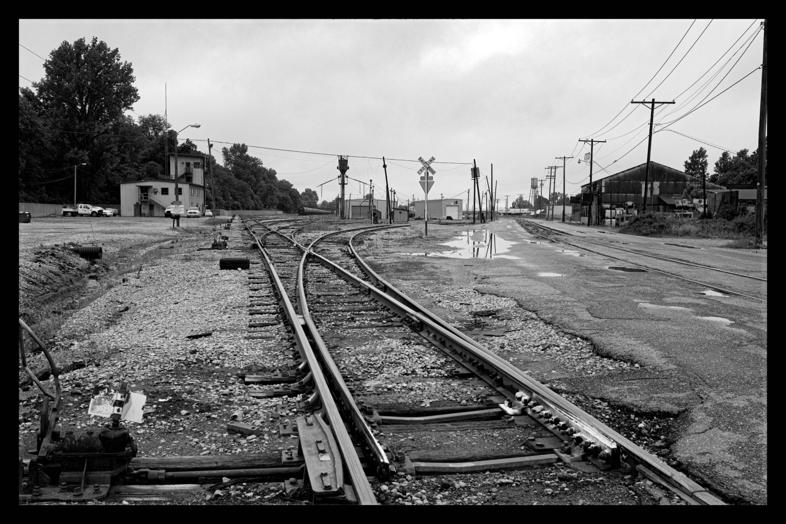
The road trip was a fascinating journey through middle America. A few memories stand out: New Orleans really had bounced back from Katrina. The Mississippi is an interesting river but it is not picturesque — it most definitely is not a Rhine or a Danube. The ancient steam-powered working riverboats have long gone and the old river towns where they used to call are now mere shadows of their former selves. Today it is all unglamorous, diesel-powered tugs pulling long trains of grain-filled barges heading south to New Orleans or empty barges trekking north.
Run-down
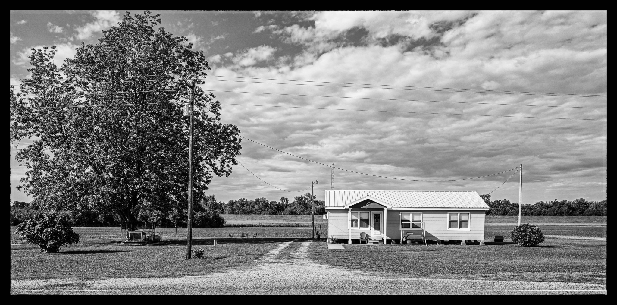
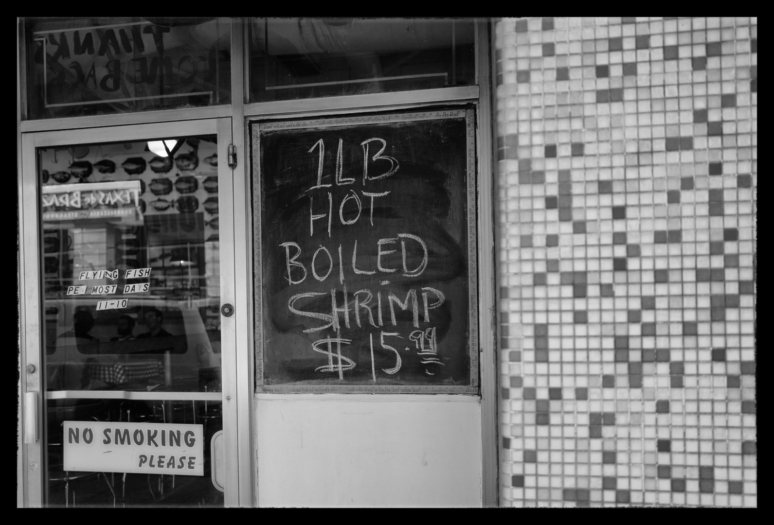
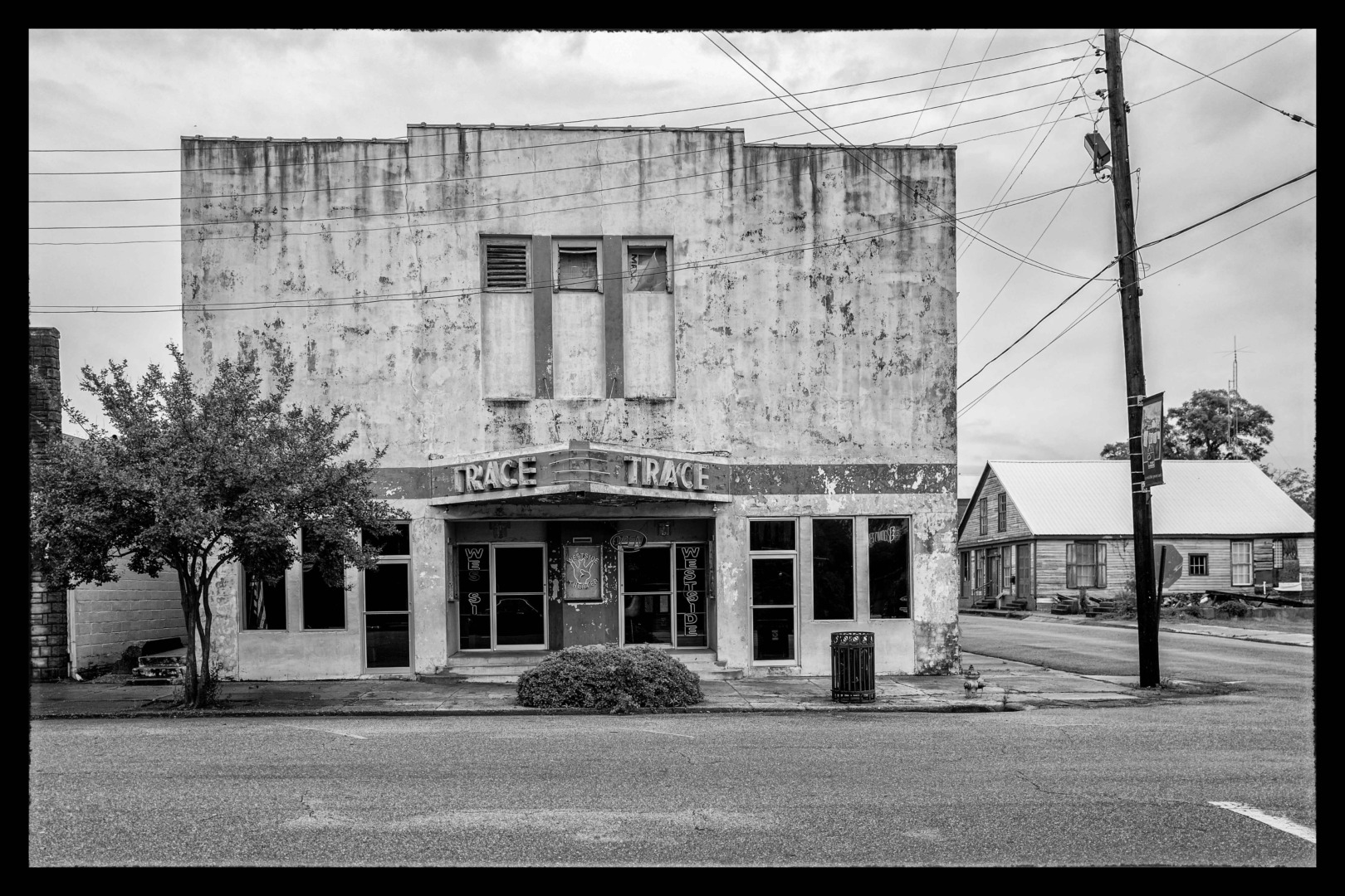
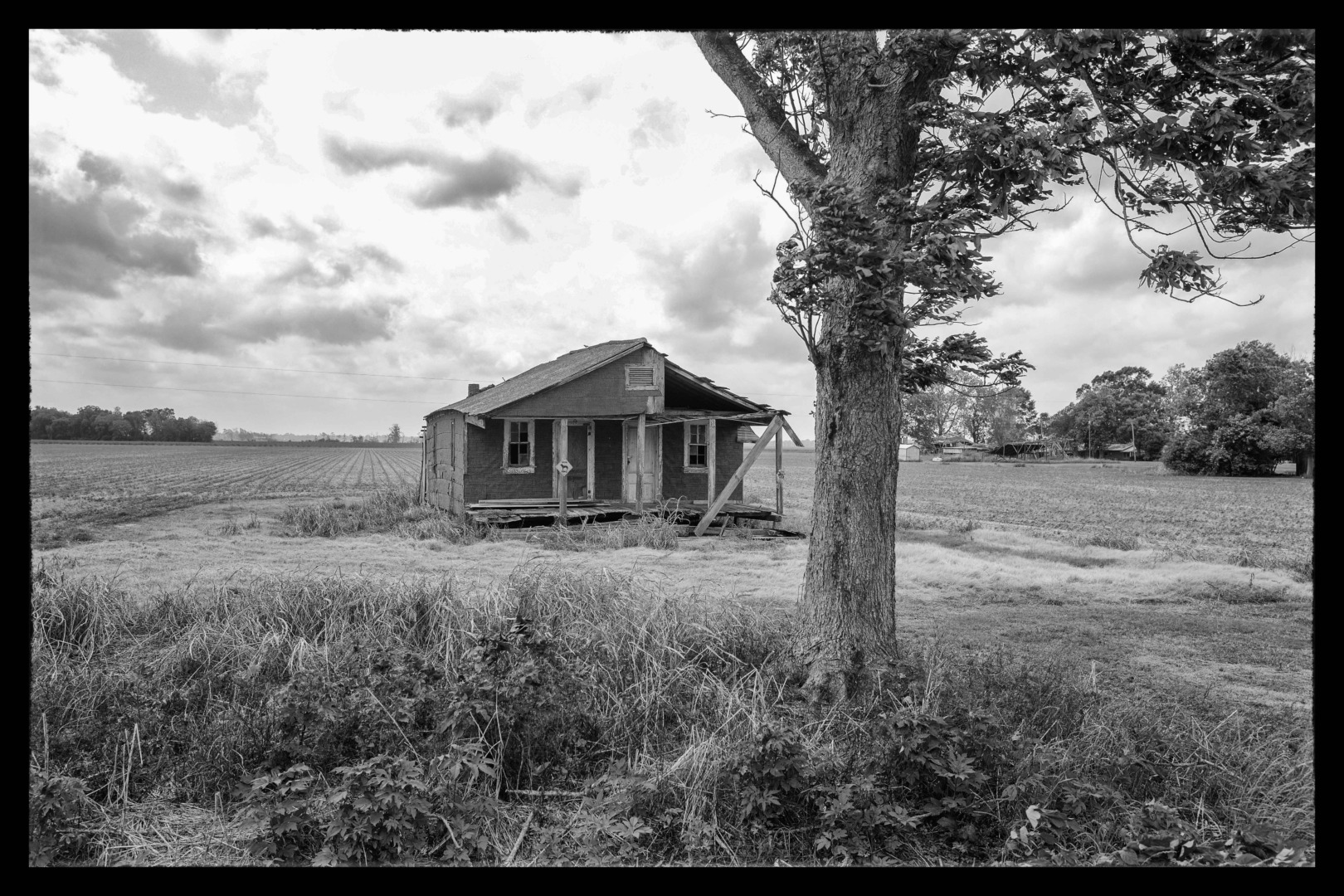
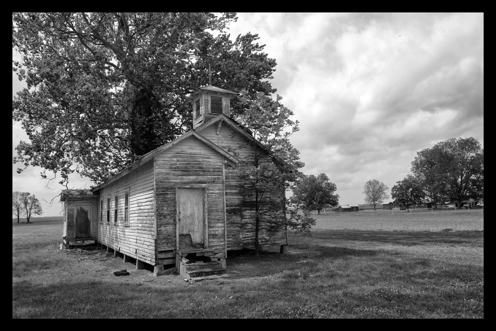
Almost all the towns and settlements on the route are tired and rundown, their Main Streets lined with vacant and abandoned shops. Casino hotels are uniformly awful. Infrastructure — in particular, roads and bridges — is often in a bad state of repair. The effects of rural depopulation are very apparent.
And Chicago is a wonderful, vibrant city but it can still be really cold in May.
The locals were generally friendly and welcoming, but there are always exceptions. On this trip, it was a vocal group of somewhat inebriated middle-aged ladies on the next table in the hotel restaurant in Natchez who had difficulty accepting that we did not share their obviously strongly held view that Donald Trump was the Messiah.
What’s your view
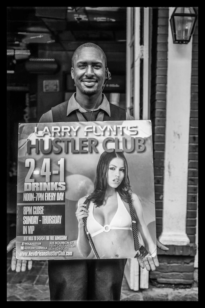
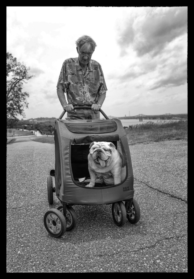
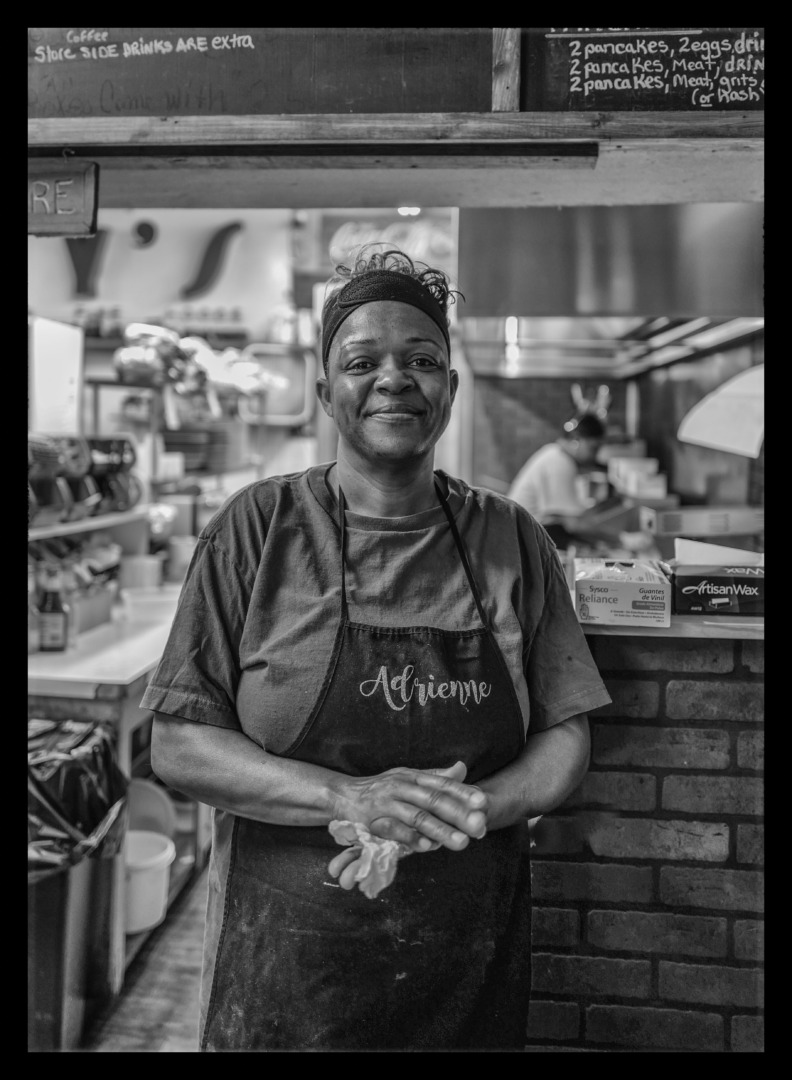
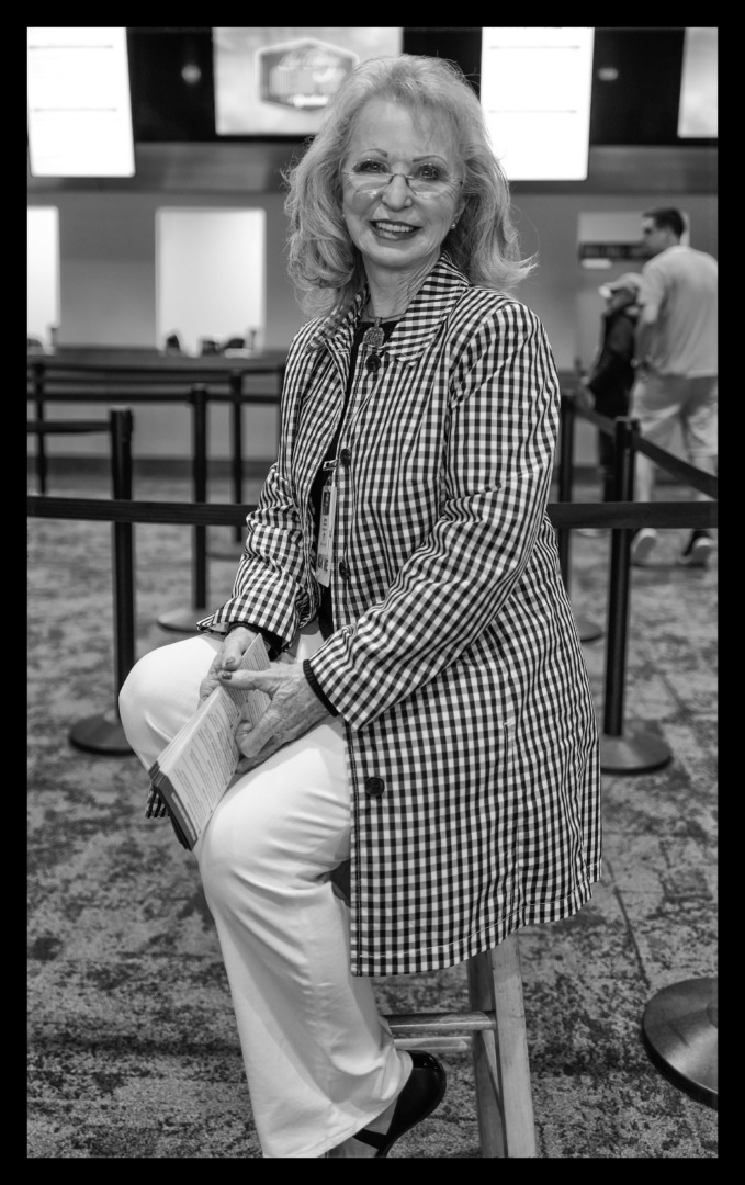
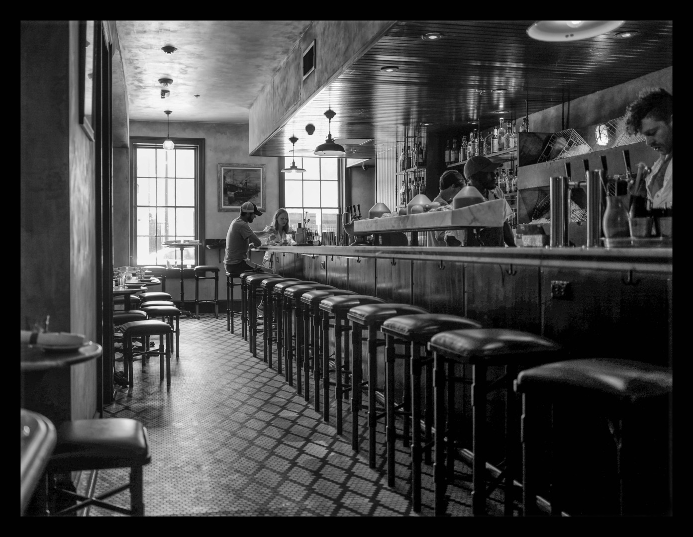
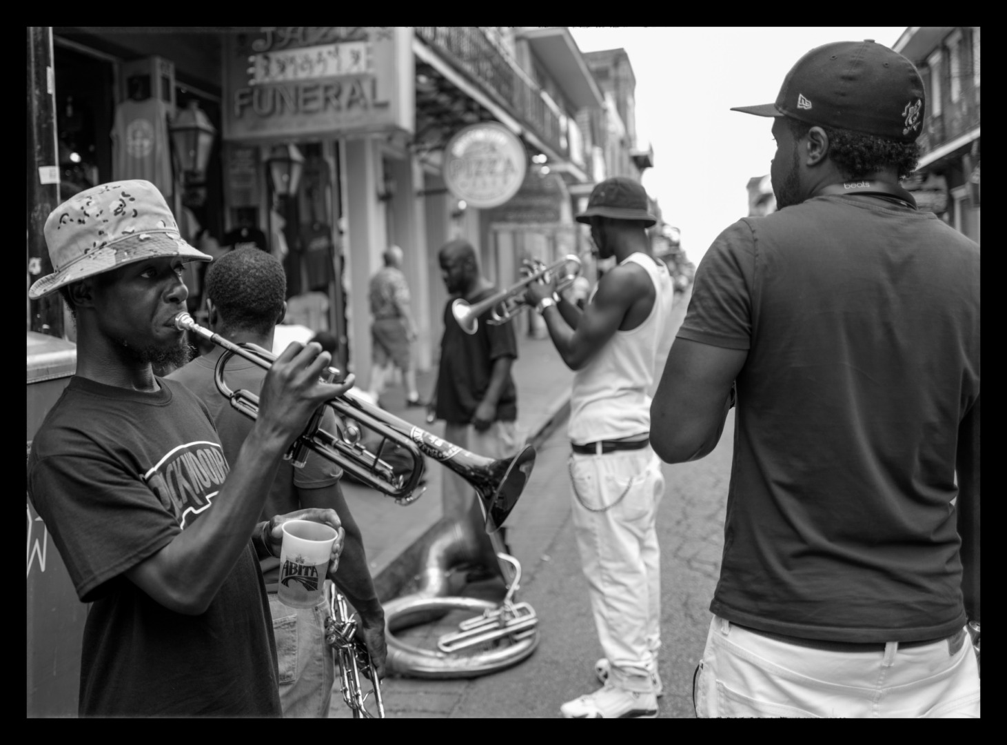
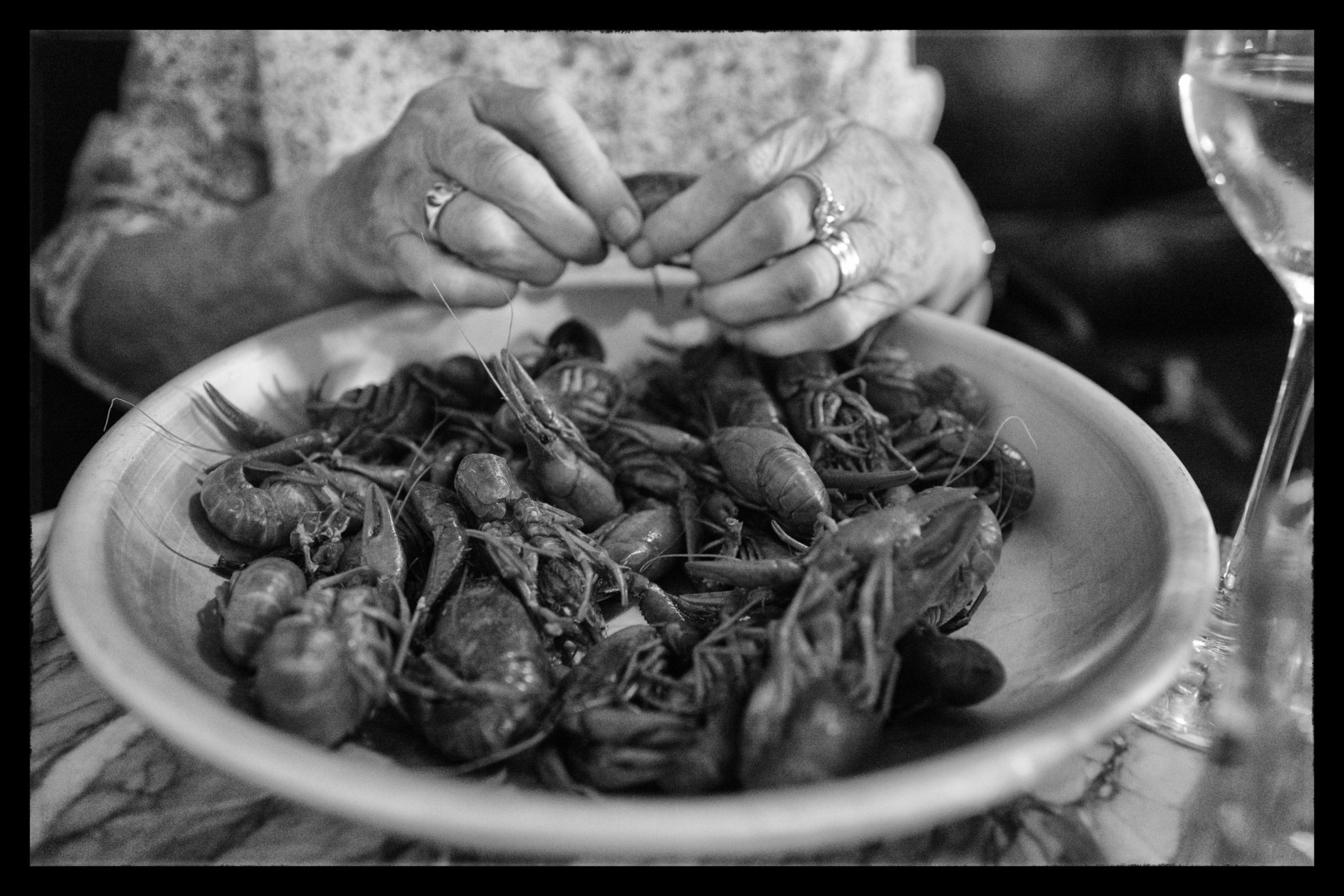
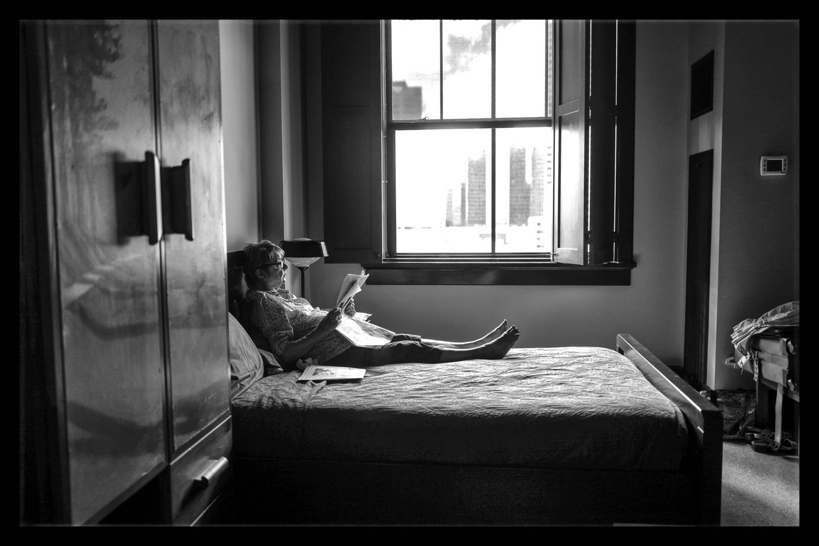
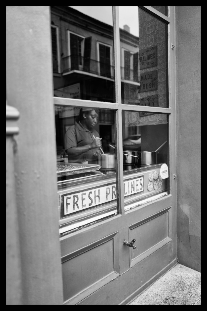
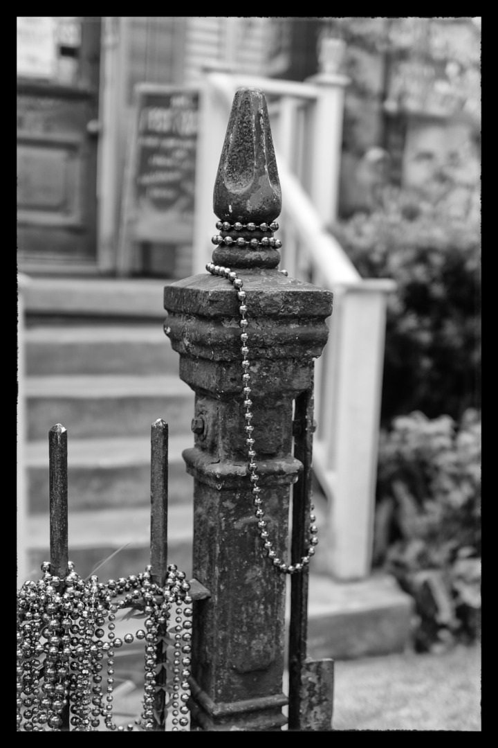
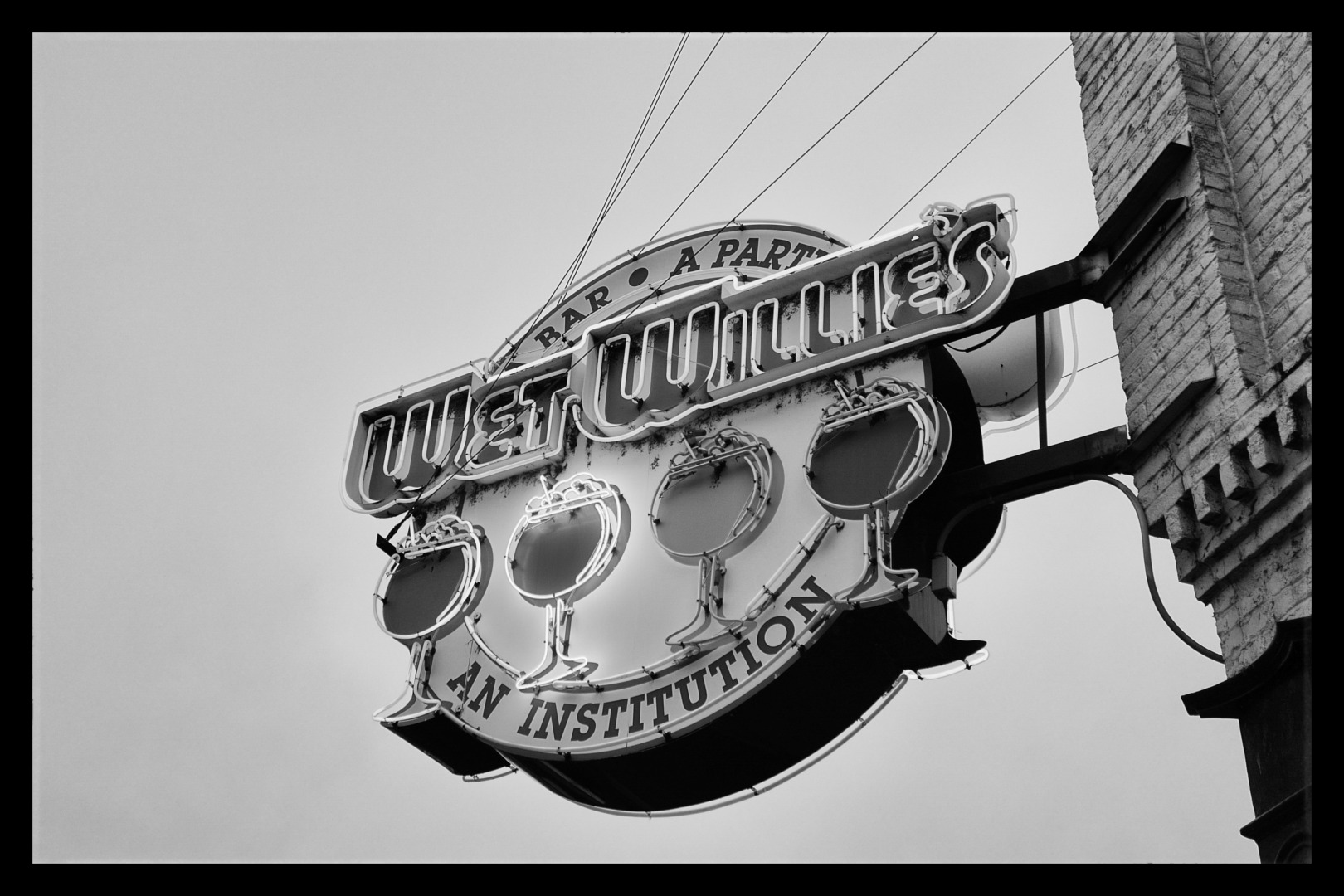
A selection of the monochrome versions of the River Road Trip photos is included here. Since I am very much committed to colour nowadays, I have mixed feelings about them. They evoke a very different response in me to the colour originals. Yet perhaps the grittiness of black and white more effectively portrays the ambience of the Middle America I experienced.
What do you think? Monochrome or colour, or maybe a bit of whatever takes your fancy. And are there any particular subjects that you feel lend themselves better to the mono treatment?
Read more from the author
You can also find the author here at The Rolling Road
Make a donation to help with our running costs
Did you know that Macfilos is run by five photography enthusiasts based in the UK, USA and Europe? We cover all the substantial costs of running the site, and we do not carry advertising because it spoils readers’ enjoyment. Any amount, however small, will be appreciated, and we will write to acknowledge your generosity.
Dave, thanks for the kind comment on the photos.
You ask where has my spirit gone. Perhaps a more pertinent question would be -how did you survive? You may not know that my lovely wife of 51 years died early April after 11 months of very painful illness, much of it spent in hospital and palliative care. To go into a strict 4 month lockdown on my own in a large, empty house within a few weeks after going through that is enough to dent the most robust of spirits and drain any enthusiasm for doing anything yet alone taking photos.
John
Hi John, yes, Sorry, I am aware – but forgot to engage my brain around that part related to the article – so please accept my humblest of apologies for missing that key piece of information.
As for my survival – it is still a thing of mystery, I cannot put a finger on, and I am leading up to a key note speech on resilience and survival in the aftermath of my covid incursion. I hope this helps others who are in my position, and gives them hope. I do hope you find hope to make the most of things once lockdown improves.
Best wishes
Dave
Good to see such a wonderful batch of images John. I love the look and feel of these.
I must say where has your spirit gone – last year in our total lockdown, I walked with my camera on my hours exercise – I even cheated by doing my long distance runs prior to daylight, and then still having an hours exercise when the neighbours might notice. Better still the images on my Flickr account around VE Day I took the daytime ones during a walk in the day, and then snook out at night to photograph Rochester Cathedral with its nice lighting for the day. To me I just used a bit of blitz spirit, in that the rules are there to tell us what to do, but my grandparents taught me to discreetly bend them to suit the circumstances – the trick is, that at the time, no one notices or cares.
Anyway, enjoy your new freedoms and summer to come, get out and use that Q2 to great affect, even do another road trip but somewhere else.
And I agree, my GAS is limited these days, surviving covid shows you want is important, and what is not.
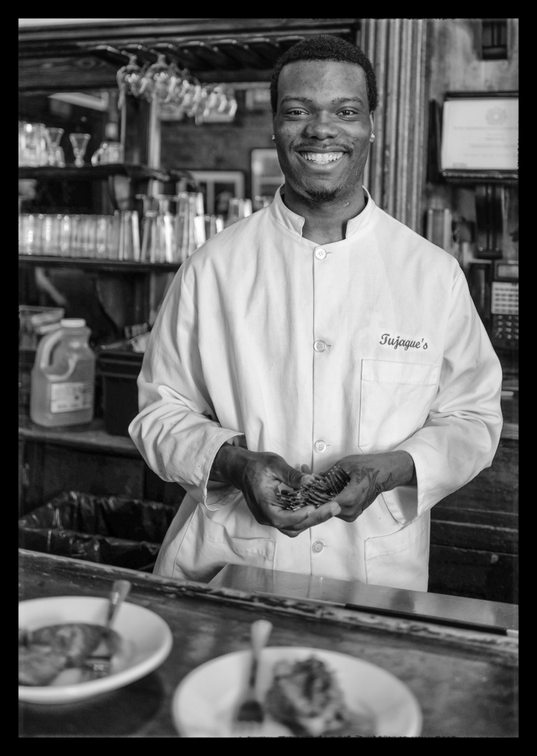
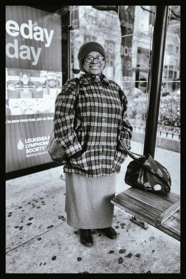
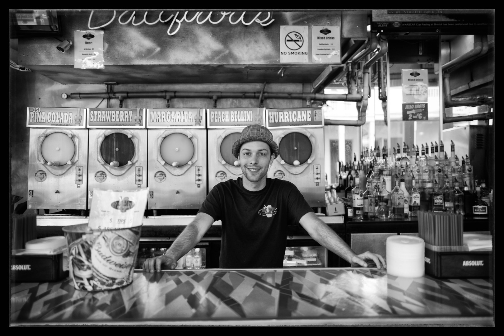
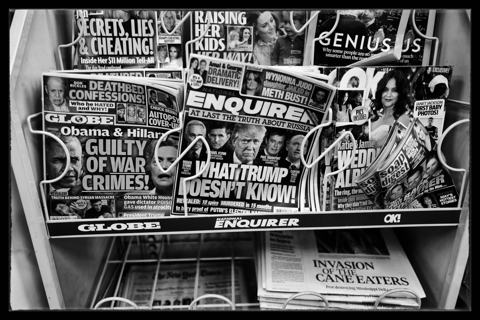
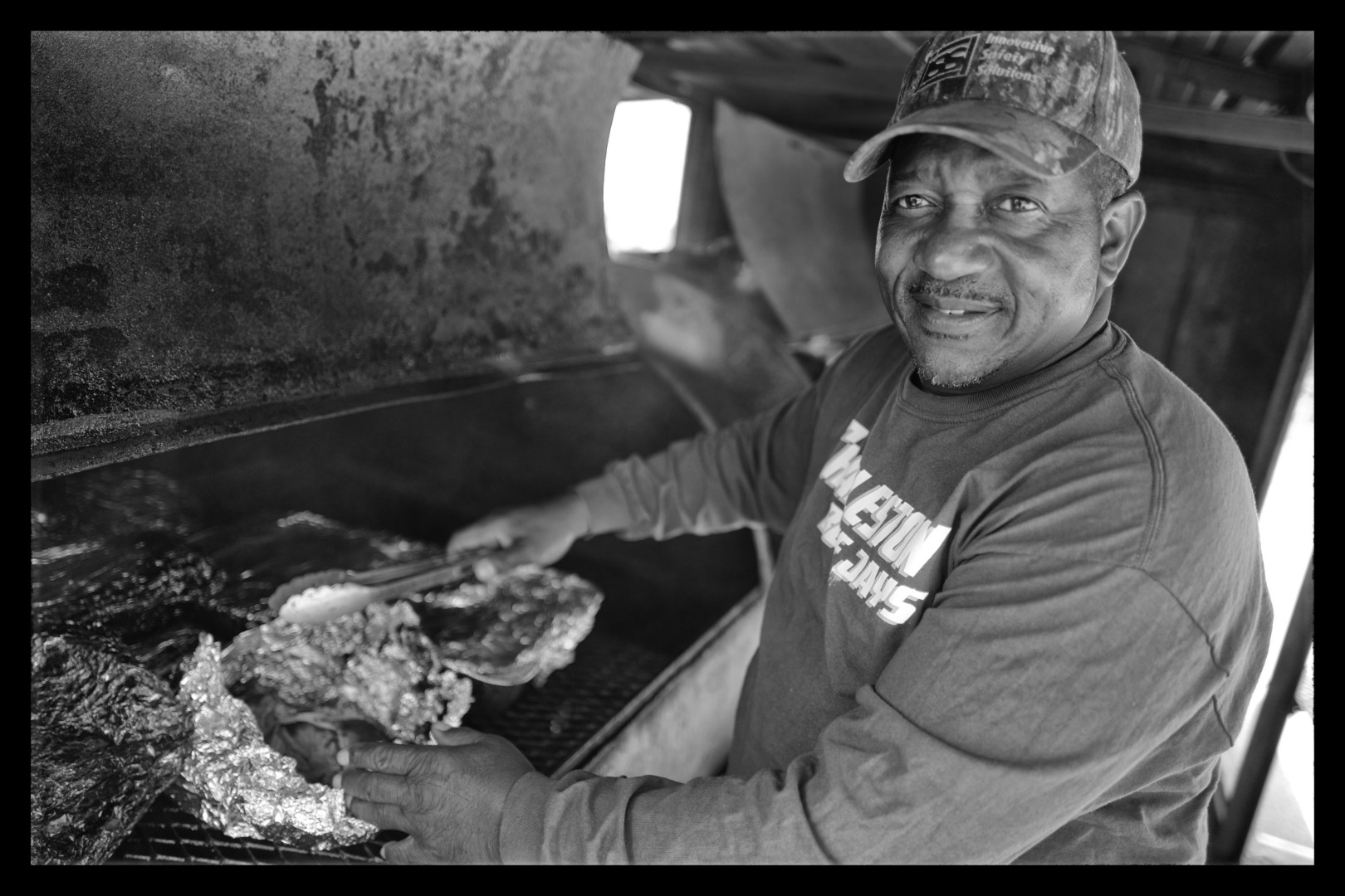
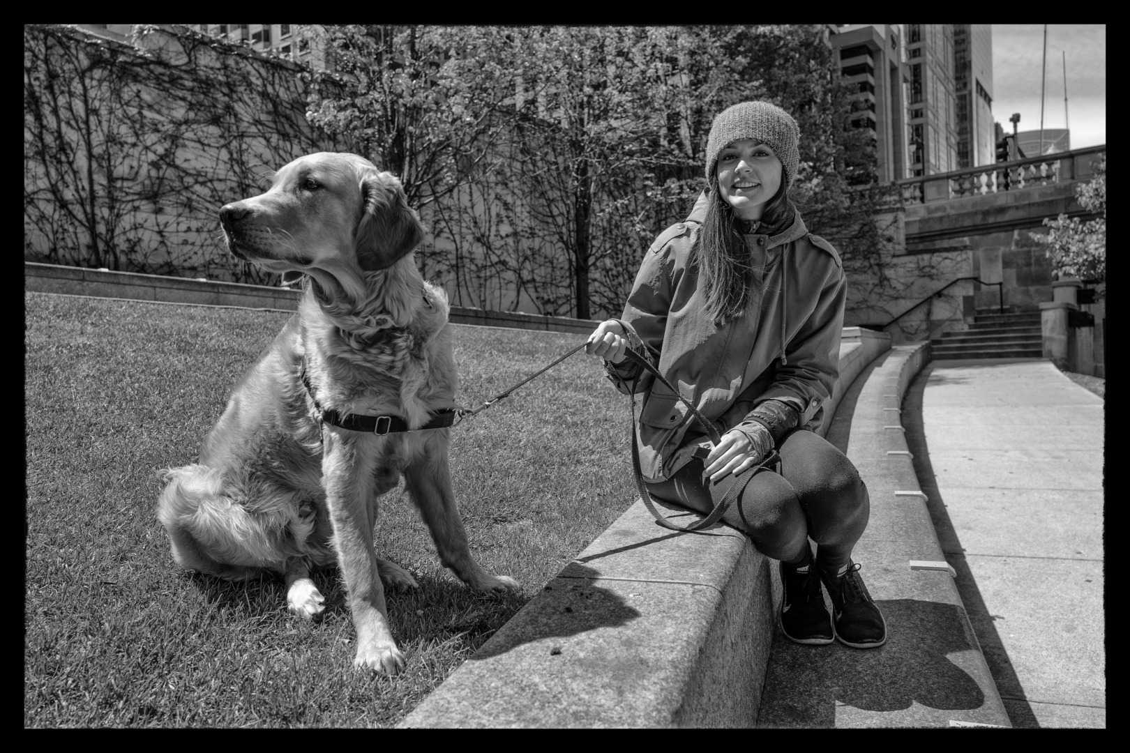
Hi John, I really enjoyed your article and can completely relate to the feelings of stagnation. It has been a very challenging time. I loved your photographs and think they look beautiful in b&w, which often evokes more emotion for me. I kept going back to the image of the gentleman who is cooking, I feel like I want to know more about him, the image really drew me in. I also loved the image of the newspaper stand and the girl with her dog (as a girl with a dog, I always appreciate a nice dog photograph!). You have made me look forward to travelling again, thanks for sharing!
William , thanks for your positive comments on the photos.
I totally agree with you on the Silver Efex,Tri-X comparison. I included reference to the processing software and the camera I used because I know that Mike likes me to include this info as many Macfilos readers find it interesting. If I had not had this consideration I would not have included a reference to either and the photos could then only be judged as photos not as the output from processing software.
If I had wanted to turn out photos which looked like Tri-X photos I would have used a Tri-X emulation preset for the processing or taken a film camera on the trip and loaded it with some, outdated rolls of Tri-X from the back of the bar fridge.
Again thanks for your appreciative comments.
John
Great photos, John. The photos from New Orleans and Mississippi show places which were the cradle for a huge amount of cultural influence in the 20th, particularly in respect of music. It is a pity to see those places so run down or, in the case of New Orleans, to become ‘party central’ rather than a vital cultural hub. There is more cultural interest in that part of the world coming from outside the US than from within. Chicago may be lively, but that was where a lot of people from the South went to find employment and they brought their culture with them.
I’m not sure that comparing Silver EFEX with Monochroms or, even, Tri-X is very fruitful. They are all different ways of producing the same thing and tastes differ, of course. B+W v Colour is also a matter of personal taste and a decision for the photographer. Photographs should be judged for what they contain and for how they look, rather than for how they were produced. On those aspects your photos score very highly in my book.
William
Technically I guess this is Middle America …but most Americans would call this the Deep South . It has looked like this for 100 years and is the poorest (by far ) area in the country . Robert Frank covered this in his book the Americans .
Like every area it is deeply rooted in history and this area in particular shows the aftermath of America s Civil War .
What was missed in this drive by collection is the deep culture of the.jazz bands and antebellum homes of Natchez Miss and virtually everything about New Orleans .
Roger, I have many more photos from the trip which show the music, New Orleans and the historic homes. However I had to make a limited, representative selection for the story for Macfilos and I am fortunate that Mike was able to include as many photos as he did.
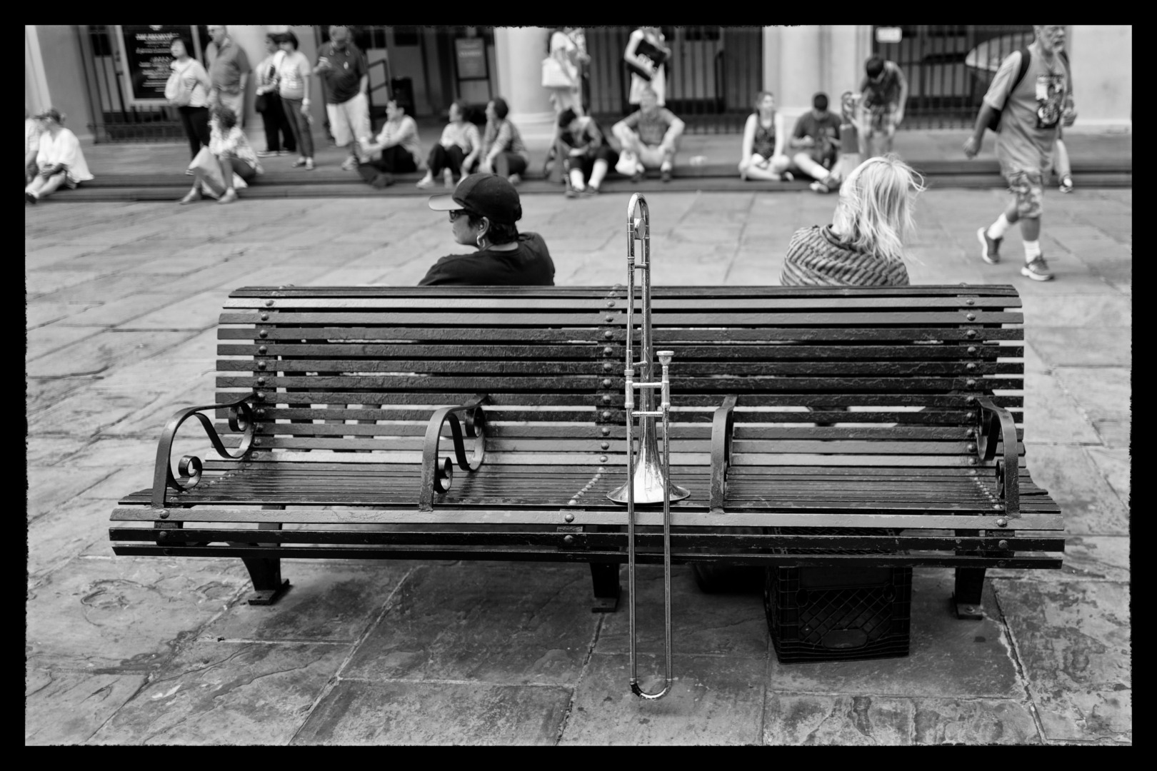
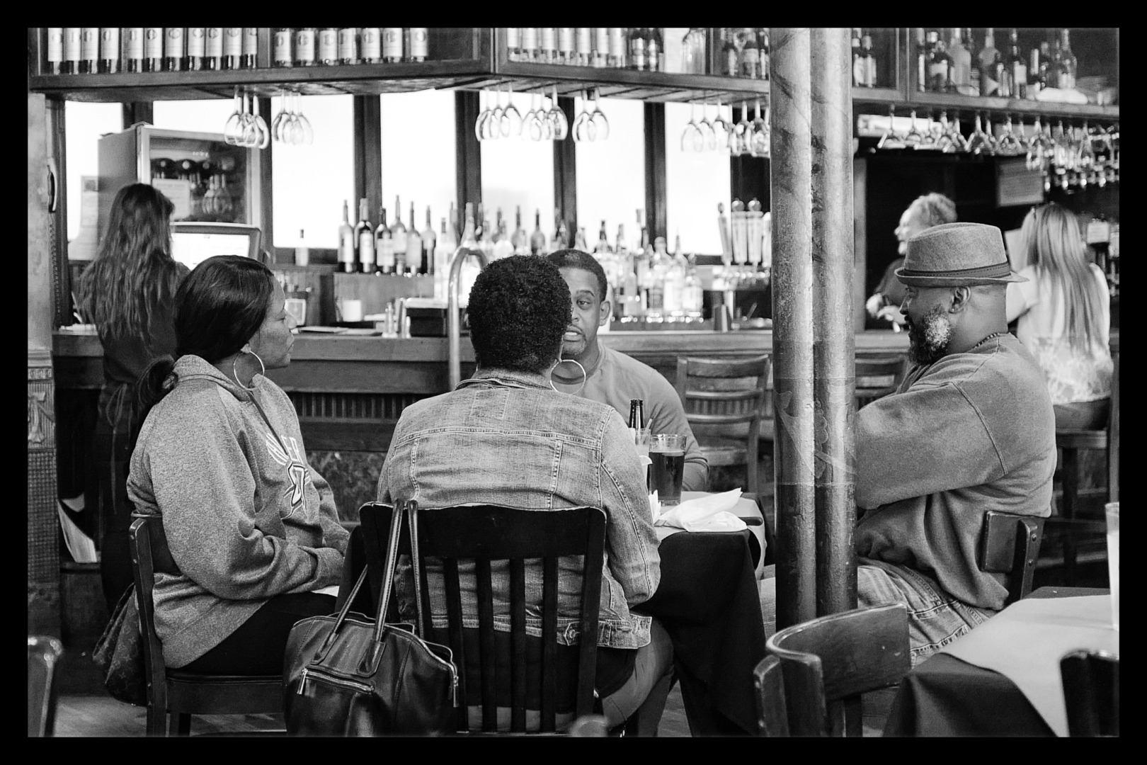
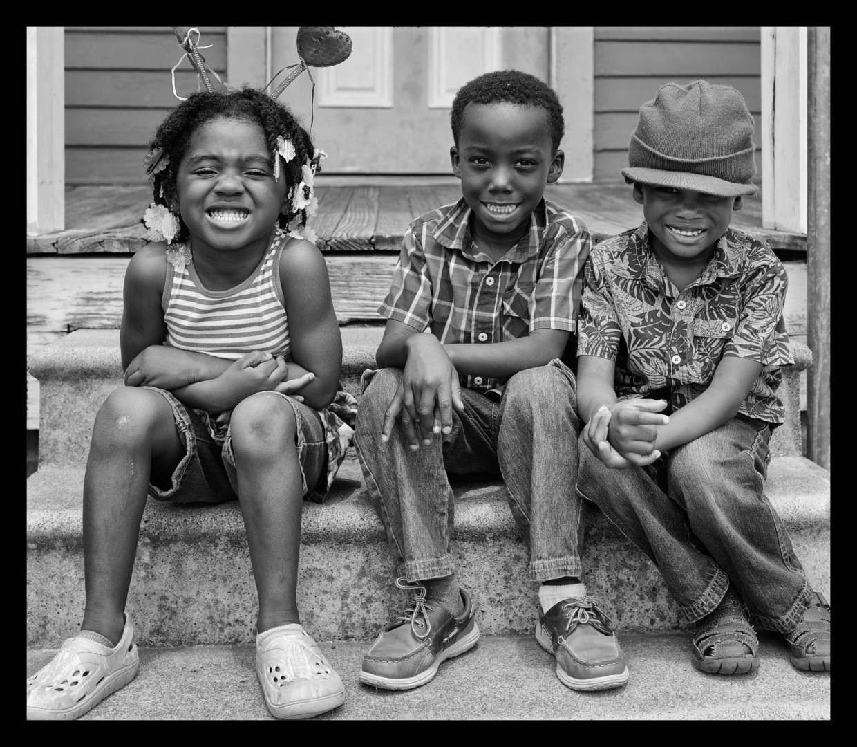
Hi John – many thanks for a great article and terrific photos! I thought the selection of black and white as the medium really added a lot to the photo-essay. It helped emphasize the impression that this part of the US is struggling, but also that there are grounds for optimism in the smiling faces of people in this region, who were clearly very happy to be photographed. I especially liked the photographs of the three children sitting on the doorstep, the long view along the bar of a diner, and the musicians warming up on the New Orleans street. I hope to contribute to the discussion of which subjects best lend themselves to B&W photography via a forthcoming submission. Thanks again for the encouragement to give it a try. I hope the lockdown restrictions continue to ease, and that you are able to visit your family soon. All the best and take care, Keith
When I looked at these pictures I immediately thought, “they were done in SilverEfex.” Just yesterday, serendipitously, I was doing the same thing as John did, converting color pictures that could look interesting in B&W. When I saw his pictures there was instant recognition. SilverEfex for me has a very, very distinctive look, or at least can produce a very distinctive look in B&W pictures converted from color. I happen to like it, but after looking at many such conversions, I begin to wonder am I more intrigued by the effect or by the actual picture itself.
Great to hear Covid relenting and powers to be will be kinder to you folks. Whichever you or any others on Mac prefer to do b/w or color they are all appreciated and show levels of perfection that we should aspire to even come close! Thank you contributors er al.
.
I think there’s more to black & white than just removing the colour from colour photos. B&W film generally showed – though it’d depend on which film you used – more contrast than just straight conversion from colour to B&W.
If two colours have the same density in a colour photo, and then you just remove all the colour, you’re often left simply with areas of grey of equal density ..but without the distinguishing feature which their colour provided. So the photos of the wooden buildings, or of the woman peeling prawns (or whatever they are) seem – to me, anyway – to be assorted shades of grey, but without either the impact of colour, or of the contrast which I think B&W – ‘Tri-X’ film, for example – would deliver.
So converting to B&W – for me – seems to suck life out of many of the pictures. Perhaps additional contrast, or ‘detail’ or ‘definition’ (..or whatever any particular photo editing software may call it..) would ‘punch them up’ and restore more vitality or clarity or exuberance.
But on the other hand, picture number 25, of the woman seen through the shop window ..the woman with dark skin, stirring in the dark.. seems to me to be pretty much perfect ..and colour, I think, would have detracted from its simplicity and impact. It has about three main tones: really dark, mid grey, and the white of the sign ‘Fresh Pralines’.
There’s human emotion in that, and the softness of the human figure, against the rigid lines and sharp angles of the rest of the picture. I think it’s a terrific photo!
Many of the others aren’t really black and white at all, though; they’re more like grey and grey ..just assorted tones of grey, and I long for more contrast, as the grey makes me feel depressed. Even the jolly girl and dog, at the end, is just various tones of grey, and although it’s a jolly picture, it’s also ..what one would call in terms of B&W film.. “under-developed”, as there is no deep black and no bright whites.
The woman on the bed – your wife? – comes nearest to being a great black & white ‘shot on film’ picture. It’s calm and soothing, but it has contrast, too, so that your eyes can rest on the white area – through the window – or the dark area by the bed. Or they can rest with the woman on the bed.
I’d say “add a little contrast” to the photo of the three children, and to many of the other pictures which are various shades of grey, and they’d all “perk up” and be great pictures, too.
“..perhaps the grittiness of black and white more effectively portrays the ambience of the Middle America I experienced..” ..but I don’t think these are “gritty”, because they don’t quite have the contrast (..or ‘grain’..) which real black & white film generally had – or has.
..But feel free to ignore all this and do exactly as you like, John! They are your photos, after all!
So, taking your argument, would a Monochrom camera do the job more effectively than a conversion? Is the M10-M nearer to film or just as far?
Dear Mike,
I haven’t used a Monochrome M (I’ve held one and tried one ..I think in Red Dot Cameras in what seems like a few years ago..) so I don’t know what settings there are on a Monochrome (I prefer the English spelling!) and I don’t know if the contrast can be adjusted ‘in camera’ or not. Some photos I’ve seen – shot with a Monochrome – look all-over tones-of-grey to me, but others do look punchy ..but I don’t know what processing – in camera or afterwards with processing software – was done with any of them.
So I don’t know exactly what output a Monochrome would give. They appear – generally – to give much less ‘grainy’ pics, especially at high ISO settings, than film would normally give (..Kodak Tri-X ISO 400 for example, though Ilford XP2, or XP2 Super, doesn’t look very grainy at high ISOs..) and can give s-m-o-o-o-t-h looking results much like ‘very fine grain’ film such as Panatomic-X.
I don’t know what (electronic) filters are built into a Monochrome (the Epson RD-1 camera, in B&W mode, is the only camera I know of which has a built in BLUE electronic filter – as well as the usual Orange, Red, Green – to simulate old original blue-sensitive ‘orthochromatic’ film).
Many people have written (in Macfilos, for example) that the little pocket Ricoh GX-something-or-other (I lose track of all the variations) gives, in B&W mode, very ‘film-like’ results, and I think my GXR does, too. And some have ‘heavy grain’ or ‘contrasty grain’ settings – or similar names – to give high contrast results. (I’m not too keen on very high contrast, but a Tri-X-like setting can look good sometimes – to me, anyway.)
But shooting in B&W is, I think, different from shooting in colour, so one mode doesn’t necessarily ‘convert’ well to the other: with B&W I think one’s looking for contrast in light and shade ..just shooting ‘flat’ B&W, in, say, dull light, with nothing to differentiate one thing from another, gives ‘flat’ and uninteresting results ..what are you supposed to be looking at? ..Whereas shooting in ‘flat’ light, but in colour, differentiates between things by virtue of their colours! So if you convert a pic like that to B&W ..what d’you get? ..Various tones of grey ..unless, in the conversion, you assign different densities, or different, contrasting, shades of grey, to those different colours which were in the original pic.
That’s why I think John’s photos of the woman in the shop and the woman on the bed work well: they rely on simple, clear steps of brightness and darkness to get their message across, and any colours in the originals are pretty much irrelevant.
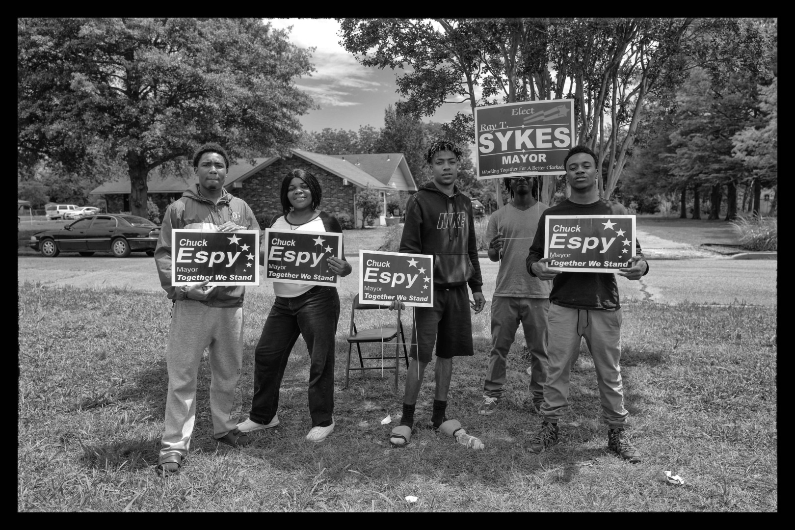
But the woman’s hands shelling prawns doesn’t work well in B&W because, I expect, the impact of the original depended on the colour(s) of those prawns. And the people standing with signs in front of trees doesn’t work well, for me, in b&w, as I guess that the colours of the signs, their clothes and the trees were essential elements of the original picture.
Similarly, I’m sure the colours of whatever the woman’s wearing in the woman-&-dog shot, and the colour of the dog’s coat, are probably what really ‘makes’ that photo, and when the colour’s removed, then what’s the photo about ..unless the woman was someone specially known to John?
So you need a particular mentality, I think, when shooting either in monochrome or in colour ..your attention needs to be on contrasting light (in b&w) and in colour (for colour). Some photographers can switch easily from one to the other – like Vivian Maier – and do well with both, and others not. But simply converting a colour photo to b&w doesn’t necessarily do justice to your original reason for taking the photo in the first place, I think.
So, “..would a Monochrom camera do the job more effectively than a conversion?..” ..it depends what was your state of mind, or your method of thinking, when you shot the photo(s). If you were thinking in B&W, then perhaps Yes. If you were thinking ‘in colour’, then why would you want (..to convert..) the picture to B&W anyway?
Thanks, David. I’m sure your eye for these things is better than mine, but it’s good to have such an assessment.
Incidentally, as you will have noticed, I make a clear differentiation between the Monochrom as product and monochrome photography. At least it doesn’t have two names like Concord and Concorde.
Don’t forget the “B&W High Contrast” setting on the Leica X1, X2, X series, compared with the other “B&W Natural” setting on the same cameras. It provides the stronger jpeg images of the type that David references above.
Something that Leica got right a decade ago.
Wayne’s post below doesn’t have a reply tag om my computer, so this should be read after his.
Reply to Wayne: I have just this afternoon (and before I read your comment!) done my first serious trial with the X-Vario high contrast setting and sharpening set to medium high. I’m very pleased with the results – mainly trees and plants plus some building. So I agree with you entirely.
Wet Willies is an institution! You have a good eye John and despite my preference for colour over black and white images I think your selection of photos here suits it. I like your mix of people and places, the smiling faces and the rundown places. A couple of years ago, I read Beth Macy’s “Factory Man” and it gave a fascinating insight into the decline of factory towns, once proud, busy and prosperous. Love the opening shot by the way.
As a former Brit and now 26-year Chicagoan I’m thrilled to see your images of the middle of America as you traveled up one of the “seams”. With a few exceptions the US has hollowed out with the loss of manufacturing and the “Walmartization” of retail which has left small towns that once thrived with a raging addiction to a cocktail of drugs and a desperation for jobs.
In many ways it resembles a war zone with abandoned and collapsing steel mills, grain silos and towns like Cairo at the tip of Illinois where the Missouri and Ohio rivers meet. Cairo used to be the equivalent of a container port but these days is literally falling to the ground.
There’s much to explore but beneath the grim exterior there is still American optimism that it will all get better. One day.
And btw. an old B&B sign works everywhere including Chicago in May: “There’s no such thing as bad weather just poor clothing choices.”
John, thanks for your kind comment on the photos. I have never even tried the monochrome mode on any of my cameras including my X Vario preferring to post process with Silver Efex. And as I said in the article monochrome photos are a rarity for me and I cannot see that changing.
I prepared the article two weeks ago and since then the vaccination rate here in New South Wales has soared and thankfully there will be a significant lifting of restrictions this coming Monday-11th. Not total freedom but a big step in the right direction. Schools return on 25th which will be a big relief to parents and pupils.It’s been a terrible 3 months.
Sadly the rate of new infections is still climbing in the state of Victoria which includes Melbourne and they remain in lockdown and they have just qualified as the most locked down city in the world. Poor Melburnians
Whenever I see good monochrome I always think to myself: who needs colour! And why don’t I just put my X-Vario into its excellent B&W mode and keep it there?! Thanks for this very enjoyable display, John, and may your lockdown be short from now on!
Thanks for the article and I like the pictures! For travel photography I personally am frequently also divided between color and b&w. Your run-down paragraph is unfortunately spot on. On top of the vacant and abandoned shops, boarded up buildings and missing windows there is often also a manufacturing plant that halted its operations a few decades ago.
These monochome version of your images are gems and a wonderful start fo the weekend. I often convert some of my images in B&W. i’m convinced that some of your Myanmar or Indian images and some of your Laos photos that you recently posted in your blog deserve a B&W conversion although, if my memory is good, you think Asian images must be in colour. Your mastery of the software and the gradation and various shades of grey you obtain with it are excellent.
Hope your lockdown will soon come to an end.
Jean
Jean, thanks for your kind comments regarding the photos and the monochrome conversions. I don’t use Silver Efex often but when I do I spend a lot of time on each image to make the graduations how I want them to look. I note your comments re my Laos photos but for me the appeal of those photos are the radiant colours. If/when I can travel overseas again I am looking forward to taking more photos in Asia but they will definitely be only colour photos.