
“I’m a romantic,” declares Paul Reid through his bushy poet’s beard, “it defines my whole story from the first time I had a go with my Dad’s camera as a kid, to the sense of privilege I still feel every time I hear those wedding vows.” These days the Cumbrian photographer can often be spotted roaming the streets of Northern towns and cities or shooting wide-angle portraits at weddings on his beloved Leica Q2 Monochrom. “They say photography gear doesn’t matter. I disagree! For me, the experience and process are part and parcel of the art.
He is one of that rare breed, gifted with Cartier Bresson’s fabled ‘alignment of the head, heart and eye’ that has allowed this particular camera to become an extension of himself, discarding colour and pursuing a singular, felt vision. In the few short months since acquiring the camera, Paul’s intense and spontaneous work has been steadily gaining attention, through a commitment to social media and regular accolades from the LFI (Leica Fotografie International), the creative arm of the Leica monolith.
It wasn’t always this way. The path from that first camera to becoming an established, creative practitioner has been riddled with highs and lows, self-doubt, loss and recovery.


Cupboard love
‘Psycho’, the school caretaker, taught the young Paul to process film and make prints in a glorified broom cupboard. “Everyone was afraid of him as he never talked and barged kids out of his way. Once he knew I cared about photography though, he became this brilliant teacher!”
Like many of us, Paul has never escaped the spell cast by seeing a print emerge in a bath of fix and, despite that ubiquitous parental warning of ‘GET A PROPER JOB’, he came to make a decent living from photography in a time when monochrome was fashionable for portraits and there was still an opportunity to bring out the reportage and buck the trend at weddings. The romantic photographer was in demand, confident, enthusiastic and briefly unstoppable.
“This was the beginning! I knew I wanted to capture moments forever in beautiful black and white. I left the day job that my Dad had told me to go and get, and literally rubbed my hands together at the thought of my golden future.” Alas, the party did not last. By the turn of the Millennium, the surge of all things digital had begun to reach into places few photographers anticipated.
Darkrooms were consigned to museums and fanatics, Flickr began to bulge and wedding guests were taking pictures on their phones. It’s hard to imagine now, but the digital revolution was feared by a generation that had grown up with a wired and physical infrastructure.

Information superhighway
Film itself, was tangible, had sprocket holes to meet sprockets in the cameras it was destined for, or came paper backed and vulnerable, preferring darkness, like a precious truffle. We made prints that we held in our hands and shared them in person or by post. It made sense, as Paul might say, it was poetic. And then came Tony Blair’s Information Superhighway that we really expected to stay science fiction – the internet. Many creative snappers laid down their cameras and left the future to the youngsters; the digital natives that were now taking charge. Paul was similarly disillusioned.

“From that moment on, I slowly lost something. The cameras were no longer metal beasts. These hard plastic cameras needed to be replaced after just a year as digital was evolving so quickly. Monochrome was no longer monochrome – instead, it was colour that you desaturated. The question of should I shoot in colour or monochrome, just disappeared. One day I announced I was never going to do a wedding or portrait again and for two years I barely touched a camera.”

The love of photography however did not leave Paul alone to crack on with his day job. Life took a turn that he could never have seen coming. “It took a tragedy to rewire my brain, to stop me in my tracks and give me a good shake. I needed reminding, to remember how I once thought as a younger man.”

Love of life
Three years ago, Paul’s best friend, Dave, died of a brain tumour. “We had been joined at the hip for a solid ten years. We worked together and we lived together, much more of an old married couple than a pair of mates! One day I noticed he wasn’t speaking right. I thought nothing much of it at first but when he told me he was struggling to button up his shirts, it was pretty obvious something was wrong. His last year was a long traumatic spiral and I fell into despair as he slipped away from me.
What really got to me from that last year was his fight to live, his love of life despite everything. There was me, jaded, drifting through life, forgetting all my hopes and dreams while my best friend was doing everything he could to simply hold on to his.”
A couple of years after the funeral and deep into the Covid 19 lockdown, life’s insistence to continue saw our hero bedazzled by a small, sleek camera that thought only in Black and White.” Like a ray of light, the Leica Q2 Monochrom was released. The camera was half the price, and I wouldn’t even have to buy a lens for it.”
The enforced homestay gave Paul time to thoroughly learn the camera and, as restrictions lifted, emerge into the Cumbrian night, skulking around and snapping as he found and honed his new voice in the digital age. People, portraits, monochrome – his loves returned.


Weddings started to pay the bills again but different now, “I wanted to be at the wedding. I chatted with guests, and I shot images from within the wedding. No longer was I the fly on the wall. The images I came away with were simply magical. The 28mm lens demands a kind of intimacy – a literal closeness and strangely, people let their guard down when you are right in their faces! I’m making portraits that tell a story.”

Hope for the future
It’s said that the Chinese character for crisis is made up of two parts: one is danger, the other is opportunity. The chance to see with new eyes was Dave’s parting gift and whilst Paul is still mourning the friend he lost, something changed in him and his work. These portraits are emotive, connected and fresh and to me, they communicate a clear expression of honouring himself as a creative, an artist and a true romantic. “When Dave died, I never made a conscious decision to change. I just did. My eyes were opened, and I could see the world and the people in it. I was just a kid in awe.”


Most recently Paul has gone that extra mile and begun making some of the images shown here into physical negatives and then, through the mysteries of physics and chemistry, into beautiful platinum palladium prints. There is a time-travelling fusion in that complex, cross-discipline process much as there is in the older, wiser man himself.

“So, I lost my way and I lost so much time. But I’m now producing my greatest work and there’s so much more to come. It is incredibly sad that such a tragedy happened and that so often, great art can come from heartbreak. But isn’t that how all the best love songs were written? Photography is my love song. A symphony of monochrome tones. Capturing the essence of fleeting moments with the gentle press of a button.”
Dave would be proud.
Read more from Roderick Field
This article first appeared in Black + White Photography Magazine
All images ©Paul Reid
Make a donation to help with our running costs
Did you know that Macfilos is run by five photography enthusiasts based in the UK, USA and Europe? We cover all the substantial costs of running the site, and we do not carry advertising because it spoils readers’ enjoyment. Any amount, however small, will be appreciated, and we will write to acknowledge your generosity.
As I’m now diagnosed by David as grim, bleak and downbeat, I’d like to say thanks, I’ll see what treatments are available. I’m hoping the doctor will suggest a tin of biscuits with a nice sunny picture of a thatched cottage and a kitten on the lid, if David can spare one from his upbeat collection.
I’ll have a look and see what I can find..
Hello David. As an inexperienced photographer I felt Paul’s images are technically accomplished with a terrific eye for detail and composition. There is a touch more contrast and clarity which overwhelms the mid tones but it does add to the pervasive mood. Inta Ruka has made a similar picture similar to the Johnny Violence portrait; a farmhand smoking I believe which shows spontaneity more than intention. What is an acceptable black and white picture ? What is a great black and white picture ? Most of the images above seem serendipitous which most great images share but often need a photographer to recognise and take action during a decisive moment. I think Paul has done that and some. Roderick’s prose has framed the images. Sort to like how a great picture has been printed and framed in a gallery. For the record Roderick’s images are a whole lot bleaker than this. Almost evoking the feeling of being trapped in purgatory after a lifetime of idyllic bliss. Cheers David !
Personally Roderick – I’d leave the images as they are, wonderful crisp monochrome with layers of detail that make studying them worthwhile.
I actually like Mikes solution on his latest article – just provide a few colour images at the end of the article to keep the local natives quiet.
Thanks Dave, I’m a bit of a fanatical editor, trying to keep the piece contained like a short film.
Hello Roderick. Your article has prompted some discussion over here on the other side of the world. The informal portrait shots are great. In one regard I’m with David that monochrome can hold back in presenting “the person”. To me that only adds a positive sense of the unknown and mystery. Sometimes less is more, but every individual has a right to see and feel it differently.
However, my favourite image is the first one in the article. Quirky, unexpected, special. Thank you.
Thought I’d catch up while awaiting my Easter roast. And found this joyous journey, with wonderful gritty images that really show the magic of monochrome.
Thank you for sharing.
Happy Easter 🐣 too.
I think photography needs a joyful criticism. Things changed and twenty years ago tattoos were rather exotic and symbolic, but now everybody has one done.
Moving and marvellous! Thank you. Every time I see black and white images like this I ask myself why I go on using colour. The people and surroundings are so completely real.
(And, very much in brackets, Leica could hardly wish for a better advertisement for the Q2!)
“Y’know..”
(..Prime Minister Harold Wilson takes pipe from mouth, leans in towards camera for greater intimacy..)
..black and white images are used so often for DOWNBEAT, agonising, photos ..for lowering skies, for Don McCullin bleakness, “gritty Northern realism”, weather-beaten craggy faces, for “it’s a hard (or stupid) life” photos, so that so many of us forget that black-&-white brought us the joyous, dazzling images of Marilyn in “Some Like it Hot”, the daft and joyous scatterbrained Katherine Hepburn in “Bringing Up Baby”, the silly/serious/silly/serious wit of “His Girl Friday”, and the joyous photos of Monsieur Lartigue, and Sergio Larrain ..and even Robert Capa’s joyful photos of Picasso and his family!
When black&white was ‘normal’ ..and colour film was more difficult to get hold of, or to process, then b&w wasn’t just for grim, dark, deprived, lonely, sarcastic photos – in the way that, say, Diane Arbus took them, or Susan Meiselas took them, or a hundred other photographers have used b&w to say “look at this pitiable landscape..” or “..these pitiable people”.
Remember Jane Bown’s impish, grinning Mick Jagger ..in black and white.. or Bailey’s grinning picture of the queen in bouncing, giggly black & white?!
My head gets weary of these dark, downbeat b&w “it’s a hard life” ironic photos; as a little bit of respite here are a few famous UPBEAT, joyous moments photographed in black and white: http://edituk.com/Joyous_Black_&_White.html
Or the Magnum school Leica boosted, sooo dramatic (LR makes them even more). Lartigue forever!
Afternoon David, or is it Harold today? I was there for the pipe, Jane Bown, David Bailey, Laurel, and Hardy. Though the norm was in flux, monochrome was my colourway of choice and my life and work was mostly recorded in that tonal range. Its a shame you are missing the joy in Paul’s work, which though dramatic, is full of life and love. For myself, I confess, I am prone to ‘grim’ as I seem to recall you pronouncing on one of my previous articles here, in colour… Perhaps ‘pitiable’ is in the eye of the beholder?
I would argue it’s a choice of the photographer to define their style. Paul Reid’s photography does exhibit joy, intimacy and mischief in the images he shares. Nothing sad or gloomy there.
Hi David
I’m not quite sure whether your post is a criticism of Pauls photographs? But if you think that his photos are downbeat b&w “it’s a hard life” thin I think you have magnificently missed the point.
For me, Pauls images are a real celebration of ordinary life with ordinary people – some of the faces are craggy, but they’re mostly smiling and I don’t see an ounce of irony, only positive joy . . and if the little boy with the tie is reminiscent of Diane Arbus, then it’s a Diane Arbus having a happy day!
All the best
Jono
Then we see different things, Jono!
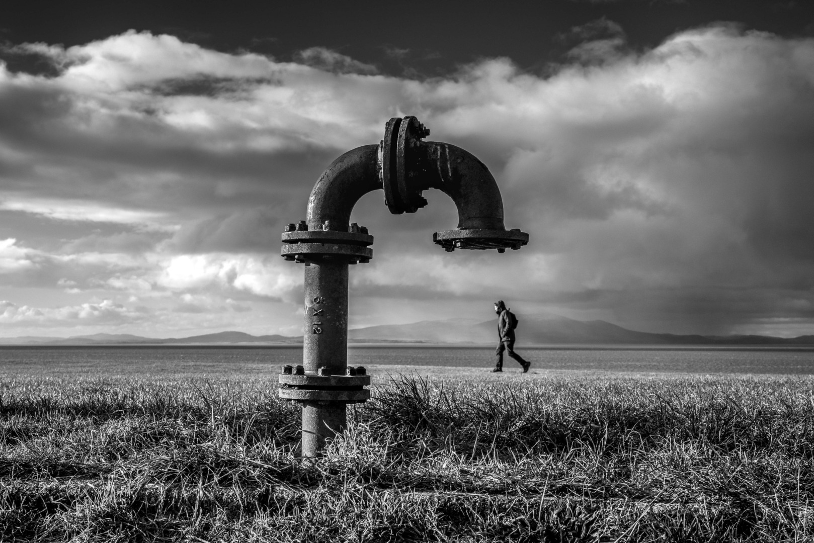
Photo 1: Lonely, deserted vista, rusty old pipe (..looks like an air vent from a deserted subterranean cold war ‘Regional Seat of Government’), one lonely passer-by, glowering heavy sky (red filter?), looks to me like desolation.
Photo 2: Glowering face, a bit like Vulcan, blowing smoke out into the world as if to obliterate it; no eye contact with the photographer ..or viewer: self-absorbed and looking bitter. But you see “..only positive joy..”? What is the point of this photo?
Photo 3: Man walking alone past a dark brick wall. You see “..only positive joy..”? It looks like an old ad saying ‘You’re never alone with a Strand’ ..except that he’s not smoking; the wall is. Distant mist. I’d say this is generic Northern grime. “..a real celebration of ordinary life..”? ..I see no celebration here.
Photo 4: Two girls taking a selfie in a bar ..an unsmiling man to the right of the cellphone. To me, this looks like one of Martin Parr’s ‘only capturing life as it is..’ but actually mocking the people in the picture. I think it’s naïve to see this as “celebration”.
Photo 5: Generic craggy black-&-white face. But what does the photo say about him ..or about anything? “..some of the faces are craggy, but they’re mostly smiling and I don’t see an ounce of irony, only positive joy..”? Really? ..It appears to say to me “It’s a hard life”. That’s it.
Photo 6: Newcastle? Generic grimy, Northern cobbled-street. Ironic cheap gifts in an area where it looks like people are poor ..that’s what it says to me. “Celebration”? ..I don’t think so.
Photo 7: Ditto. So where’s “..only positive joy..”? Are we really looking at the same photos?
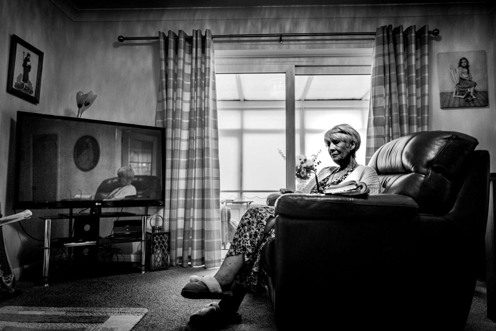
Photo 8: Woman alone, reflected in the TV. Er, “..positive joy”? Weird Arbus-like pictures on the walls. Light streaming in, but much of the picture’s in darkness, and the room’s sparsely furnished. “..some of the faces are craggy, but they’re mostly smiling..” ..well, I don’t see her smiling; she looks tired and worn down to me. So what is this photo saying? Why has the photographer taken it? To epitomise loneliness?
Photo 9: Little girl running in a deserted landscape (..or seascape, judging by the ripples in the sand, left by a tide that’s gone out and, one might say, abandoned the place). It evokes a miniature HC-B ‘Behind the Gare St-Lazare’ ..the man jumping over a puddle. It looks – to me – like a demolished landscape, with the girl the only sign of life. It might evoke joy if it were in colour, but to me – again – it suggests desolation, and being happy with small, meagre amusements.
Photo 10: (shall I go on..? When I click on them, the 1st picture appears twice, so it shows as Number 1 of 15, and then as Number 2 of 15, so my numbering here is slightly out of step with the numbers shown on the enlarged pictures) ..Boy in the hat: classic grimy Northern cobbles. The boy’s all dressed up, but going where through the grimy Northern surroundings? (..and with what looks like an over-burned-in sky beyond and above the bridge, apparently emphasising the depressing grime). So is there really “joy”, as you put it, in this picture? I’d say it’s “oddity”. But is it ‘involving’? ..D’you get more out of it, the longer you look at it? I really don’t see the point of it, sorry.
Photo 11: Boy(?) in smart jacket and black tie(?) ..”joy”? ..Again, I see “oddity”, and a mixture of textures; the smooth face, the curling wispy hair, the thick texture of the jacket or coat, and the smooth untextured roadway and out-of-focus buildings. But again, what does it say, and what is it for? There’s a slightly ‘haunted’ look about him (? ..it’s hard to tell if it’s a boy or a girl) ..so would I hang this on the wall? No thanks ..unless I was a parent of this child.
Photo 12: Man with white beard looking up ..with similar dark tie. There are other heads in the room, and he has a head too. Maybe these are photos to demonstrate technique ..getting in focus just what the photographer wants, and blurring everything else. But “joy”? I don’t see that here. Nor what the photo’s for.
Photo 13: (d’you really want me to go on..?) Man in panelled room with hands on table. Eye contact with me, the viewer, and a satisfied smile (..at last)! But again ..what’s the point? Who is he? What’s he smiling for? What are his surroundings, with all those chairs? ..A club of some sort? But what does the picture convey? ..Gloom, and an almost triumphant, but unknown, man. I want to know who he is ..but nothing in the picture tells me anything more.
Picture 14: Smiling man smoking, with an ear-ring and a decoration. This is what I’d call a portrait. Another craggy face, but this one with a homely, tolerant, amused smile on it. It’s pleasant to look at. The tattoo on his hand suggests he’s seen plenty of life. I like this one. There seems to be no angst or irony or depressiveness in this photo ..and the black-&-white suits it.
Maybe I have “..magnificently missed the point..” ..but I’m telling you the truth ..that’s what I see in these. You see what you see, and I see what I see. I do like to see joy in photos ..but – sorry – I really just don’t see any here ..except a bit in the last one.
Yours,
David.
These photos are definitely art. As with all art, a photographer’s images are a reflection of their heart. However, a viewer of an image interprets an image via the lens of their heart. Hence, as unique individuals, we will all have different opinions of an image. These interpretations can also be heavily impacted by recent major life experiences, joyful or catastrophic, which clearly shift a person’s median heart viewpoint.
I personally did not see a grim viewpoint in these images but I realize others will have totally different experiences. Being married for 41 years to the same love of my life, has convinced me on different viewpoints that I often do not understand.
I think this was magnificent photography. If it communicates darkness to someone there should be no problem with the photographer whether or not that is his intention. The artist is entitled to their artistic expression. If I do not like the style of someone’s decor I quietly sit there and am grateful I do not have to live there.
Anyway, I am trying to get relaunched in my photography after an extended health related hiatus, and this article was a positive kick in my butt to get back at my passion and my first love; monochrome Onwards and upwards.
Hi There David
I wonder whether you had actually read the text (or looked hard at the images) when you wrote your first message criticising Paul’s images for “lowering skies, Don McCullin bleakness, “gritty Northern realism””.
and then:
“b&w wasn’t just for grim, dark, deprived, lonely, sarcastic photos – in the way that, say, Diane Arbus took them”
and finally:
“My head gets weary of these dark, downbeat b&w “it’s a hard life” ironic photos”
Did you read the quote from Paul at the end of the article:
““So, I lost my way and I lost so much time. But I’m now producing my greatest work and there’s so much more to come. It is incredibly sad that such a tragedy happened and that so often, great art can come from heartbreak. But isn’t that how all the best love songs were written? Photography is my love song. A symphony of monochrome tones. Capturing the essence of fleeting moments with the gentle press of a button.””
His pictures are love stories – not ‘dark, deprived, lonely, sarcastic photos’ and he’s about as far from Martin Parr’s mocking unkindnesses as you could possibly get.
Sure, some of his settings are indeed ‘gritty’ and ‘northern’ (Cumbria mostly), and lot’s of his subjects are neither a youthful Mick Jagger or the Queen, but they are real people having a real time captured sympathetically and joyfully (yes that!).
Someone once said that talking about photographs is like dancing about architecture, and I rather agree, so I’m not going to answer all your criticisms shot by shot, but I’ll have a little dance on four of them.
Picture 1
you say:
Lonely, deserted vista, rusty old pipe (..looks like an air vent from a deserted subterranean cold war ‘Regional Seat of Government’), one lonely passer-by, glowering heavy sky (red filter?), looks to me like desolation.
It’s a sunny day, looks like a lovely sky to me, hills in the background – and the visual joke is the juxtaposition of the pipe and the man, will it pour something on him or suck him up . . . but clearly it’s a joke.
Picture 2
you say:
Glowering face, a bit like Vulcan, blowing smoke out into the world as if to obliterate it; no eye contact with the photographer ..or viewer: self-absorbed and looking bitter. But you see “..only positive joy..”? What is the point of this photo?
Did you ever smoke? I did and that looks like a moment of absolute enjoyment, blowing out a stream of smoke, looks to me like he’s playing it cool with his handsome face and raised eyebrows. The lighting is wonderful and to me this seems like a moment of quiet self satisfaction for Mr Cool.
Picture 4
you say:
Two girls taking a selfie in a bar ..an unsmiling man to the right of the cellphone. To me, this looks like one of Martin Parr’s ‘only capturing life as it is..’ but actually mocking the people in the picture. I think it’s naïve to see this as “celebration”.
The girls are having fun, the photographer is having fun, and although he doesn’t have eye contact he is unquestionably complicit in this image – almost touching the girl’s hand with his lens. If you think this is mocking then you should go to instagram and look at some of Paul’s stunning and sympathetic wedding photos:
Actually I suspect this shot was from a wedding and Paul says in the article:
““I wanted to be at the wedding. I chatted with guests, and I shot images from within the wedding. No longer was I the fly on the wall. The images I came away with were simply magical.”
I think this is a simply magical photograph, and one I would love to have taken at a wedding.
Picture 11
you say:
Boy(?) in smart jacket and black tie(?) ..”joy”? ..Again, I see “oddity”, and a mixture of textures; the smooth face, the curling wispy hair, the thick texture of the jacket or coat, and the smooth untextured roadway and out-of-focus buildings. But again, what does it say, and what is it for? There’s a slightly ‘haunted’ look about him (? ..it’s hard to tell if it’s a boy or a girl) ..so would I hang this on the wall? No thanks ..unless I was a parent of this child.”
At first sight ‘oddity’ perhaps – the little boy has an unusual face, and there is a touch of ‘Diane Arbus’ in the framing. But then the face; look a little harder, it’s like looking at the Mona Lisa, the eyes look sad, but the mouth suggests something a little different.
I could dance on about all of your comments, but I won’t bore you any more.
Paul makes it clear that his pictures are love stories, and that he loves to communicate with his subjects. There isn’t a touch of irony, mocking or sarcasm, these are the people he lives with and around, some of the lives might be hard, but there’s always space for a smile or a laugh or some kind of visual joke. Paul treats them with compassion and respect.
Of course you are entitled to “see what I see” in these images, but in the context of the article it seems like you are wilfully misunderstanding them and really are magnificently missing the point!
I can only recommend that you go on to Instagram (@paulreidphotography) or facebook (Paul Reid) – or maybe get a better handle on his personality by squandering 5 minutes on this video which will immediately remove any idea of sarcasm or bitterness
https://www.youtube.com/watch?v=bqa5svdqgUo
All the best
Jono
Yes, Jono, I did – I always do! – read through the whole of the feature, or article, as well as looking at the photos.
Maybe you’ve got your brightness turned up way higher than mine – I find the brilliance hard on my eyes unless my screen’s at no more than halfway brightness (..though I did turn it up full [MacBook Air Mid 2013, running on mains power] to really look at these pictures).
You say that Pic 1 is “..a sunny day, looks like a lovely sky to me, hills in the background”. What’s all that blackness at the top of the picture, then, or don’t you see that? (That’s why I said “red filter?”). Don’t you see what looks like rain (right-hand third of the sky)? And dark, almost black, rusty pipe in the foreground? No, sorry, I don’t buy your “..sunny day, looks like a lovely sky to me”. Looks like a gathering storm to me, with that black top layer where blue would be (..in a colour picture).
Disagree, sorry.
Pic 2″ “Glowering face, a bit like Vulcan”. I watched the video, as you suggested, and it turns out, from the video, that this man’s called ‘Johnny Violence’. He would have called himself that, presumably. So that’s what I picked up on from the photo, only I said ‘Vulcan’ instead of ‘Violence’ ..but pretty much the same thing, I think. You say “..this seems like a moment of quiet self satisfaction for Mr Cool”. What I see is, as I said, “..self-absorbed and looking bitter..” and, to me, a hint of violence. Sorry.
Pic 4: Girls’ selfie. You say “..The girls are having fun, the photographer is having fun, and although he doesn’t have eye contact he is unquestionably complicit in this image – almost touching the girl’s hand with his lens”. To me, the girl on the right looks like she’s holding back a little, and all that heavy make-up might have looked good in colour, but in b&w it looks – to me – not just unnatural, but rather weird. It’s as if the photographer is a bit censorious about this madcap over-indulgence. You say ‘Girls just want to have fun’, but I see ‘Superficiality’ here. Or, as I wrote above, I think it’s naïve to see this as “celebration”. Perhaps you’re a ‘glass half full’ guy, maybe – though I hadn’t noticed it – I’m more of a ‘glass half empty’ guy.
Pic 11: “..it’s like looking at the Mona Lisa, the eyes look sad, but the mouth suggests something a little different”. Really? The Mona Lisa? The boy’s eyes are looking just a teeny bit ABOVE the lens, as if halfway between the camera and the photographer ..not looking the viewer absolutely straight-in-the-eyes, I think.
But, as I wrote; “what does it say, and what is it for? There’s a slightly ‘haunted’ look about him (? ..it’s hard to tell if it’s a boy or a girl) ..so would I hang this on the wall? No thanks ..unless I was a parent of this child”. Sorry, but this reminds me so much of the child in ‘The Shining’ ..in essence, ‘creepy’.
[This is really hurting my eyes: winding up the brightness to see the pictures at their best and fullest, but quickly winding it back down again to type these black letters against the otherwise too bright and vivid – blindingly bright! – white background.]
At you’re suggestion above, I did “..go to instagram and look at some of Paul’s stunning and sympathetic wedding photos”. And I watched his video, from which he seems to be an awfully nice chap, and I see that he’s offering photography courses or mentoring. I’ve known many awfully nice chaps and chapesses who are photographers ..and many who are really brilliant photographers!
But being nice at anything – chimney sweeping, teaching, road mending, conducting orchestras, running big companies – doesn’t necessarily mean that you’re GOOD at it ..it may mean that you enjoy it, that people welcome you when you approach them, it may mean that you’re familiar with the skills involved in it. But you might still have much to learn about it ..if it’s, say, your vocation, or you’re moderately good at it.
And I think – you may disagree, and so may Rod – that if you shoot in black-&-white people are, to a great extent, predisposed to believe that your photos are terrific, because people confuse – to my mind – b&w with some kind of ‘authenticity’, and ‘tradition’, and ‘knowing what you’re doing’ ..so you’re ‘ahead of the curve’, so to speak, in the popularity stakes if you take what are perceived to be ‘serious’ black-&-white photos. You are a respectable – and to be respected – photographer if you shoot in black-&-white.
(But I think that’s a load of hooey, and you can be just as ‘serious’, just as ‘accomplished’, whatever medium you use, b&w or colour.)
No, I’m not “..wilfully misunderstanding..” these photos. I think that he’ll get there. He’ll find his way. He’ll have his realisation, that “Ah! ..there’s a better way to take these photographs!”
I think these are a work in progress. I think these are still ‘snapshots’, except for that last one. I think he’s too constrained by that 28mm lens. I think he hasn’t found his style yet. Shooting in b&w is not his complete style ..he needs to think what he wants to put into a picture, and not just what he wants to ‘capture’.
But now it’s bedtime ..so, in the words of Uncle Mac; “Goodnight children ..everywhere”.
AFTERTHOUGHTS, next morning:
Who made this selection? Many of the Instagram photos are bright and cheerful. Maybe Rod made this selection. If so, perhaps it’s Rod’s ‘downbeat’ attitude which is shown here, rather than Paul’s own personality. I think we should be told..
Hi David
My objection was to your original accusation of:
“grim, dark, deprived, lonely, sarcastic photos”
Which I stand by as they arent!
Now, however you are questioning how ‘GOOD’ he is, which is something quite different, relative and subjective. I grant you your right to any opinion (personally I haven’t much thought about it).
What we can say is that he IS good ENOUGH to earn a living, fill up his training sessions, get a good following on instagram, please a lot of people and inspire Roderick to write a fine article about him.
All the best
Good photographs!
Also a good reflection on his personal fight against the inconveniences digital carried with, specially sensors seeing in color. I never ended into a digital monochrom though.
I share with him the love for the spontaneous. Cheers
A most enjoyable and inspiring article. Thank you for sharing.
Great writing by Field and superb pictures by Reid. The boy with the tie is a haunting image.
Paul Reed’s images touch the heart with a sense of intimacy that makes them feel like you know the person. Now we know why and that makes the work even more poignant and appealing.
What a great Article, the two photos that grabbed me the most, was the little kid with his parents who looked like he was thinking of flipping you off, and the two women going up the stairs to the light, sort of like the mother ship is coming to take them home! That camera is Q2m the Leica Holy Grail, and when I get mine will have to reach you to borrow your settings, please keep the articles coming, thank you!
Strangely, like an earlier comment, I found I was suddenly disappointed that the fascinating article was over. It was so absorbing and the images were all so evocative and gorgeous examples of the enchanting quality of monochrom done with mastery.
This article is so inspiring for me to go out and work on improving my skills. Thanks for a brilliant article!
Inspired story and the monochrome images are fabulous..it has inspired me to shoot more monochrome on the Street
Thank you Paul
John H
An article that accompanies jaw dropping images.
Thanks
Jean
sorry I forgot an excellent article ….
Excellent – great article Rod and fantastic pictures from Paul
Paul’s definitely an artist and then some. The image gallery is a tour de force. I believe that some may see this as an effort which brooks no compromises however my opinion is of an artist who has a singular vision and achieved clarity in his creative endeavours. May I also add that it was a great read and at the end of the article it seemed too short. Perhaps it’s just really well written. Thank you.