
I’ve been thinking, which is not necessarily a good thing it has to be said, about my travel photographs. I have come to realise that I take photos which embody bits of places where we go but don’t necessarily give the full picture of the town or city. They are in the main just a flavour.
Here, for instance, are some photos of Paris. I hadn’t set out to ‘document’ Paris, but just took snaps while we ambled around. There is no photo here of the Eiffel Tower, none of the Trocadero, none of the Grand Palais nor one of the Gare du Nord.
These are just pictures within the city, taken with a variety of cameras, and simply of ‘quirky’ things which appealed to me, but which do, for me, anyway, evoke “Paris”.
Which cameras? We-ell, some are taken with a little pocket Fujifilm Finepix F550, some with a pocket Sony RX100 Mark V and Mark VI, some on film with a 1954 Leica M3, and some with a 2009 Leica M9, some with a Ricoh GXR with the Leica M lens mount on it, some with a teeny pocket Sony WX350. To my mind, though, which camera was used isn’t important. Could you tell which ones were taken with which? And does it matter in any case?
I choose a LENS before I choose a camera: how w-i-d-e a lens do I want to use? Which camera will provide, or fit, a lens that wide? How far away is whatever I want to shoot likely to be? So which camera or lens will let me use that ‘focal length’, or which camera (or lens) will zoom to that length, or width?
It’s the lens which captures the picture. So I use a camera which that lens will work with. That’s my motto.
First bite
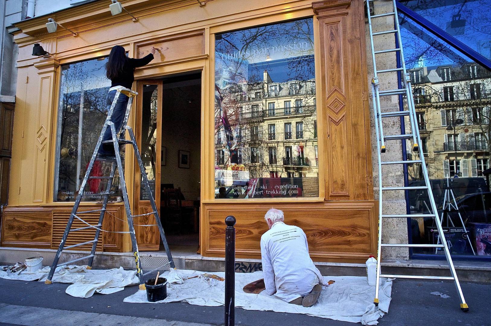
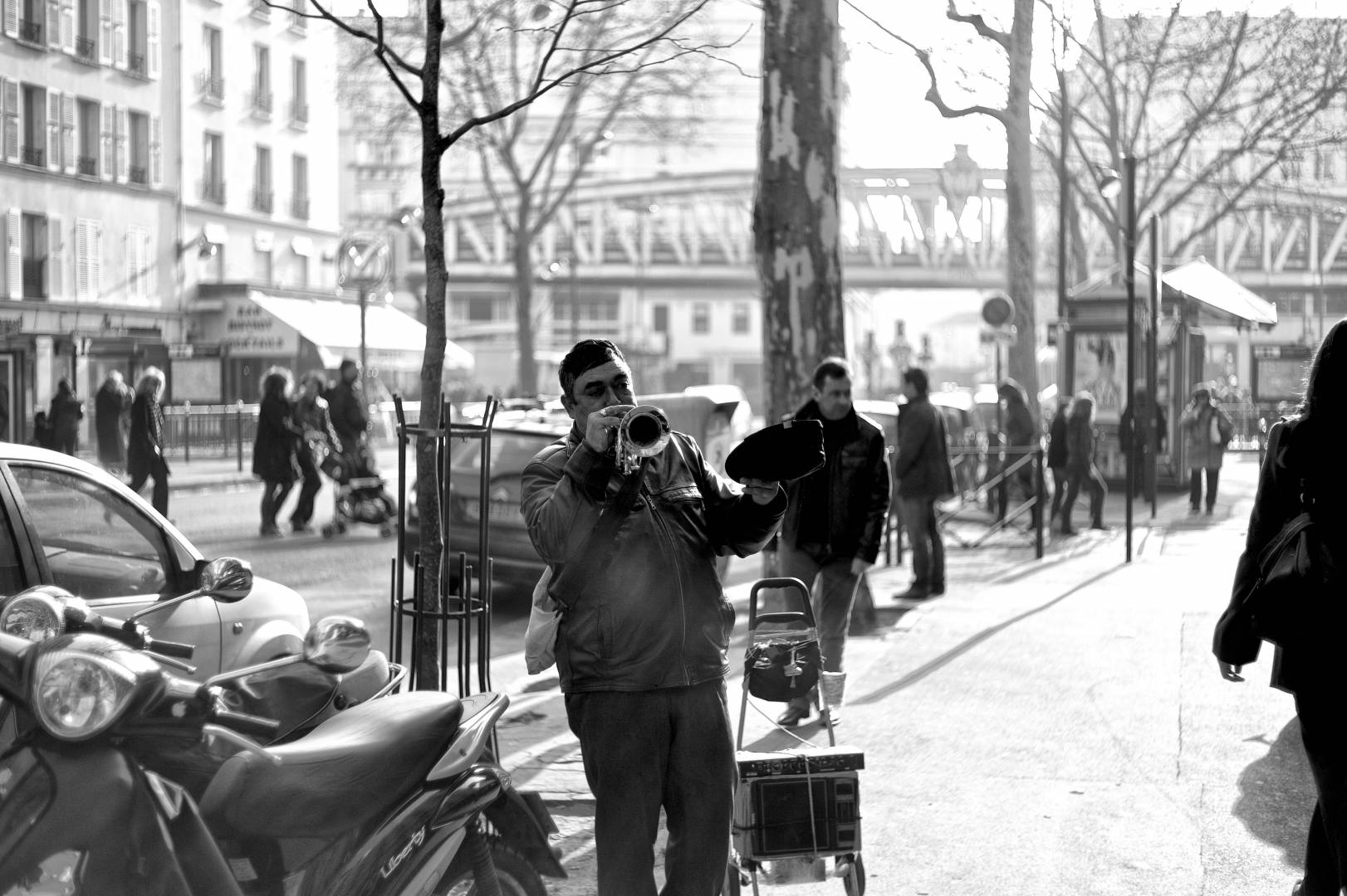
Here’s a shopfront being repainted, or rather, re-varnished. It looks like the shop owners are doing it themselves. Note that it’s right next door to a camera shop — see the tripod in the window? – which is how I came to be there. The building itself is nice’n’olde-worlde, but reflected in its windows are the traditional, stately Paris buildings opposite.
So it’s a picture of two people renovating a building, but it’s the reflections which give the picture its setting. And I like the echoes of the ladders and the tripod, and that diagonal beam in the window to the right: in fact, there isn’t a vertical line in the whole picture. So the angled lines give the photo some ‘dynamism’, as well as the activity giving dynamism, too. It looks — to me; maybe not to you — like Paris, especially with the French wording on those windows: “Guides par passion”.
It was taken with a terrific little Voigtländer 15mm super-wide lens (which equates to 22mm when it’s on, like this, an APS camera).
Second bite
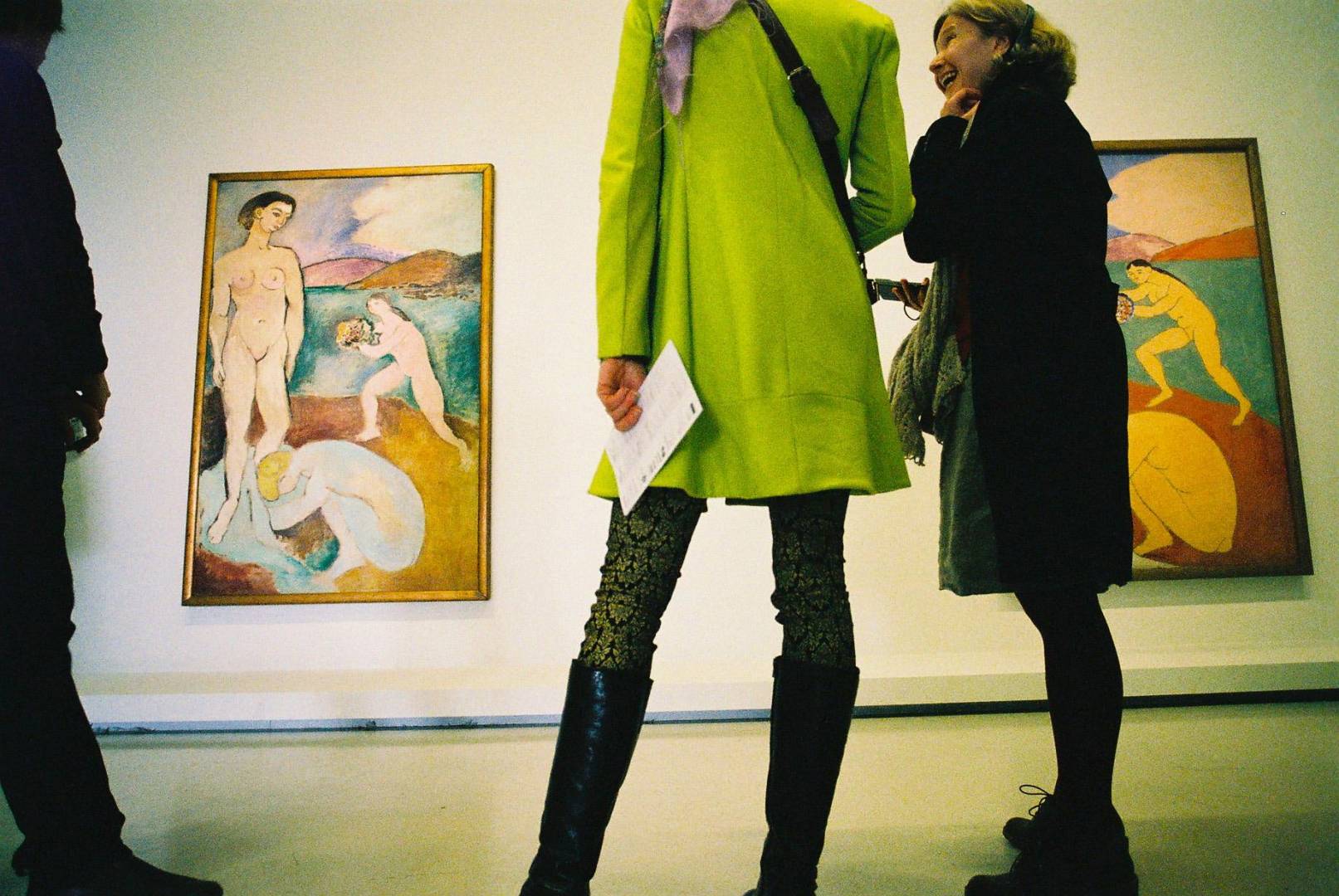
This is (obviously?) Paris: it’s Matisse’s “Luxe” bathers in the Centre Pompidou, but with a wry comment, apparently, from one visitor to another. The women in the painting are echoed by the women in the gallery. It’s a jolly jape.
I can’t tell you which lens it was, as this was taken on film, so there is no EXIF file. But, by the look of it, I’d say it was a 21mm lens.
Third bite
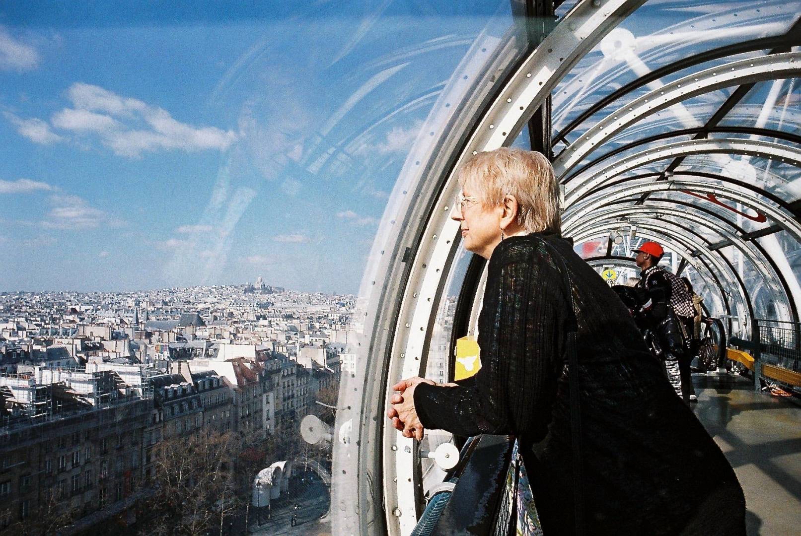
No EXIF on this, either, but I think it was taken with a 1950s or 1960s 50mm f/2. It’s in one of the perspex “tubes” — the famous external passageways — of the Centre Pompidou, and there, in the distance, is Montmartre on the left, and a reflected face in the sky, looking down on Paris. Half is inside, and half is out.
This, for me, encompasses the buildings of Paris, and Paris as a city of Art.
Fourth bite
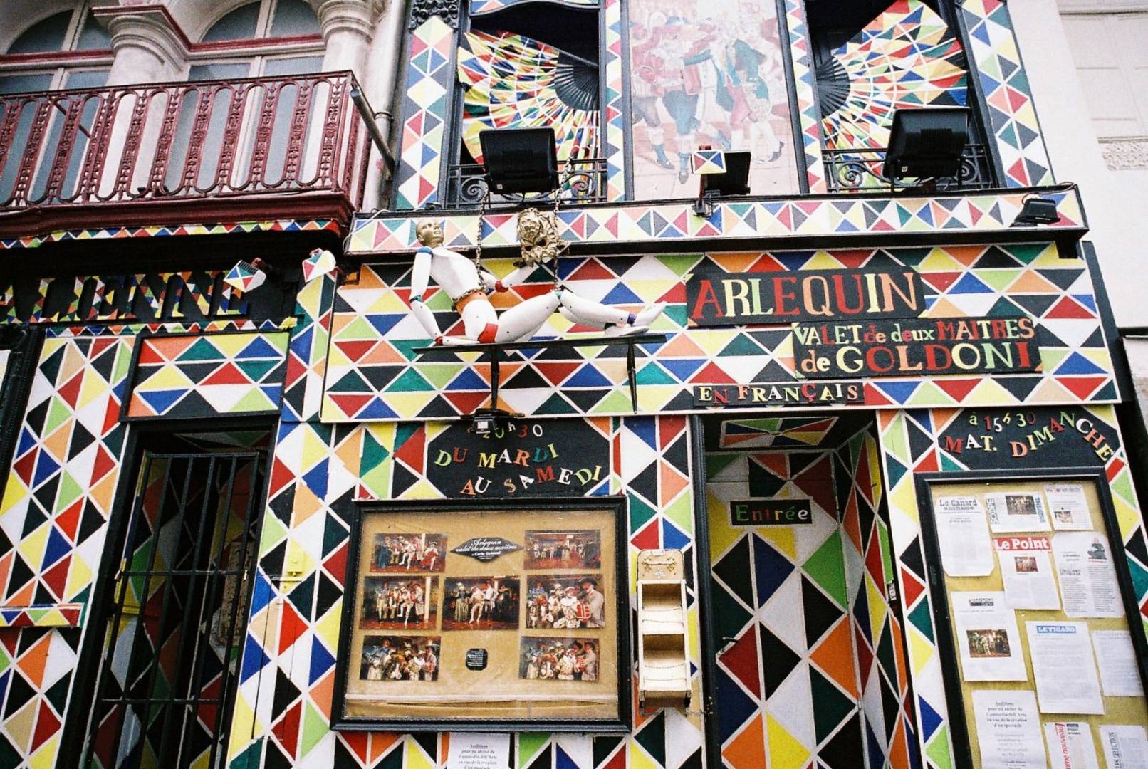
A street: Harlequin Theatre. This was shot on film, too (‘Lomography’ repackaged 800 ISO Kodak?) and, though I like the vivid colours which I get from digital cameras, I haven’t boosted the saturation in this straight scan from a developing lab which put the photo onto a CD. This is just how it came back from the lab.
If I’d scanned it myself I’d probably have boosted the colours a bit and boosted the definition (in iPhoto) to sharpen up the edges of all those triangles. But I’ve restrained myself a bit, and just kept the photo as it came back from its developing and scanning. I think it gives the feel of the place as I was passing by.
Fifth bite
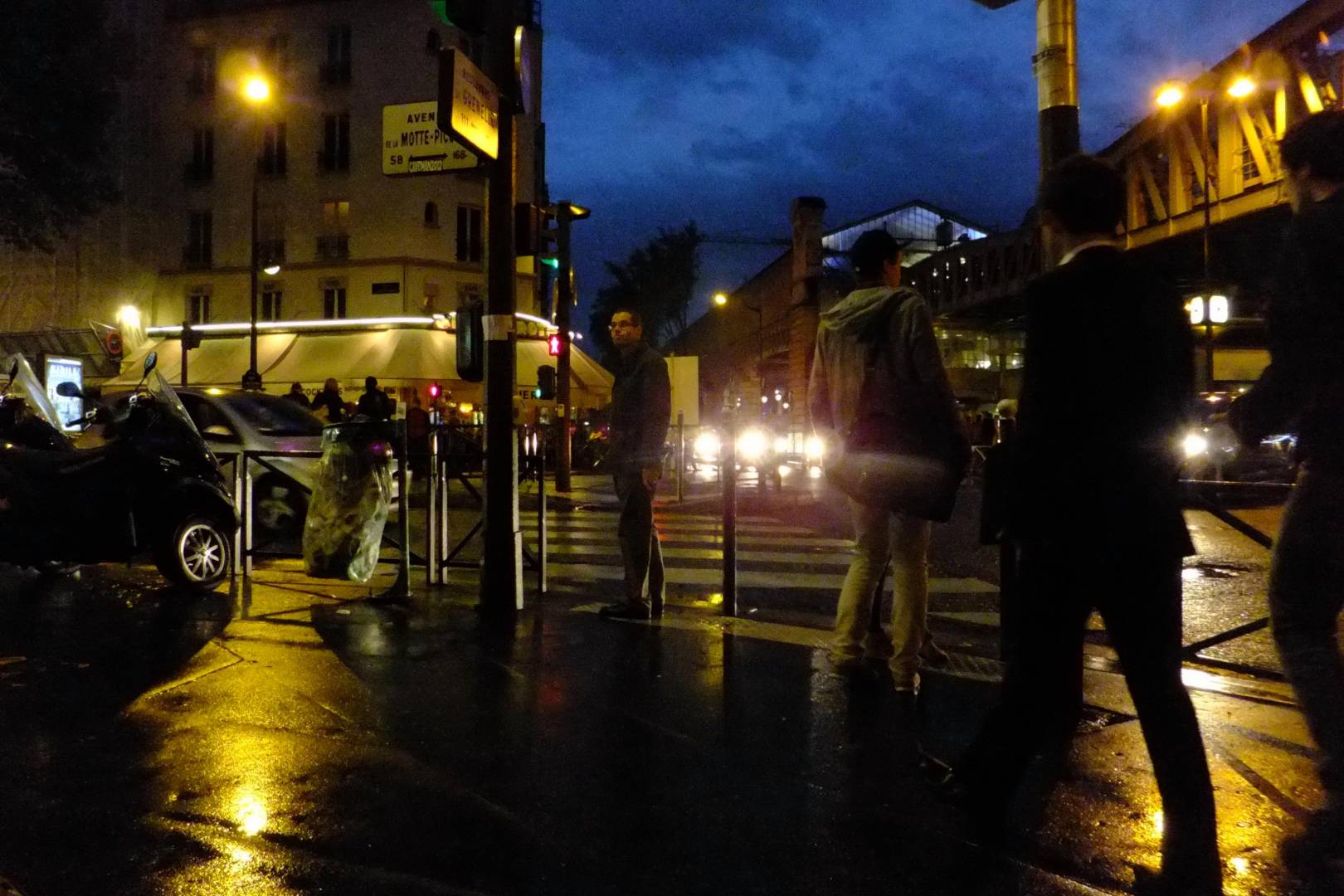
Ah! This “moody” shot is “our” street corner. This is where we sit during the day, although this is obviously at night, and it’s been raining. There’s the Metro station up in the sky (not underground) and the rigid horizontals and verticals contrast with the more ‘organic’ shapes of the passers-by, the blurry lights. And I seem to have a thing about zebra crossings; in New Zealand, in New York, in Tokyo (naturally) and here in Paris.
Sixth bite
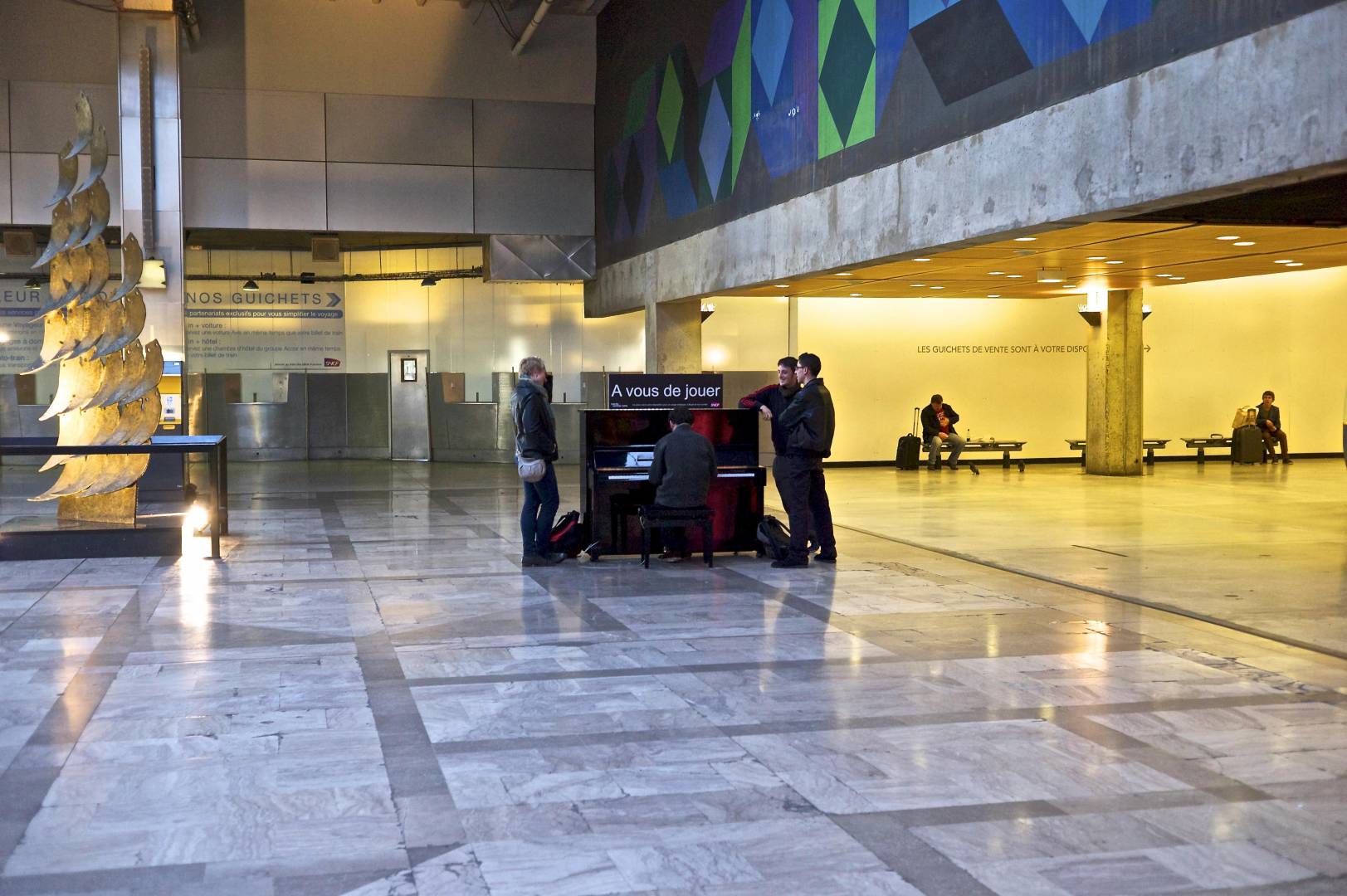
Montparnasse train station: you’d expect it to be crowded and busy, but here it’s calm, pretty much deserted, gently colourful, and not looking like a train station at all. But still there’s Art; painted, musical, sculpted, a mosaic floor; a piano for any passer-by to play. It’s shapes, it’s colours, and it’s just a few people.
Seventh bite
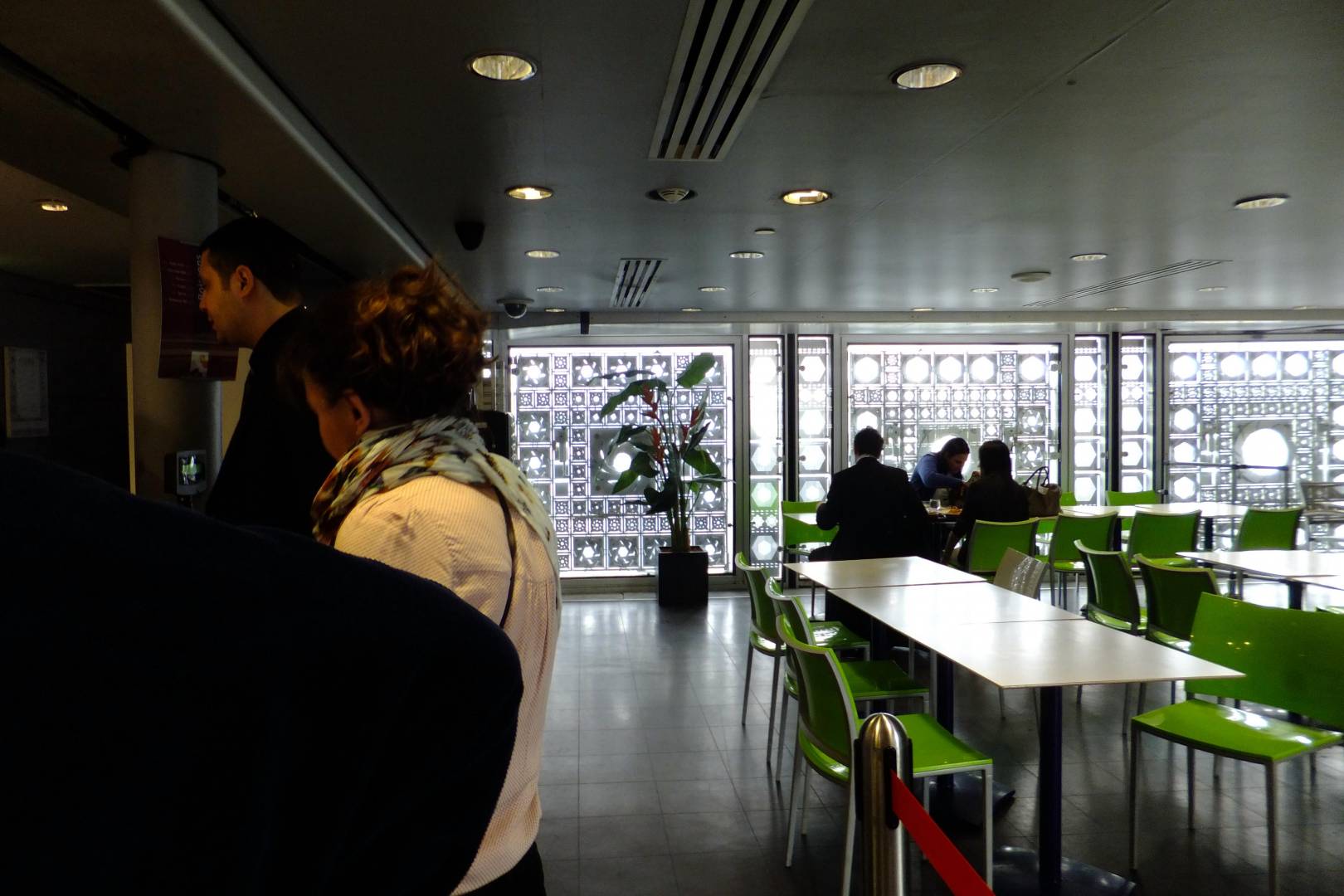
L’Institut du monde arabe: people buying food at a buffet and eating it. A gallery café. The shapes in the distance in the windows are mechanical irises which open and close to let in more or less light. The Art is in the mechanical intricacies of the metal irises, as there shouldn’t be any copies of the human form, as I understand it, in Arabic art, the art is in metalwork, in lettering, in abstract depiction.
There is no similar building in London, so this — for me — epitomises Paris.
Eighth bite
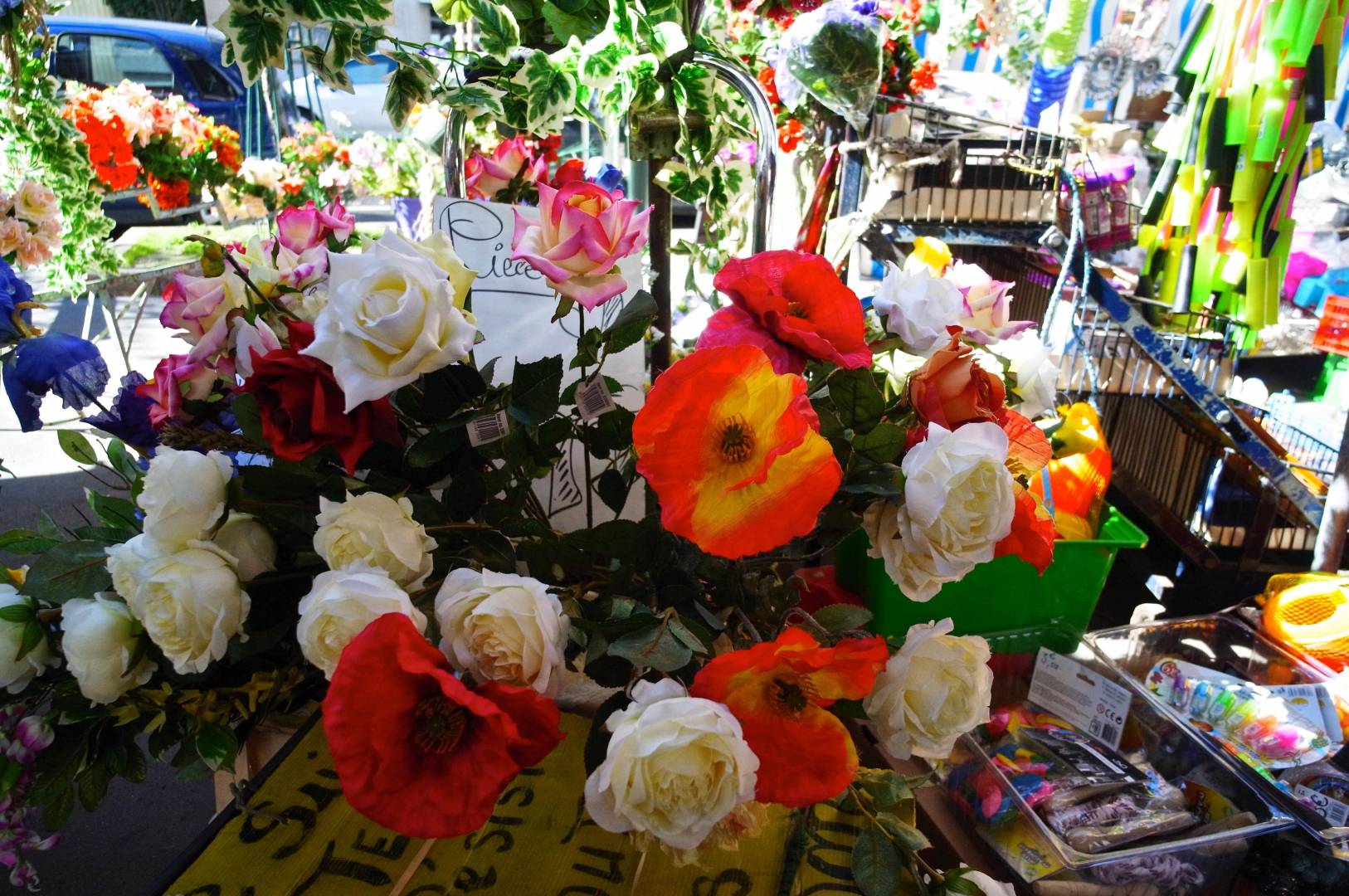
Flowers in a Parisian street market. Nice and vivid; just how I like them! The reds aren’t overblown though; must be a decent camera!
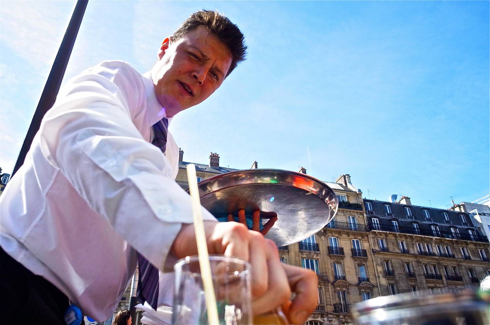
Ninth drink
Same camera. For anyone who’s ever been there, that’s Paris. It’s obviously a pavement café — although you can see neither café nor the pavement — and the waiter has just brought me an Orangina.
Tenth bite
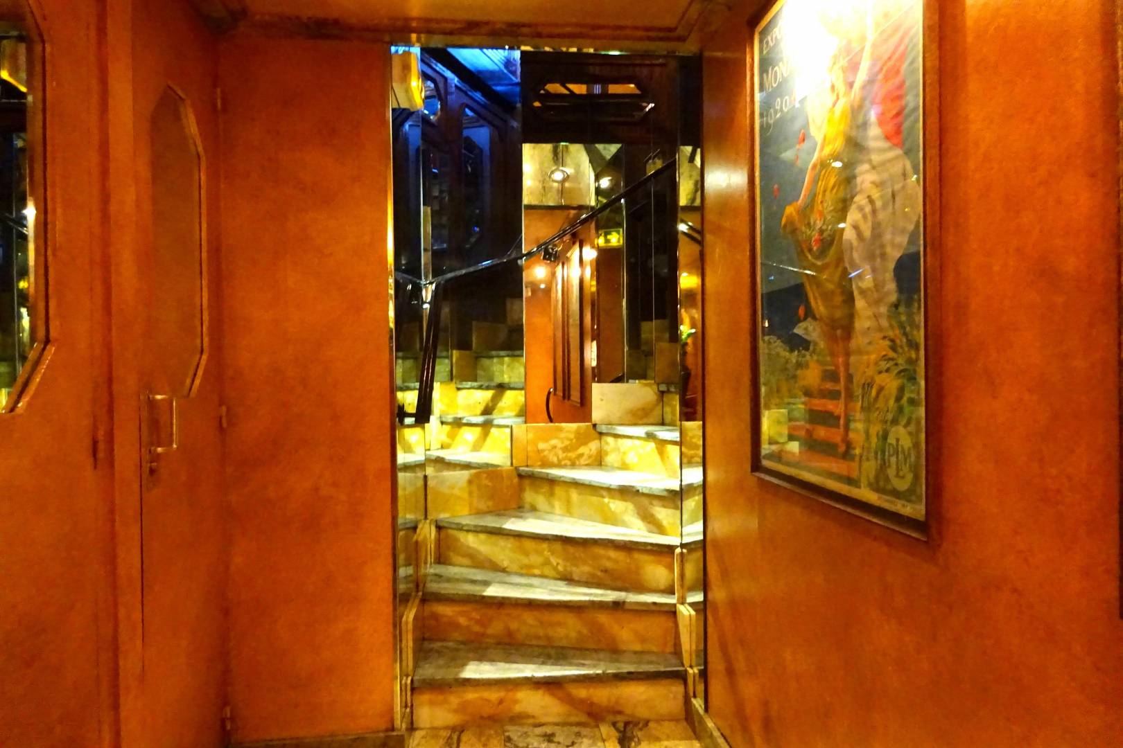
I love a view like this! And I have many more of the same kind of thing. It is, of course, the steps down to the gents (and the ladies) but with an intricate view of…. you can’t tell what, because the steps are lined with mirrors. It’s a riot of colour and shapes. It isn’t a picture “of” something (a staircase, for example) but it’s just, instead, a mixture of shapes and colours smacking you in the face: it’s colours and shapes just for their own sake!
It’s “Blam! Smash you in the eye!”
Eleventh bite
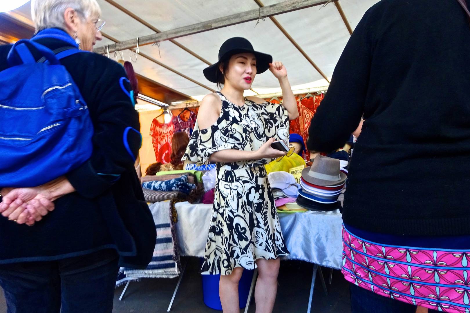
At a street market, a girl with a face like one of the inert dummies modelling the hats (deep in the background) and frozen in black and white amidst the colourscape. She’s trying one on for size.
It’s not a photo of her. I don’t know who she is, and I didn’t ask. It’s a photo, instead, of “contrasts”: of black and blue on the left and right, and of doll-like black and white in the centre. It’s a photo of hats!
It doesn’t matter who the people are: they are not the photo — it’s a photo of “this is what you do when choosing a hat in a market!”
Twelfth bite
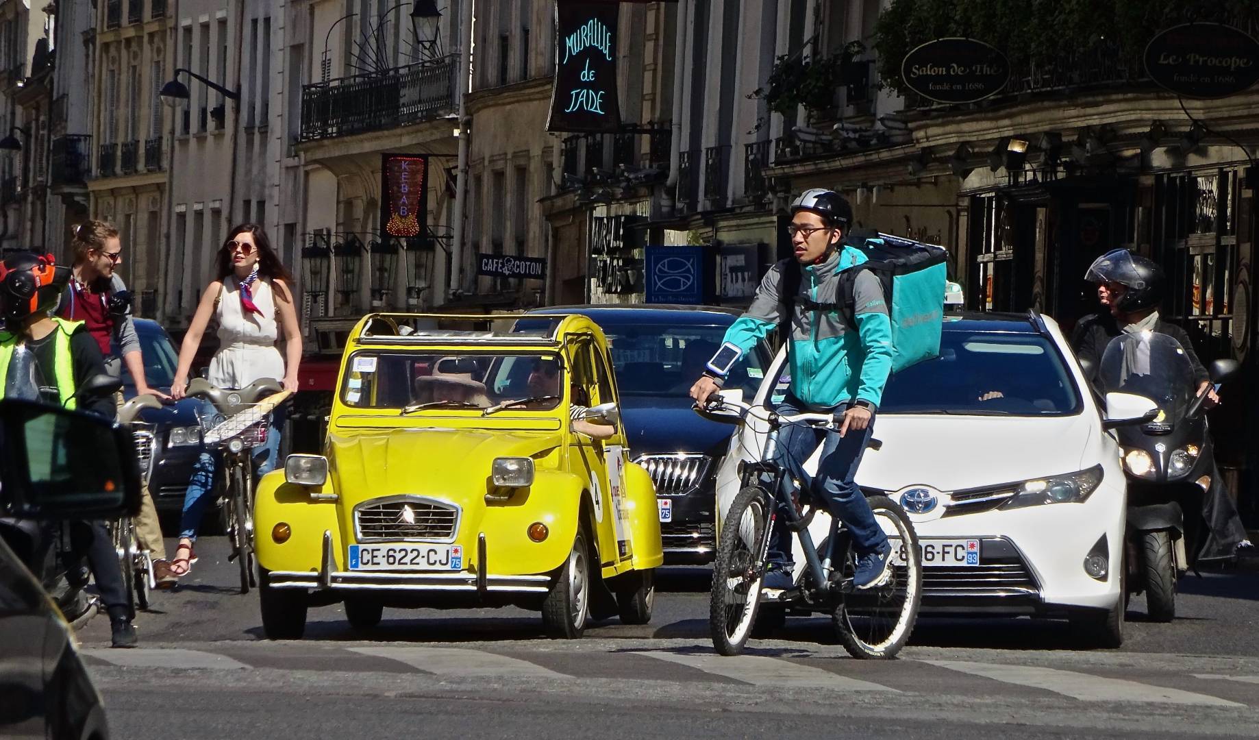
This is Paris traffic — and, oh, there’s another zebra crossing. This sums up Paris traffic as it used to be — choc-à-bloc with Citroën 2CVs, except that now there’s hardly one around, they’ve almost all gone to the breaker’s, so this is an evocation of what Paris used to be — the 2CV — but amidst modern traffic: a Deliveroo rider, modern bikes, modern cars.
And the traffic’s caught in a pool of sunlight, with the buildings taking a darker back seat.
Thirteenth bite
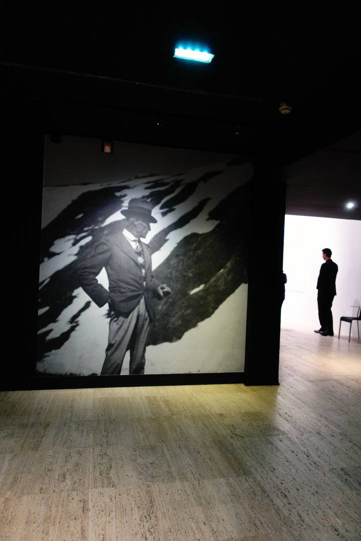
Art, again: a blown-up photo ‘clocking’ a gallery attendant. (I can’t even remember what the exhibition was, but this image just stuck with me.)
Fourteenth bite
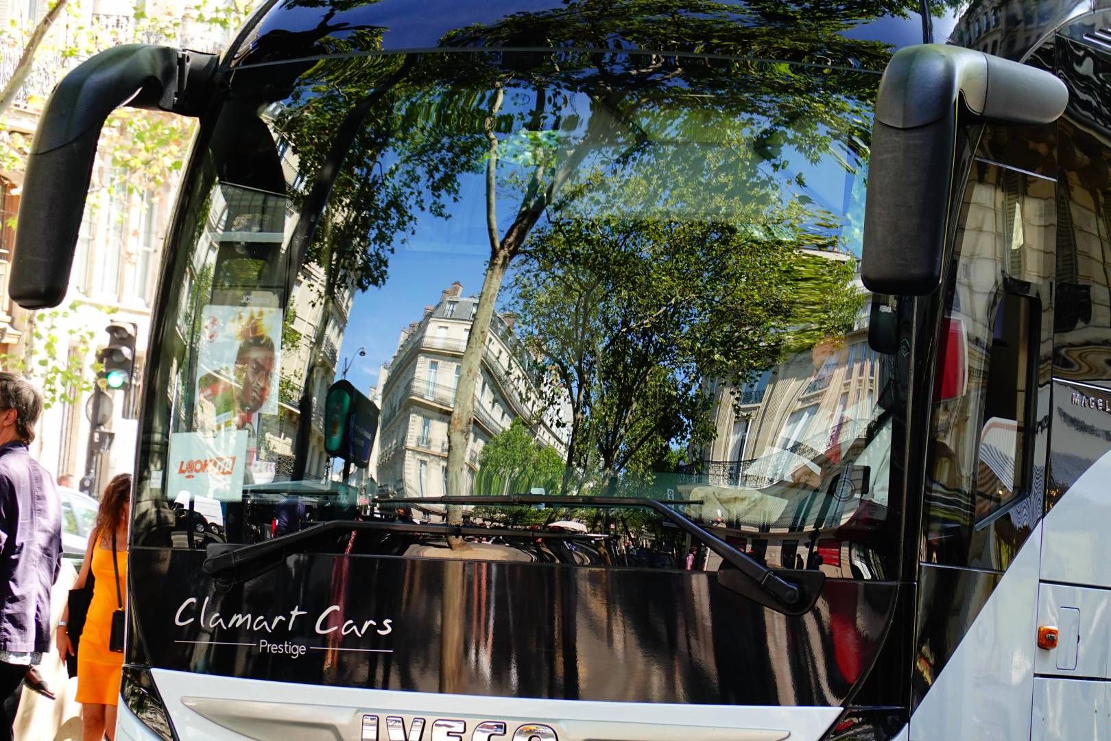
More Paris traffic, this time on the Champs Élysées. This sums up a good photo for me. In-yer-face, vivid colours, and “what-am-I-looking-at?”
That’s what Paris is: traffic, buildings, trees, passers-by, vivid movement, although I know there are parks, quiet side streets, the river, quiet churches, silent monuments, boats, dark cafés and more. Maybe I’ll cover this in another instalment sometime.
But I tend not to take pictures of quiet moments — people silently reading on park benches — unless there’s something especially ‘quirky’ about the situation. These photos aren’t of memorable landmarks, and they’re perhaps of the more touristy parts of Paris, rather than the tenements at, say, Boulevard de Barbès, or somewhere up near the Moulin Rouge. But these are mainly <i>locals</i> at “our corner” and at street markets, and in the last picture below — and in all the rest of the photos — not actually tourists.
Fifteenth bite
Now I have — especially pour M. Perenet¹— occasionally taken a few black-and-white pictures, as a nod to Eugène Atget, Henri Cartier-Bresson, Robert Doisneau and the other ‘social documentary’ or ‘social realist’ French photographers of the early Leica years. There’s an extra one for Jean. I do like the fade-to-white background, which evokes, for me, the blue-sensitive film of those early years, on which the film, overloaded with blue light from the sky, revealed the distance as just a plain mass of empty white and which also looks — to me — like Lowry’s painted skies, and Utrillo’s. I like the road and pavement turning white, just like Lowry and Utrillo did it, too. (Of course, it was the film which went <i>black</i>, and it’s the positive prints which look white.)
Last bite
I think I’ve shown that my photos aren’t of fixed things. They’re not of ‘scenery’, or ‘the view’. They’re of ‘moments-which-epitomise’ a place and time. Pictures of things which happen. They evoke, for me, happenings, or places, or moments, and are not meant to be perfect photographic replicas of a place. They are photos — instead of — intangibles such as “exuberance”, “activity”, “juxtaposition”, “colourfulness”, “nostalgia”, “clutter”, “intensity” and, sometimes, “peace”. They are not pictures of the tangible things in front of the camera, so much as wisps of thought and whimsy, as snapped by a dreamcatcher.
That’s why I use a camera — to record the intangibles of life — which you just can’t quite put your finger on.
Hi David, I am late to the party. Somehow I missed your post. This is a fascinating post: images and information.
I fully identify with your approach of “I choose a lens before…”. I prefer prime lens but if I use a zoom I pick my focal length and then use my feet.
Your concept of bites is so creative and appropriate. I found your bites gave me a wonderful experience of Paris that the iconic images generally do not.
My favourite image is the striking 2nd bite. It is gorgeous on so many levels and cropped perfectly to add mystery.
The 13th bite is fascinating. I think it looks like the man on the left is watching the man on the right pee. As a suggestion, personally I think the image would be even stronger if cropped square or horizontal to remove the upper light.
Thanks again for a real treat!
David, I just discovered your images while turning on my computer around midday today. These are wonderful images and you have a great eye to capture everyday scenes. Thanks for the black and white image. By the way, I’m not a black and white fundamentalist, most of my shots are colour ones which I sometimes turn to B&W or have an assigned fn button for it which makes it quick to make a B&W copy. The colours you captured are truly wonderful. Reading your article and John’s article on Cambodia in colour has set me thinking that I should invest in something wider than my 28mm and a bit longer than 47mm though I like the fields of view it renders. Your images also remind me of my student days in Paris some 40 years ago and long walks I took then with my camera of the time, a minolta srt 100X with 45 mm lens and street shooting I did at the time though I was really far from your mastery of camera at the time. Thanks for sharing that wonderful set of images.
Dear Jean ..you’re welcome ..glad you liked them. So you’re not “..a black and white fundamentalist..” – phew! But I hoped you liked the photo, just the same!
“..I should invest in something wider than my 28mm and a bit longer than 47mm..” ..mmm, I’d say start with a 24mm, and maybe progress to a 21mm – that’s for the wide end. For longer than 47mm, I’d start with a 75mm, and see how that suits you ..maybe all that you need. Then you’ll get to see the differences between them.
Ooops ..running out of battery now ..à tout à l’heure.. (or in English, toodle-oo!)
Thanks David for the advice. I did have a 21mm with my contax g1 but I found difficult to use and you had to be very thoughtful about composition, foreground and background. I guess 24 or 25 mm would be a nice addition to my camera gear with a75mm but now need to ponder which brand to choose. I know I will invest in a FF camera when I retire, so making some research to find what would suit me.
Mmm. With a G1 you’re a bit ‘disconnected’ from what the lens sees by that awkward tunnel-like viewfinder.
(If you still have the lens, there are adaptors – both manual and ‘Techart’-brand autofocus – to use it on a full-frame Sony A7xx MkII camera ..on which it’s magnificent!)
Er, thank you, Stephen. (..er, what do you put in your morning cocoa?..)
I don’t think there’s been a ‘spat’, but just two Davids putting forward their own points of view. And why not?
I don’t quite know who “..the Serbian chap..” is ..that’s a bit too elliptical for me. But you’re right about these being just “snapshots” ..that’s exactly what they are. Just a little instant glimpse of this, and a little instant glimpse of that.
Hmm, Saul Leiter, huh? ..Well, I think I prefer that than to be – who’s the man with the intentionally mundane photographs? ..William Eggleston. At least there’s a bit of joie de vivre in mine, I think!
Cheers,
– David.
Sorry David I suffer from vagueness sometimes, perhaps I imagine that other people’s memory is as avaricious as mine, so I say things as if everyone else (of course) knows what or who I am talking about…
This time…
Dragan Novakovic. my apologies to yourself and Mr. Novakovic, if he is reading?
From elsewhere here: https://www.macfilos.com/2018/01/03/2017-12-29-northern-england-in-the-1960s-and-1970s/
Oh and in the end, the London shots that I singled out, are on his website rather than here after all…
… so much for my amazing memory. 🙂
Ah, yes; Dragan’s ‘Noorthern’ black and white shots ..so evocative of the fifties and early sixties ..or of what people think of, or what people envisage, as the fifties and early sixties. Like Mike Evans, I lived there ..and – believe me – although there were those long terraces of soot-black back-to-back garden-less two-up-two-downs on cobbled streets with cobbled back alleyways – like in the old titles to Coronation Street – the world wasn’t black-and-white.
Photographers used black-&-white ..often because other photographers used black-&-white.. mainly because, I think, black-&-white was how film had started out, so there was this idea that b&w was more “authentic” somehow, and more fitting for “Northern gritty realism”. But northern painters didn’t use black-&-white: Lowry’s mills and factories aren’t black and white .. because PAINT had been available for hundreds of years – in colour! There wasn’t really a precedent for using black-&-white paint, so painters didn’t use it.
It’s just been a convention that “gritty realist” photographers use black and white, and black-&-white has always been more accessible, cheaper to use, than colour. So the cheaper b-&-w has been used to show “poverty”, “deprivation”, “degradation” and so on. Dorothea Lange’s ‘Migrant Mother’ was shot in black-and-white ..but newspapers, and many magazines in those days, didn’t print in colour ..so ‘reportage’ was in b-&-w. So it became conventional to this that black-&-white conveyed “truth”. That’s where it’s “authenticity” tag emerged as well, I think ..because “professionals use black-&-white”.
British films – most of them, in my childhood, in Manchester – were black and white ..whereas most American films were in (the more expensive and expansive) colour. And when TV began, it was also in black-&-white. But the WORLD itself was never black-&-white (..except for the cars, and except that Manchester was covered in soot, and so most of its buildings did look completely black).
But suddenly, in the late fifties and the early sixties, cars were offered in colours, the buildings began to be cleaned, the new 1956 ‘smokeless zones’ prevented more soot from landing everywhere, and the clothes – in Carnaby Street and the King’s Road in London – began to burst into colour, and colour blossomed everywhere. And we got the ‘Swinging Sixties’.
I love Dragan’s pictures of “oop North”. But that black-&-white “drear” was what those photographers, like Bill Brandt, wanted to convey. Or they wanted to make dark abstractions out of black-&-white patterns. It wasn’t until John Bulmer https://tinyurl.com/s5fbwkv showed photos of the “dreary North” in colour in the Sunday Times that many people “down south” began to realise that the North wasn’t all grimy black-&-white, like it was in ‘Saturday Night & Sunday Morning’, and ‘The Loneliness of the Long Distance Runner’, and ‘A Kind of Loving’, and all those other “gritty” Northern films with Albert Finney and Tom Courtenay and Billie Whitelaw. Or ‘Coronation Street’.
Black and white has always been a lie. An enticing lie, an artistic lie, but always a lie. It’s been an ‘impression’, a ‘suggestion’, an ‘interpretation’ ..but it’s never been the truth.
Look at the difference between the Paris in black-&-white of, say ‘Cleo from 5 to 7’ (made in 1962) with its “gritty realism” – and with an episode of fantasy – compared with the colourful Paris of ‘The Red Balloon’ (1956) – which is realism, sadness and also fantasy. Paris itself has never actually been black and white ..it’s the film-makers’ interpretations, or economic constraints, which have shown Paris as black-and-white, or left it in colour.
So Dragan’s photos are marvellously evocative, but I remember Whalley, for example (where my Auntie Mildred lived) as a riot of colour: vivid green grass, startlingly blue sky, warm brown stone, bright red buses, and not as grimy, dull, and black-and-white. (There’s a giveaway in Dragan’s photo of a man walking in Whalley at the end of his excellent photos on that Macfilos page which you linked to (above) ..there’s a yellow line at the edge of the road along which the man’s walking ..but, of course, it isn’t bright, or even dull, yellow in the photo: it’s dull and grimy grey.)
Note, too, that in all but one of Dragan’s photos, there is no smoke coming out of any of the numerous tall, dark chimneys ..the chimneys evoke “grimy Northern poverty”, but much of the grime had already gone by the 60s and the 70s. The green grass, though, looks as “black and grimy” as the chimneys. But, of course, it isn’t – and never was.
So I do like Dragan’s ‘atmospheric’ photos on Macfilos, and all the rest of those excellent, wonderful, evocative, ‘documentarian’ photos on his own website, and they are accurate in their shapes and their textures ..but they are not the truth. Everywhere has been manipulated to convey ‘bleakness’ rather than reality. Life is actually in colour. Just look at any flower.
David, with the exception of the Serbian chap, that is quite possibly my favourite piece published so far in Mike’s illustrious organ, and yes I remember his editorial approach, one suddenly feels out of one’s depth, well I did anyway, and yes and I do recall that the author has a similar background. I was impressed by him somewhat because the London places that he snapped were somewhat familiar.
I liked the comments and the little spat at the end.
I am a person given to obsessing on little things for a while and then forgetting them, but I think this is the sort of work that I was trying to describe when I started meditating on the word “snapshot” a couple of years back. I was not being demeaning, it was my genuine feeling that such snapshottery does give a great general impression about a place, and as the writer suggests, all set off with bold colours and daring composition.
If it begins to emulate any famous work, in as much as any two artists work ever does, it would perhaps chime a bit with the “early color” output of Mr. Leiter.
As I was reading your lines on “sight seeing photography”, I remember being really disappointed by something that I had known of for years, but when I saw it, I preferred the next door street booth with the yellow kodak advert more.
Yes, Bob Dylan has a song about the continual attempts that one makes to try to keep up to ones own standards, it is called “When I paint my Masterpiece” he wrote it for his backing group and there is no official studio recording. However, it has become a tradition, that he “apparently” tunelessly knocks out yet another version of the song, a pastiche of it even, and it is pure snapshottery, utterly sublime.
There is a line in that song where he visualises looking at the “Spanish Steps” on a cold winter night in Rome, in amongst the Roman rubble.
And then I saw them at Christmas two years ago, absolutely covered in tourists pointing cameras and munching on burgers…. Yuk.
Excellent piece David (and Mike), thanks.
Wow! ..Well thank YOU, David.
“..The thirteenth bite is also very good just needs making fully mono as the floor colour is a little distracting in my opinion..” ooh, er, well I like the ‘relief’ of a little colour in the floor (..like Jono’s photos OF – rather than with – the M10-Monochrom). But each to her or his own: my colour vision’s not too good – that’s why I like BRIGHT colours, I think! – so I enjoy the coloured floor leading up to the pretty-much monochrome ‘content’ of the photo ..the huge picture looking down on the ‘smaller’ attendant.
Oddly enough, re: “..the eleventh bite..”, I found I’ve got an almost identical photo from Japan: a girl in a black-&-white “crossword”-pattern coat, just caught between multi-coloured passers-by in a Tokyo tube station. Maybe something just catches my eye about black-&-white within a colour ‘arena’.
– Yours, David.
David B. First let me say that I fully respect your liking for the coloured floor in this otherwise near monochrome image. Your opinion is valid and it is certainly an excellent image as it stands. So far so good.
I think we can also agree that the floor is NOT the subject of the image. The subject is the relationship between the larger person in the image and the smaller real attendant, both of which are in (near) mono.
All I am saying is that in my opinion if you have an object (the floor) which is NOT the subject of the image and it is in colour (however muted) then the eye is inevitably drawn to that coloured object. Even if this is only ever so minor a pull it distracts that portion of attention away from the real subjects of the image which are the people.
For this reason, I would prefer this image to be made completely mono in which case the floor will adopt its proper minor position in the visual scheme of things. Thats just my opinion.
Can I stress that I love colour images as per my comments on some of the other images in the article. I take mostly in colour as well but I do think there are some images which are stronger in mono and that this is one of them.
Best wishes
Each to their own, dear David.
To my eyes, though ..well, I’ll explain: up at the top of the picture there’s a little blue “bleed” (..at least, it looks blue to me..) from the Emergency Exit light – the glow at the very top. I like the complementary (or ‘opposite’) yellowish colour of the floor.
To my eyes, those two colours vertically “book-end” the monotone look of the centre of the photo. The yellowish floor colour almost goes to white near the standing attendant, and the blue-ish “bleed” goes to white in that Emergency lamp.
I don’t subscribe to the “taking-them-by-the-hand” idea ..that one should clearly show, to a person who’s looking at the photo, what they’re “supposed” to be looking at, for example by its being “..made completely mono in which case the floor will adopt its proper minor position in the visual scheme of things”. I want people to LOOK, for themselves, not to be shown. As I mentioned in a bit of the text, under the picture of the bus: ‘..This sums up a good photo for me. In-yer-face, vivid colours, and “what-am-I-looking-at?”’
I want people to look all around a photo and discover its things for themselves (..though I did cheat a bit by mentioning the tripod in that first photo). I want a picture to be a bit of an adventure! ..”Why did he take this? ..What am I looking at? ..What’s the purpose of this photo? ..What on earth is my response to this? ..This is drivel and rubbish!” ..and so on.
For me – maybe not for anyone else .. but then my colour vision isn’t 20/20 – there’s colour in the face of the big man with the hat in that photo. So I really don’t want it to be completely black-&-white. That’d make it too ‘simplistic’ for me ..overstating the obvious. I do want to give a feel of that gallery, with its polished, ‘glowing’ wooden floor, and the black blankness of the wall around the big photo. But, of course, feel free to enjoy it, or deride it, or take a copy of it and make it black-&-white for your own enjoyment!
(I’m not so interested in ‘formulas’ for photos ..put this here, make this misty photo monochrome, make sure you do it like Ansel/Beaton/Moriyama/Bailey (the other one) or like members of the RPS do it. I don’t want to make my photos look like other people’s – except that last one ..just for fun! – or to go by other people’s rules: I remember long ago on the radio – or was it TV? – Jimmy Savile being asked “how d’you keep up with all these new trends?” and, of course, he replied “I don’t keep up with trends; I set them”.
I do LIKE many other photographers’ pictures; M. Lartigue’s, Mike Abrahams’, Jay Maisel’s, Sergio Larrain’s, for example ..but I don’t want to take their photographs ..the photos which they took; I’m taking David Babsky’s photos.)
All best wishes,
– David.
What a joy to read your perceptive article about why you take photographs and to enjoy a stroll around “your” Paris. We all love the city but your eye is good and you have captured much more of the essential Parisian sparkle than if you had given us stock images of the Eiffel Tower and other landmarks.
Your images are very good. As with food generally, “the first bite is with the eye” and your images certainly look/taste great, if that isn’t a mixed metaphor!
I love the second bite and the echoing of people and painting. High marks for that one.The ninth drink is also brilliant for excluding everything non essential.What a crazy angle but it works as the very prominent hand takes our eye up his arm to his face.The tenth bite is pure Klimt, love it. In the eleventh bite, I very much like the triangle composition of her arms, hat and face as well as the two onlookers who effectively focus the view on her. The thirteenth bite is also very good just needs making fully mono as the floor colour is a little distracting in my opinion. Well done in Fourteenth bite for capturing Parisian elegance and glamour in a bus windscreen. Finally, I really like the fifteenth bite, a super mono with more photographic and artistic references. In short Iadmire all your images David, a treat, thank you.
Thanks for this David, a most enjoyable read. I liked your approach to illustrating the city which brought to mind a Parisian ‘taster menu’ of flavourful pieces which whetted my appetite and left me wanting to explore the concepts further.
Mike’s idea of the “bites”, Kevin. But now you’ve mentioned it ..I’m getting hungry for more, too!
I love this bites sized more random tour of Paris without the usual familiar tourist shots. And for me this is why I love to be out on the streets, as its real people, in real scenarios, just living a real life – what more could we all ask for. I wouldn’t want to name a favourite bite, more because each bite has a little something that is of unique interest, or character.
Thank you for sharing David, it is a unique journey of unique people. Not sure how you managed to convince Suggs from Madness to serve your Orangina though.
Dave
Oh, it was madness, Dave! (..But you can see why I use a wide-angle; I could never have cought Suggs without that super-wide in my lap!)
It was Michael who’s used the idea of these fifteen “bites” (..or bites and a sip). He’s the editor, so he gets to choose what to call things.
[Incidentally, Mike’s constructed things so that you get a super-LARGE copy of every photo if you right-click (on a PC) or Ctrl-Click (on a Mac) on any of them – or just an ordinary click for somewhat larger.]
Whoops, no; that’s Cmd-Click on a Mac for a super-big version!
I’m not so sure I “constructed things” because it was pure chance. And it was you, David, who discovered how to make even bigger images. For anyone interested, it used to be possible to set what is called the Lightbox to enlarge any photograph. However, a couple of months ago the Newsmag Theme, which we use for Macfilos, was updated and the ability to link to the Lightbox was lost. Except, that is, in the case of galleries containing more than one image. Then, again by chance, I discovered that I can designate even single images as a gallery and thus link to the Lightbox plugin. A quirk of doing this, though, is that the caption (if present) appears in contrast at the bottom of the picture rather than below. I rather like this, however, so I am using it more.
As for the bites, yes, that was my idea instead of Photo One, etc. As all contributors will know, I get involved in the spirit of things and look for opportunities to improve and iron out any inconsistencies in any article.
I would say to anyone who has a story to tell but might be unsure how to do it, give me the bones and I’ll make sure it looks good and provides a good framework for your pictures. Don’t be afraid to submit an article!
I’ll vouch for the final paragraph – Mike can take the pure skeleton of amoeba, and turns it in to a living, breathing horse.
For other readers, I am working on an another amoeba, and hoping Mike can reinvent Dinosaurs from it. 🙂
I am growing to enjoy the super wide world in some circumstances – yes the 14-24 is bearing a few low hanging fruit of images now, more so as I learn to understand its nuances.
A great set of images to enjoy, as well as study your use of composition and perspective.
Your second and thirteenth bites especially grabbed me. Very thoughtfully structured.
I’d paraphrase your last sentence to read “whimsical wisps of thoughtfulness, captured by a dream catcher”.
Thanks for the showing.
Thanks for looking, Wayne! You can see why I like a camera (..or a film..) which can take pictures indoors, in low light, not just in bright sunlight outdoors. (Unless we’re farmers, or professional rock-climbers, or railway engineers, or we work on building sites, most of our lives are spent indoors, driving a desk, so why are so many of our photos taken OUTdoors? ..I think it must be a sub-conscious hold-over from the olden days when there was sufficient light for photos only outdoors. And that’s what we’ve seen in so many others’ photos, so that’s what we usually take ourselves.)
But six of these fifteen were taken indoors.
I think you are right. There are so many images of the Eiffel Tower etc on the net it would be difficult to say anything new about the subject. Your candid shots give insight into life in Paris.
My son took a marvellous picture of the Tower when he was about twelve: just looking straight up between the girders from the centre beneath!
Marvelous images that capture the energy of Paris. The tool employed is of no concern to me, the images are more than enough!
Well there we are; that’s why I didn’t mention which was taken with which!
Nice Ameuse Bouche!
Merci, m’sieur!
Really nice set – thank you!
I, too, find myself choosing a lens for a particular mood I may be in, and then the camera on which to use it. Keeps things interesting for me, and probably confusing for anyone else trying to find a stylistic center to my photos. Oh well…
I consider myself to be a “landscape” photographer, although much of what I photograph is in cities. I enjoy trying to capture the “lay of the land”, as it were.
A “cityscape” photographer, then!
I think your bites are the pleasant memories of place and time you can not replace..fantastic. Especially like your nod to Jean, but next time you need add Ricoh GRD4 in high b/w contrast. Really enjoyed this article, thank you.
Okey-dokey, John: I’ve got a GRD4 here (..with the extra-wide-angle attachment, of course!..) but when I set it to high b/w contrast the pictures still come out in colour ..or at least that’s how they look to me! (Though I’m not that much a fan of indiscriminate high b/w contrast, like Daido Moriyama’s photos ..but each to our own, I suppose..) ..Thanks for your comment!