

It’s not every day you get the chance of a private guided tour of a museum’s “back office” conducted by both the director and the assistant director. That happened to me this week when my friends at the 700-year-old Worshipful Company of Glaziers and Painters of Glass invited me to an outing at the London Transport Museum’s storage facility in west London.
Known as “The Depot”, this huge facility, opposite Acton Town station, holds thousands of items that cannot be squeezed into the limited space of the public museum in central London, right in the heart of Theatreland. They comprise what might be called a cornucopia of delights. Unfortunately, the depot isn’t generally open to the public except on special days throughout the year.

Some years ago I went there on one of the occasional public open days, but it was crowded and rather uncomfortable. And, more importantly, I didn’t get to see the private rooms bursting with posters, station tiles and general bric-à-brac.
Secret rooms


Thanks to my friend Phil Fortey, who is this Master of the Glaziers for 2022, I got to join a handful of glass gurus on a three-hour walk through some of the depot’s normally private rooms. We examined original route maps from the 19th Century, fondled precious station tiles first mounted in 1890 and enjoyed an exhibition of Underground art dating back to the beginning of the last century.
We were privileged to be shown around personally by Sam Mullins, director of the London Transport Museum, and his assistant Chris Wix. Chris is a specialist in station tiles and showed us how glazing and colours had changed over the decades. He knew precisely from which stations the tiles had been rescued, and he explained how difficult it was to remove Victorian tiles without damage because of a unique keying system on the back of the tile. Any attempt to prise it off the wall would cause the tile to break. We were amazed to see the number of different tiles, with some specific to individual stations or locations — such as the Sherlock Holmes tiles from the old Baker Street station.
London Transport poster art


Over 5,000 iconic London Transport posters from the 20th century are housed in a private room, access through a working office and decidedly non-public. We had the run of the place as Chris Mullins explained that hundreds of artists, some of world-renown, had been commissioned over the years to produce a series of posters that came to define the London Undergound in particular. Most had been intended for use over just days or, at most, weeks, and had been printed on lighter paper which needs great care. From wartime exhortations to calls to the countryside, from safety advice to event publicity, these posters are part of every Londoner’s life.


Chris picked up a 1908 poster featuring Mr and Mrs Country Bumpkin and a generously proportioned policeman. The subject was one of the new (pre-Beck) system maps which were so easy to use that visitors no longer needed to ask a policeman for directions. The slogan, No Need to Ask a Policeman, is thought to refer to a popular theatre production of that name in 1908.
Just in case it’s needed
A place for everything and everything in its place: This is a supermarket of a very different time. Want an old Underground train motor? A set of signals? The odd cog or two? Everything you could desire is carefully curated at The Depot.


Route maps and branding
System maps are one of the great triumphs of the London transport system. Up to the early 1920s, the routes were superimposed on an ordinary map of the city. They were confusing and, as the system expanded, provided an increasingly inaccurate overall impression of distances and connections.
It was the great London Transport designer, Harry Beck, who came up with the idea of the schematic drawing with which we are now all so familiar.


Above: Chris Mullins highlights the original Harry Beck route map of the late 20s. Before this iconic design, routes were superimposed on standard maps with the result that they were difficult to follow and often misleading to passengers
But it was rejected initially by the management. Only in the late 20s did receive recognition and become an instant success. Beck’s design has been copied on almost all underground railway systems in cities throughout the world. The very latest edition was issued this week, with a purple streak across the middle to chart the route of the new Elizabeth Line.
The Johnston Type


Above: The original Johnston type cabinet from 1916. Johnston and New Johnston are used for signage throughout the system. In the bottom right photo, you can see some beautiful early-century lift headers from old stations before they were modernised
Another unique attribute of the London Underground is the Johnston typeface, developed in 1913. This was when Frank Pick commissioned calligrapher Edward Johnston to design a bespoke typeface for the Underground Group. The first version of his classic design was commissioned in 1916. An amended version, New Johnston, was produced for electronic use by Eichi Kona in 1980. It was again updated in the centenary year, 2016., and now incorporates some of the original flourishes, such as the distinctive diamond full-points and dots on i and j.
Johnston is used for all Underground signage. It perfectly complements the distinctive Underground crossed roundel trademark, bestowing the system with a coherent and instantly recognisable image.


The famous rounder with the crossbar was developed from an earlier design which had the station name mounted on a large solid red circle. The later design, with the outline circle, was developed specifically to draw the eye to the station name. It works, as we all know.
Everyone recognises the Underground brand, although the same logo (with different legend) is now used for all branches of London transport, from buses to the Overground, to Tramways, the Docklands Light Railway and the new Elizabeth Line (which is not part of the Underground network as I explained in my article on the Elizabeth Line earlier this week). It is arguably one of the strongest and most successful urban transport brandings in the world.
History in the raw
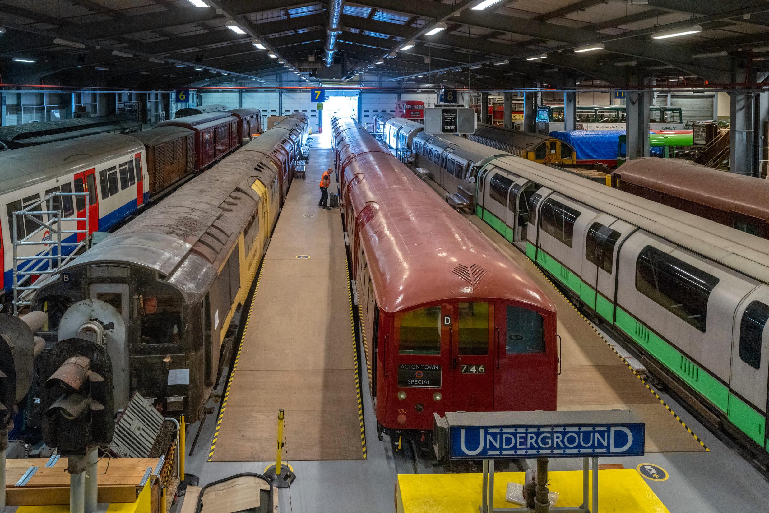
Out in the main depot lies a bewildering collection of larger objects, including complete trains, buses, trolley-buses and trams. There are spare motors, lamp posts, signalling equipment, station refreshment kiosks, telephone kiosks, platform seats, signs, and even the boardroom chairs. Racks contain yet more material which sadly remains unseen, although this is a working depot and not just for show. All this material is meticulously catalogued and is there just in case anyone ever needs it.


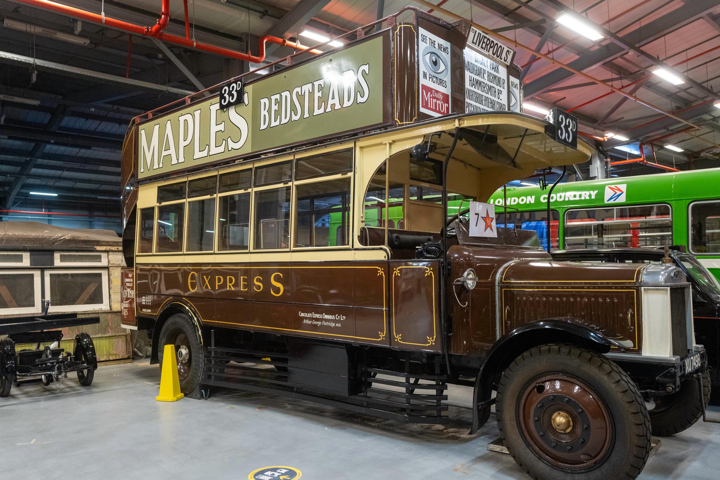
I’m a bit of a sucker for old buses and there are some fine examples here, including the mid-1920s Chocolate Express. This was one of the so-called “pirate” buses which took advantage of free-market regulations to muscle in on the routes of established companies such as London General. They’d overtake nippily and land at the next bus stop (with its penny-wielding customers) before the LG driver could react.

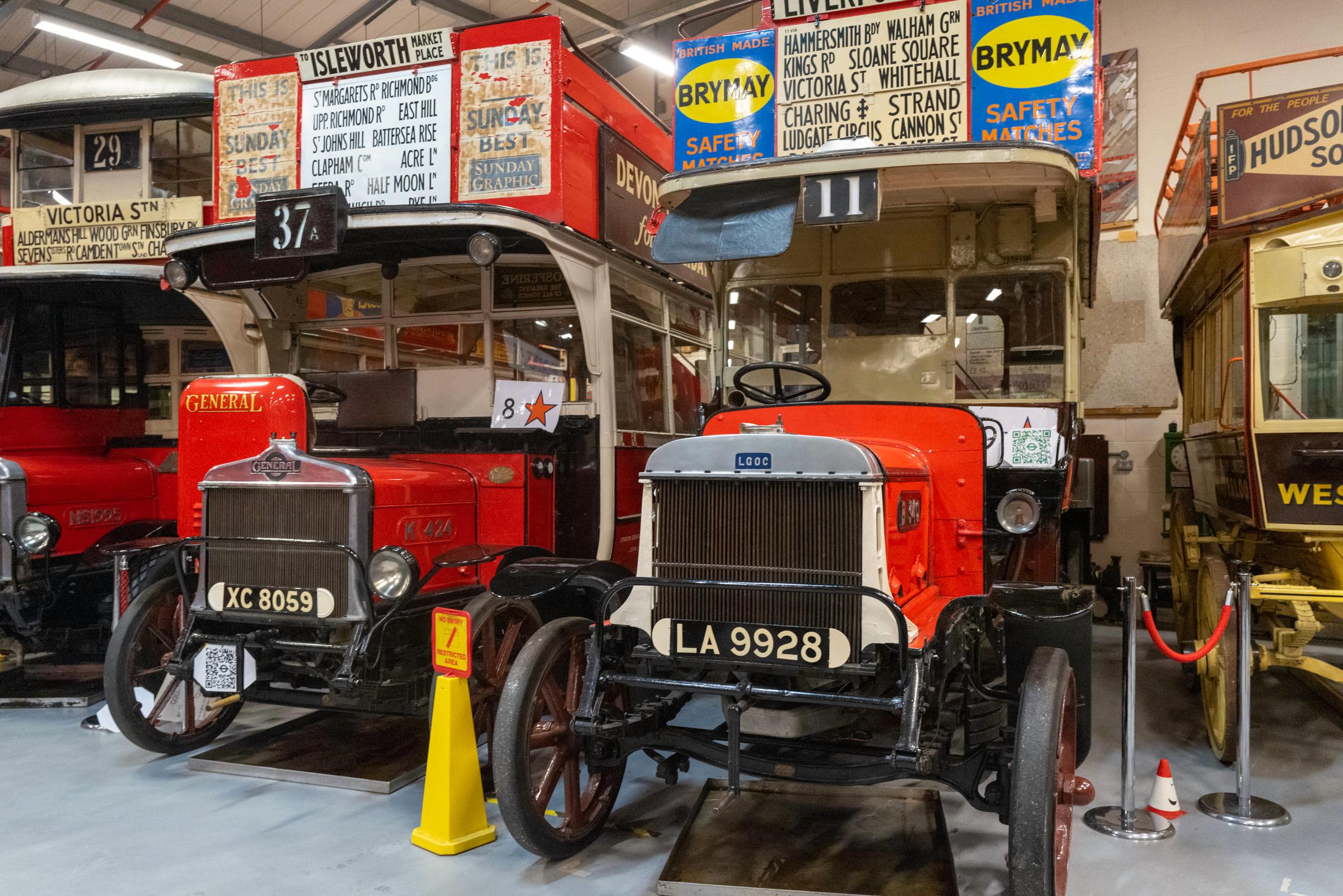


Above, left to right: Such teeth! An early example of a hybrid vehicle; Top-deck coverings were banned until the late 1920s on safety fears; the General symbol on the radiator of this pre-WWI bus is thought to have been a forerunner of the Underground roundel; 1920s single-decker flanked by one of the first trolley-buses; finally, by 1930 buses were allowed to have covered top decks.
We ended our tour aboard a newly refurbished example of the revolutionary 1938 rolling stock which I can remember using in the years up to its withdrawal in 1988. After fifty years of service, this fine example of a nine-car train is now preserved for posterity.

It features the original advertising used on its last run on the Northern Line, some of which is now decidedly politically incorrect, and perhaps all the better for it.


Even I was surprised, though, to find that in 1988 I could have relished a night out, with dinner, cabaret and dancing at a smart London evening venue for just £14.50. There must have been a snag, even 34 years ago. For that price nowadays you’d get fish and chips wrapped in newspaper and eaten on a bench in Covent Garden.

As an exercise in nostalgia, Wednesday’s wander through the corridors of Transport “remainders” proved to be a pure delight. The degree of time and effort that goes into preserving transport history is quite astounding. And it is particularly encouraging to see all this material lying around in an un-presented fashion. Public museums (and the London Transport Museum itself is no exception), these days tend to be dumbed down with interactive exhibits aimed very much at the younger end of the market.

Detail and period atmosphere is so often lacking. There are no such problems, however, with the LT Museum Depot and the bulk of the organisation’s historic material. Here is history in the raw and is well worth a visit if you get the opportunity.

Make a donation to help with our running costs
Did you know that Macfilos is run by five photography enthusiasts based in the UK, USA and Europe? We cover all the substantial costs of running the site, and we do not carry advertising because it spoils readers’ enjoyment. Any amount, however small, will be appreciated, and we will write to acknowledge your generosity.
Fabulous article Mike. Brings back so many memories of travelling on these trains during my early years at work in London. Nicely done. !
I love topics like this! The nerdishness of good design, typography and entertaining ways to inform through posters always excites.
Back in the mid 80’s I worked on a “Save the GLC” campaign which included reminding Londoners about the festivals the GLC organized. All of that festival work was based (thanks to the brilliant Joanna Wenley and Dave Wakefield) on the design principles of the original London Underground posters. The work won countless awards for the agency, BMP, and in turn encouraged other art directors, graphic designers and typographers to revisit the original work of the London Underground and Frank Pick. Good design goes on giving.
Agreed. The typography and general sense of design makes travelling on crowded transport slightly less stressful.
Enjoyed the read, Michael.
The colouration (rendering?) of the images give them a rich heritage feel – camera settings? Or post processing? To my eye they well suit the subject matter.
Sorry to disappoint you, Wayne, but this batch of pictures was rushed and apart from adjusting the tonal values I did nothing. I suspect the auto white balance may have got things wrong in a few instances since the conditions were relatively poor. But no, no special treatment. I suspect the OOC jpegs would have looked much the same.
Thanks, Mike, for taking us to a place most of us will never have the luck to visit ourselves. I am especially tankful for your mentioning the Harry Beck Underground plan. His map is one of the most influential graphic representations in the urban context of the whole 20th century. It’s revolutionary, and it’s iconic (in this case literally, the term is now being used in an inflationary way). This map changed our perception of cities. Unfortunately, Beck’s achievement was fully acknowledged only after his death. JP
Thank you, J-P. I am sure you would love to visit the depot. I agree on Harry Beck. But the father of the modern transport network is generally thought to be Frank Pick who was responsible for nurturing Beck. Pick also had a great interest in design and was responsible for finding and appointing some outstanding individuals, particularly those responsible for some of the iconic (here we go again…) stations in the suburbs as the lines expanded. Here is an article I wrote about Frank Pick in 2019:
https://www.macfilos.com/2019/06/13/frank-pick-the-man-who-transformed-londons-transport-infrastructure/
Good to remind of Frank Pick, too. Those were the days when good design and typography had a value on their own. London Underground is a proof in case how long-lasting such an investment can be. So Pick is certainly the more important figure in this wieder context. In purely urban-cartographic terms, Beck will remain the creator of a new concept of representing space and connectivity within a city… JP
Great post Michael, as I have just obtained my “old git status” bus pass, I really should spend some time (as suggested by the ads) exploring.
One thing that I don’t see in the pictures, and it is possible (indeed likely) that my compromised memory is failing me, are the leather strap hangers that used to aid standing passengers, perhaps they have succumbed to some kind of rot?
I didn’t pay attention to that. I imagine they must be there on appropriate rolling stock. As it happens, I can recall using new strap hangers, more rubbery feel, quite recently and I wonder if it was on the Betty Line or, more likely, on buses. Must pay more attention because we take these things for granted.
The leather strap hangers were definitely on that 1938 rolling stock.
By the 1960’s plastic (or possibly Bakelite) had replaced the leather.