

Leica offers a range of handsome accessories for its M-series cameras, aimed at improving their handling and ergonomics. However, these invariably come with a Leica premium price tag. As a result, many third-party manufacturers offer alternatives at more accessible prices. We have previously reviewed an accessory from one such company producing innovative, high-quality products. Today, we have a look at another of their recent introductions: the Focus IDS Works Leica M11 hand grip.
I recently reviewed an articulated thumb rest from a company called IDS Works. When I was in communication with its CEO, Henry Tse about this product, he asked if I would like to review the hand grip that they were just making for the Leica SL3. That sounded like a great offer, except that I do not own an SL3. However, they do have a hand grip for the Leica M11, recently upgraded, and I indicated that I would be happy to review of that accessory.
I started talking to my wife about camera grips, as she too, earlier on, had been a photographer. I told her that I was going to test out one from IDS. Aside from jokes about me finally “getting a grip”, this was an interesting conversation. Memories of large film SLRs with separate flash unit brackets and cable releases on their handles floated up from the past.
M purist relents
I have for years been an M-purist, more or less. A street photographer with a grip? Would HCB (Henri Cartier-Bresson) use one? When Leica digital Ms started getting much heavier, though, something had to give. Without realising it, I had been getting leather half-cases which had a rudimentary body handgrip built in. And I started using more secure thumb rest arrangements, like the Hobby Japan one, and then IDS’s foldable one.
Digital M bodies plus APO lenses are heavy. I remember well the last camera with which HCB was depicted; it was a Leica Minilux. Perhaps it is not light as a feather, but it is small and compact. My thinking: I am rapidly approaching HCB’s then-age, so maybe a grip makes sense, but wouldn’t it add bulk and more weight to the ensemble?
When I got my Leica M11, I had already purchased a half case with a small protuberance that serves as a grip. Not only have I been enamoured of the combination of camera protection plus the usability of this arrangement, but it also protects the camera’s base, where all sorts of things reside. If I now decided to like the grip idea, what was I going to have to give up? (Answer: It must be one or the other).
What else is available?
In preparation for a review, I wanted to consider the other M11 grips out there, but even though I asked, no one was ready to send me one of Leica’s own, at over $400, to do a side-by-side. I did ask. I also saw that there were at least two other commercially offered M11 grips, one from Really Right Stuff, and one from Gurippu. There are many unlabelled grips on eBay that appear similar to the Gurippu.
The grips seemed to fall into two categories: minimalist appearing, and more formidable. The Gurippu is skeletonised; the RRR heavy-duty. The Leica and the IDS grips are perhaps in the middle. They are relatively tiny, have an enclosed base but with a trap door for the battery, and are ergonomic looking. In fact, except for the optional finger loop for the Leica grip and a small channel for one’s fingers on the IDS version, the profiles of these two seemed similar. Online, one writer had complained that the bottom door on the IDS grip came open too easily, but that has apparently been fixed on the updated model that I received.
Self-assembly
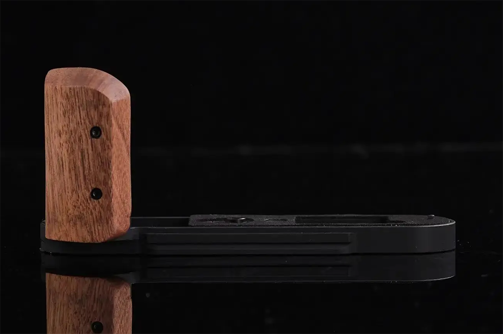
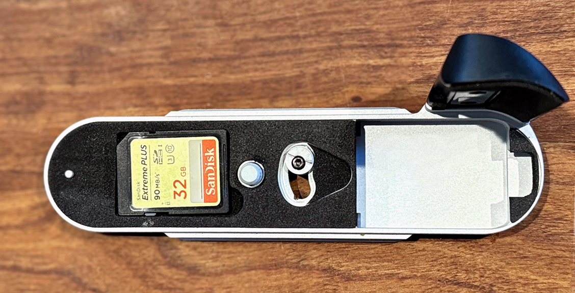
There was some assembly required. The African Blackwood handle / grip pad of my grip (there are several other choices of materials on the IDS website, https://idsworks.store) needed to be screwed into the base. And there was a minor issue of fitment so that the external swinging button on the base could activate the switch that opens the door where the battery and SD card reside. The magnet that holds the trap door closed over the battery compartment seemed very robust, and unlikely to pop open even in heavy use.
Henry’s website says that he felt forced to design his own handgrip for the Leia M10 because he did not find what was out there satisfactory. That grip replaced the factory baseplate. There are now also grips for various models available; again, see Henry’s website. Of course, on the M11 there is no baseplate, so things had to be different. Henry has this to say online about the M11 grip.
The hard stuff
Using the lightest pad, our Leica M11 grip weighs only 65g
“Aluminium zinc alloy 7075 was used in the construction of the M11 grip because of the new battery design for the camera. 7075 maximized the strength of the grip since when the legendary bottom plate design (of all earlier Leica M models) was discarded, I decided a much harder metal was necessary.
“The bottom plate plus the grip pad supporting structure now weighs only 60g compared with 85g before. It means with our lightest grip pad at 5 grams, the total weight is only 65g. Moreover, all fastening screws to the body have been upgraded to aluminium with the same finish for better looks.”
A Modular ARCA rail design is integrated into the base, allowing quick loading on an ARCA system. M11 handgrips from some other manufacturers also are ARCA-Swiss compatible.
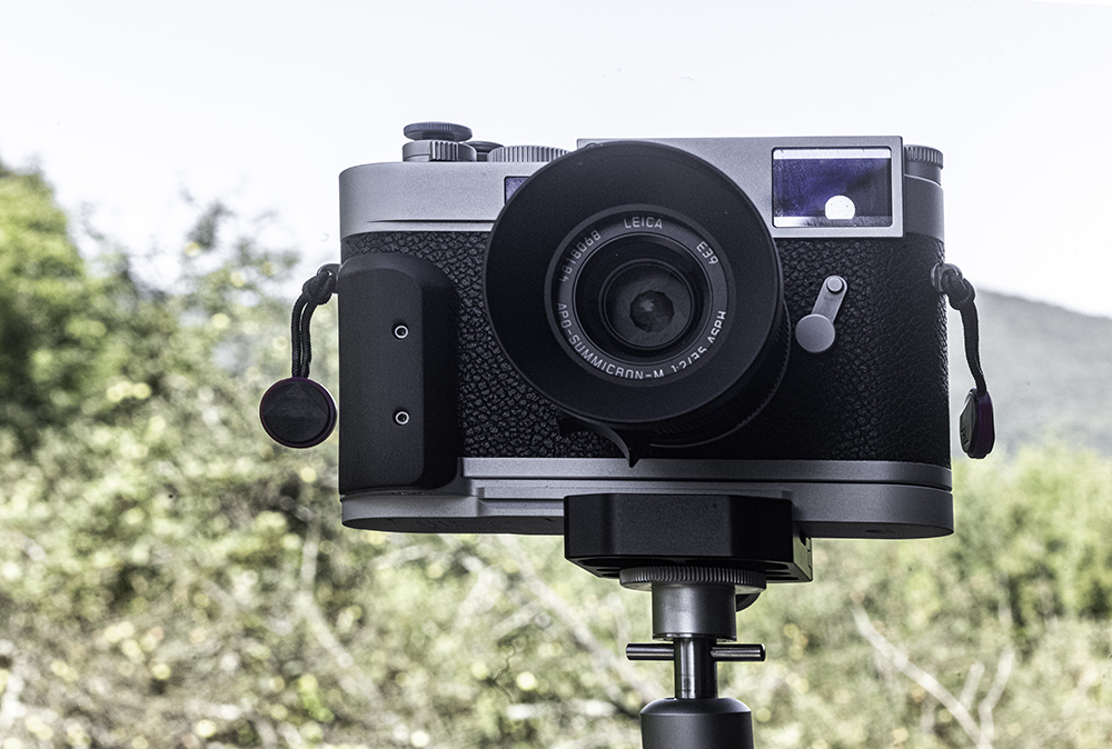
I had considerable satisfaction when handling and hefting my M11 with this handgrip attached. The camera feels about the same, but now it has a small but effective handgrip (more accurately, a hand and finger grip, because of the groove indentation between the grip pad and the camera body).
…and with the folding thumb rest
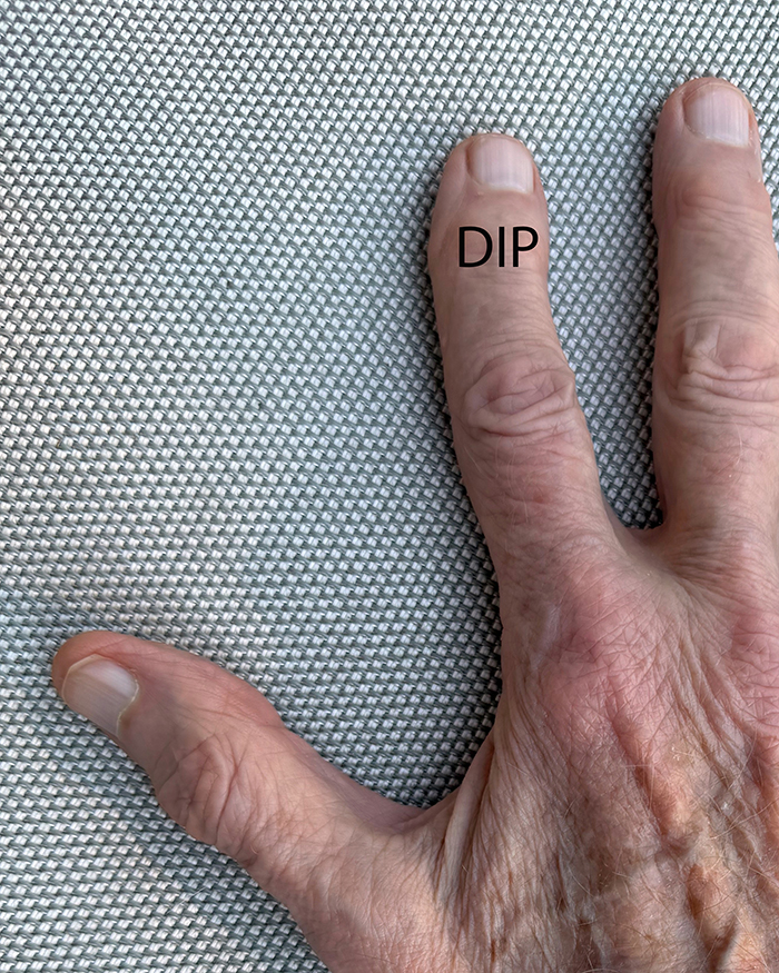
The combination of this grip plus IDS’s foldable thumb grip gives even more secure handling and weight distribution. With a finger grip plus a thumb grip, one’s supporting musculature is shifted from a pincer finger-grasp to the fingers, wrist, and arm as a unit. And using the handle/grip pad, puts your index finger DIP joint over the shutter release or softie; this is how it ought to be.
For those of us street shooters who fire with zone focusing, Henry adds:
“The design of the grip provides a very convenient vertical shooting experience. The shape of the grip pad with 3D variable curves allows different variations in holding the camera horizontally and vertically at eye level, waist level. As well as at a really low angle. Combining your experience in zone focusing as well as distant judging skills, it allows you to get your orientation right and have more chances of getting that shot of the moment.”
Right for you?
Is this accessory right for you? I like mine quite a bit. And, before it arrived, I wondered whether this would be so. It is both minimalist and secure. And, for what it’s worth, my half-case weighs 44g versus 65g for the grip. That difference is about the weight of one AAA battery, or two pencils. It is worth adding that there is a padded space milled-out inside the mounted grip that will hold a spare SD card.
The IDS Works M11 hand grip can be ordered here and retails for $325 plus tax and shipping.
Make a donation to help with our running costs
Did you know that Macfilos is run by five photography enthusiasts based in the UK, USA and Europe? We cover all the substantial costs of running the site, and we do not carry advertising because it spoils readers’ enjoyment. Any amount, however small, will be appreciated, and we will write to acknowledge your generosity.
PHEW! what’s all that red(?) italic IN YOUR FACE MASSIVE FONT about?
(Can’t write any more, my eyes have fallen out)
Glad you like it, David. The large red italics are the way the developers have interpreted the WordPress “Quote” paragraph style. There is nothing we can do to change it (without help and cost), and I do think it has its merits — not for quotes but as a break in the text to emphasise a certain point.
However, Ed’s article was posted and reviewed using the old quote style, which was much less in your face. I was surprised at the appearance and made a note not to repeat this in future. We will revert to the simple “….” format. This new large red font will have populated all 5,000-odd posts on the site, although we always made sparing use of this paragraph form.
As I mentioned earlier in the thread under the announcement article, it’s an off-the-peg theme and changing paragraph formats requires additional code (and expense) and can also cause problems when the theme is updated. As usual, it’s a matter of seeing how we get on. It is still a work in progress.
Mike
Er, er, NURSE!
I have edited this article to remove the bold quotes. As I said, it was prepared before the theme changeover, when the old quote block looked acceptable. Clearly, it doesn’t work in the same way with the new quote block. In fact, I think the theme designers have decided to use the quote block as a means of adding an emphasised extract from the article. We will use it as such in future, and use standard quotation typography for genuine quotations.
I can hear your screams David but I fear no matter how many times we press the RED button nobody is coming to help. I do agree with Captain Mike that the red text provides a welcome break in the text and emphasizes a certain point but the real problem here is there’s just too much going on all at once and in every direction with the new look. In this article alone you’ve got a giant blue and white L to kick off the text, then bold text, then regular text, then the red text, then violent insertion of triple-sized sized bold text. It’s all over the place….! It rather reminds me of the look some print photography magazines adopted when they were trying too hard to get our attention on the shelves in W.H.Smiths. When I first saw the new home page I clicked on the blog option like a drowning man.I hope Mike is right and the turbulent seas of the new layout will settle down so we can just focus on the content of the articles again.While I fully appreciate the value of the archival content on MACFILOS it appears to be overwhelming the new content here in the way it is presented. In the meantime, I know I’ve got some seasickness pills or Polo mints somewhere…I think I left then in the Billingham, or was it the Think Tank? 🙂
<<you’ve got a giant blue and white L to kick off the text>>
At first, I couldn’t understand what you meant about the drop cap L until I looked again and saw it. This is NOT part of the standard design, and it came about because, this afternoon, I was fiddling with the WordPress options and decided to see what a drop cap would look like. I must have forgotten to remove it because, I agree with you, it was not a good idea.
So, at least, the drop cap has been banished (unless I think it is useful in the future). Meanwhile, the quote block will be used sparingly and for highlighting an extract from the body text rather than for personal quotations. All I can say about the Newspaper theme is that it has been adopted widely. However, some news outlets probably have the money to employ people to tweak the appearances. We don’t, and having spent a lot of money (for us, that is), we have no option but to carry on. I think it looks good, so maybe others will agree!
On the issue of the busy appearance of the home page, you do have the option to view the blog page, which takes a much more regular chronological approach. And, of course, many readers go straight to individual posts by clicking on emails or RSS feeds, so will not notice that much change.
The bold text of the initial paragraph is something we have been doing for several years, and it is part of all posts. With the new theme, it looks different, and we need to discuss whether it is now necessary. The initial bold par is not part of theme, but comes about in our editing process. We will discuss reverting to regular text for the first paragraph, but can do nothing about past posts and this could lead to an imbalance, given that the front page actively takes readers to older articles.
I’m afraid I didn’t know the proper name for it. I learned something! Now I know what a drop cap is. It reminded me of the title pages of those ancient books illustrated by monks but in an ultra-modernized version. That might have been the origin of the drop cap for all I know. I’ll have to research.Sorry to be so critical in the comments, just my visceral visual response to what I am seeing before I’ve really got accustomed to it! Carry on regardless. 🙂
Thanks, Stephen. For some reason, drop caps appeared everywhere, even beneath all posts. I have undropped them and all should be well. Yes, drop caps have become unfashionable since the Venerable Bede popped his clogs. The Victorians loved them. But I see a resurgence in web posts and, perhaps, it is time for us to dust off the dropped cap in all its variations. However, once tried on WordPress, it is the devil of a job to kill them off. They insist on reappearing at random.
Hi Mike,
I think they try to make very good products. Henry Tse‘s notion was to try to bring various small quality independent artisanal makers of accessories under one roof contractually. And I also see that he goes for continuing improvement in products.
I know we will see more IDS products, but I am doubtful that I myself will have any need — but who knows. I never thought I would get an M11, but that is another story.
Ed
I have an IDS grip for my Q3 as well as being comfortable I can access both battery and SD card doors unlike Leica’s own version