Softly to read. Pages turn gently. Absorbing deeply, creating your own reality.
As a regular contributor and reader of Macfilos, I was delighted to be asked to share the making of Glas, a project that, I believe, will resonate deeply with this community of photography lovers. Those of us for whom what began as a hobby has got somewhat out of control, but in a most enjoyable way.
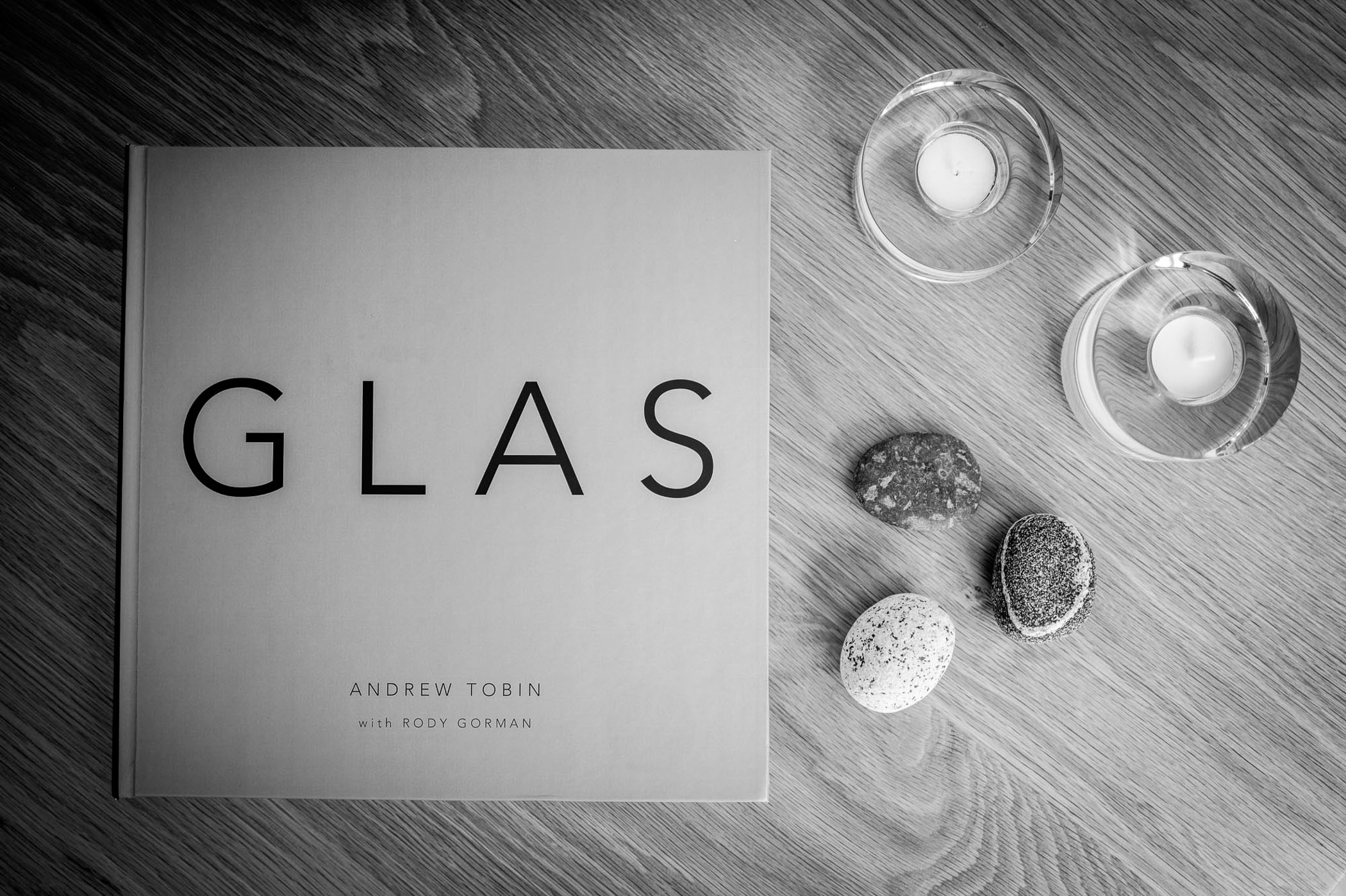
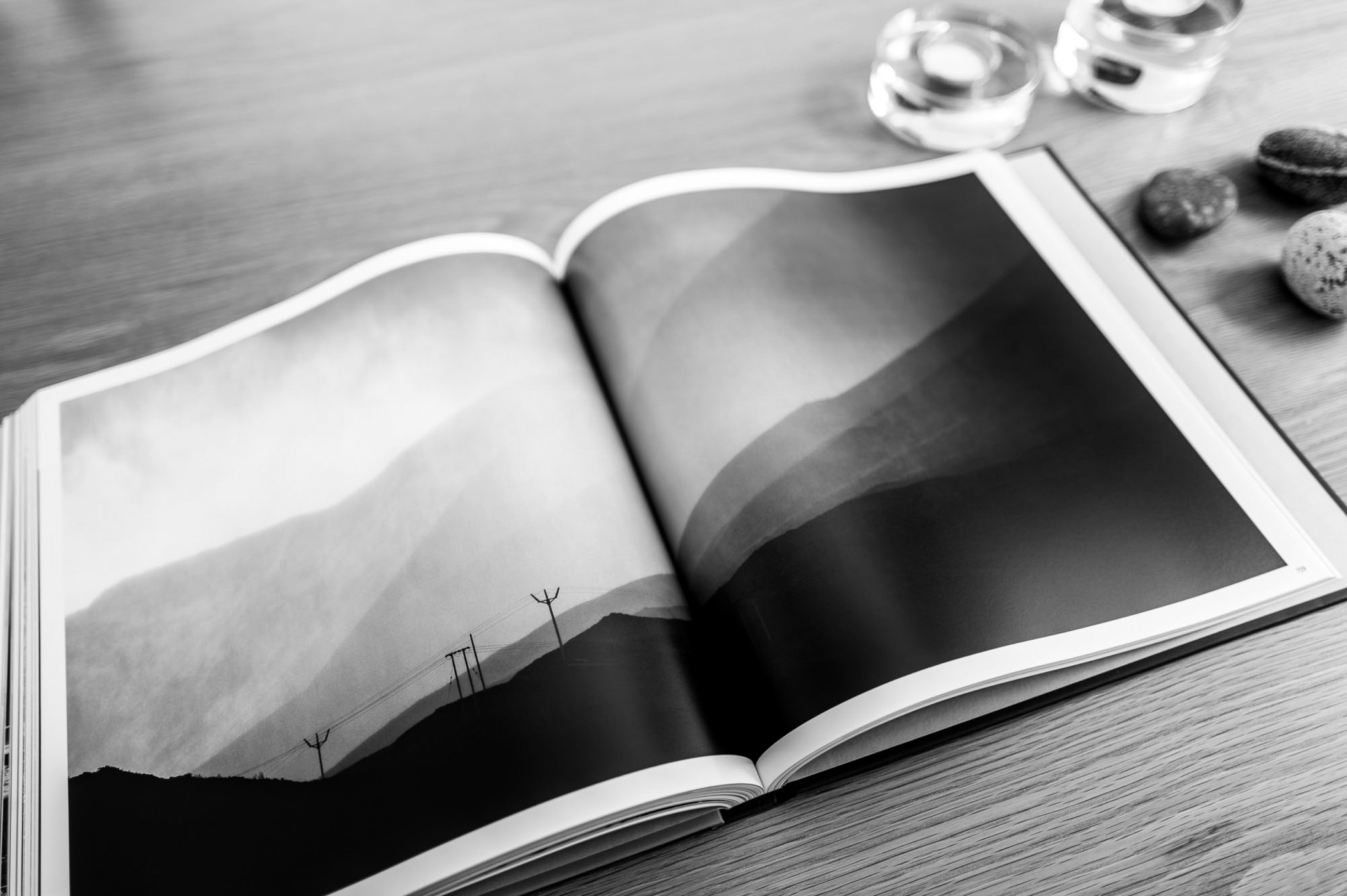
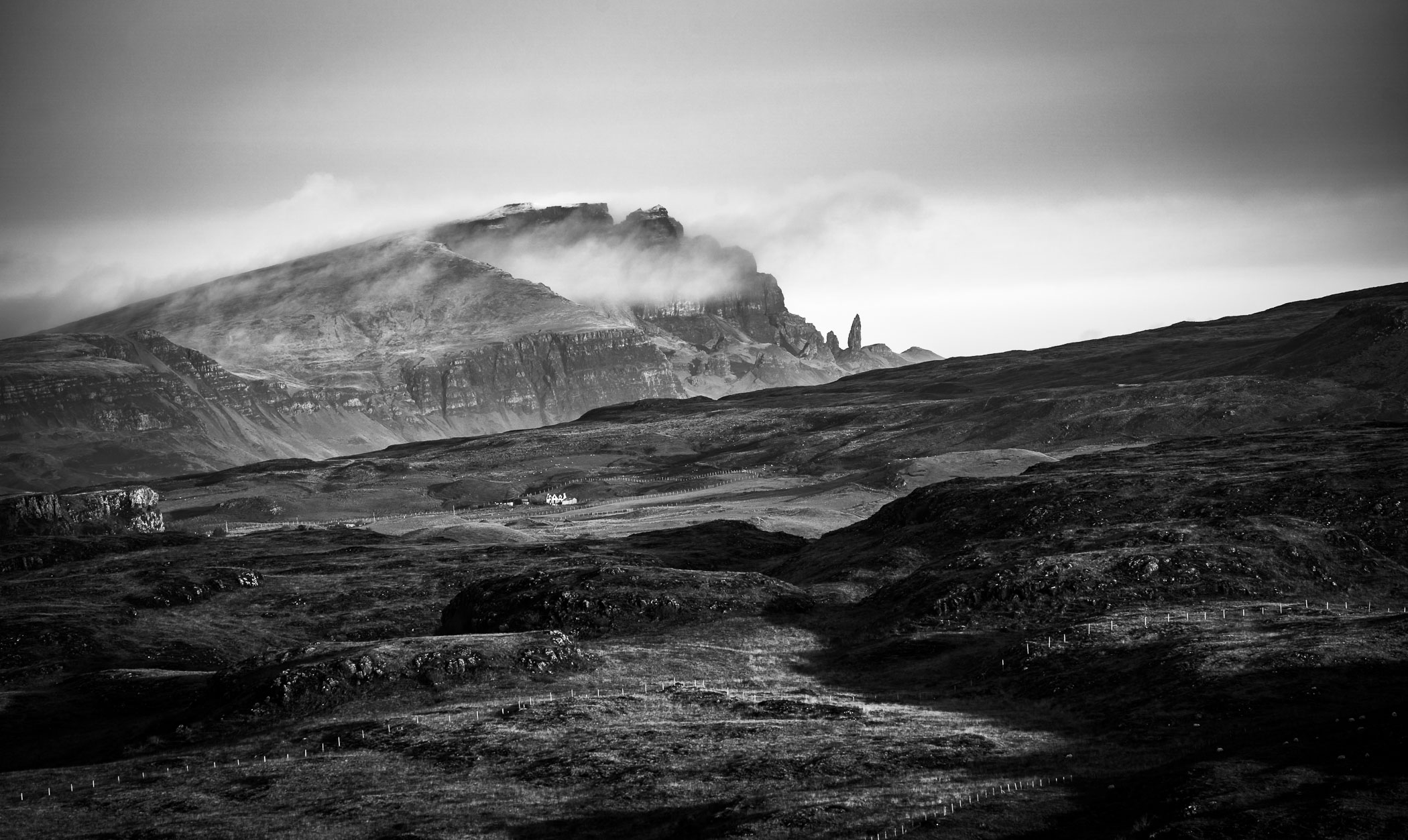
I’m giving you the first look at my new book called Glas, which is Scottish Gaelic for “grey”. It is the culmination of a seventeen-year photographic journey through the Isle of Skye, Scotland’s most iconic island.
Glas isn’t just a photography book, however. As well as over 200 pages of images, it includes specially commissioned poetry in Scottish Gaelic with English interpretations. The words of Rody Gorman, in response to the images in the book, give Glas something unique.
High praise
Lord Macdonald, High Chief of Clan Donald, has written the foreword, describing Glas as “a masterpiece of the highest order”, which makes me immensely proud, or “chuffed” as we say here in the UK.
An early reviewer, artist Peter McDermott, said, “A few weeks ago, I had the privilege of previewing a proof copy of this book, and I was utterly captivated by Andrew’s imagery. In my view, it stands as the most definitive portrayal of Skye — its landscapes, shifting light, and ever-changing moods.
“No other publication comes close to capturing the island’s mercurial character with such depth. Presented in striking black and white, the work places Andrew in the company of some of the world’s great photographers, evoking comparisons to masters like Ansel Adams and Minor White.”
Needless to say, those two comparisons are music to my ears and trigger significant imposter syndrome symptoms in my brain. Just to be even considered in the same sentence as two such greats that I deeply respect is astonishing for me.
The essence of Skye
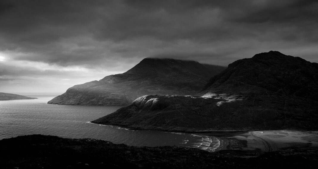
I wanted to capture the essence of the Isle of Skye — not just its scenery, but its raw, dramatic spirit and its quirky character. I also wanted to convey some more profound messages that are very personal.
But how to do this? It is a puzzle photographers have agonised over for decades. How can you translate what you see and feel into a two-dimensional image that conveys those same sights and feelings?
In this article, I’ll describe how I have tried to do it, and the underlying philosophy behind my approach. In a second article, I’ll go into some photography techniques and gear that I have used, and the mechanics of creating a book like Glas.
The philosophy of Glas
I have three non-negotiable, foundational principles that I have stuck with during the seventeen years it has taken to produce Glas.
Firstly, I want to encourage calmness, quietness, and contemplation in those who read the book. These days we are bombarded with hypersaturated digitality, and endless scrolling stream of attention-grabbing blurb. It is draining and sapping, and has become more so lately. I want Glas to be an escape route. A gentle place where peace can be found.
Space for personal interpretation
Secondly, I want to allow space for the reader to construct a personal interpretation. The best books are ones that leave things out, allowing your imagination to fill in the blanks. In the case of Glas I would like readers to ask themselves how cold it is. Does the wind scour or caress? Is the grass green or brown? What does it smell like? Does the ground squelch or crunch underfoot? Has it rained, is it raining, will it rain?
Lastly, I want to be “true” to the Isle of Skye. What do I mean by this? Skye is much more than the Old Man of Storr or the Quiraing or the Fairy Pools. Sure there are spectacular highlights enjoyed by tourists all year round, but there is so much more, including the Gaelic language naturally. By being observant, alert and looking deeply it is possible to get into the soul of the place, warts and all.
From philosophy to photography
I am a strong believer of the “less is more” idea. It is particularly appropriate in photography, where one composes to remove distracting elements, bringing the attention to the intended subject in the best possible way. This is something I have learned from following David Ward‘s work intently over the years. He doesn’t know it, but he has been my silent mentor for a long time.
As well as “less is more”, I also believe “more is more”. These two seemingly contradictory statements hide one of the joys of photography for me. By “more is more” I mean how a composition, carefully designed to be free from distractions, can be improved and resonate more strongly by the addition of some features.
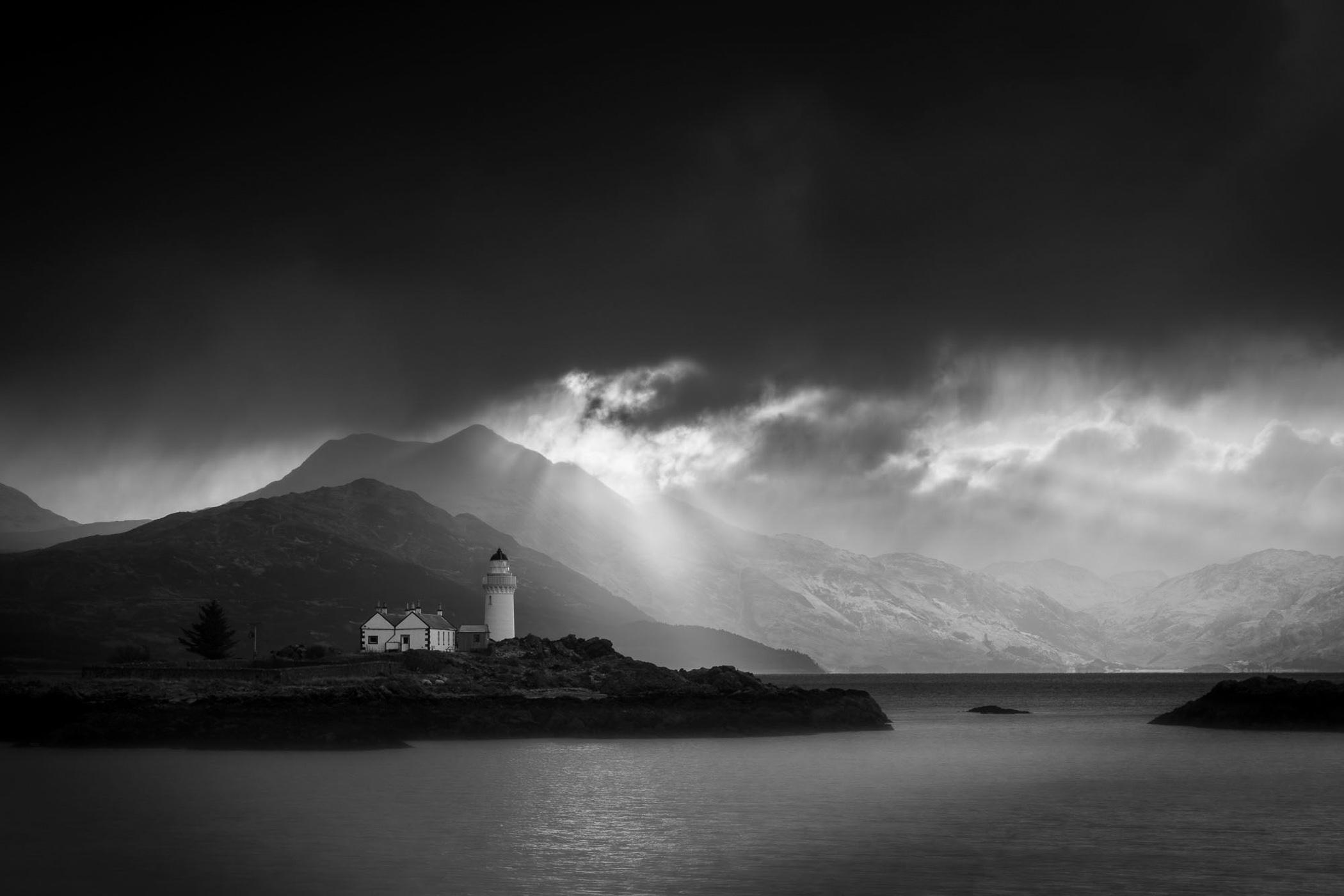
For example, if the scene is lit dramatically by a sunbeam, and there is snow on the mountaintops, and a moody sky. Such additional elements can make an image exceptional due to the rarity and uniqueness that they can convey. This also means it can take a long time to get the photograph that I’m looking for, hence this being a seventeen-year endeavour.
Finding purpose through deliberation
This combination is a real delight for me. It makes me think deeply about my photography, making it very purposeful and deliberate. Occasionally, it can take years to get the image I really want. It is important to be careful, though, not ending up creating “clutter” by adding too much back in.
It is also essential not to get too hung up on creating something perfect. Some of the best photographs in Glas are the product of the instant recognition of a fleeting moment that captures some little special thing that speaks volumes about the Isle of Skye.
And then there is colour. To follow my second principle of allowing space for the reader to create their own vision, all the images in Glas are black and white. By removing colour, I let the reader imagine what the scene was like. Black and white also brings out shape and texture far better than colour in my opinion, so it was an easy choice for me.
Poetry In action
As my library of candidate images for Glas started to take real shape, I started to think about how I could make Glas exceptional. An indulgent set of photographs is all well and good, but can it be improved?
Then I had an idea. In the same way that the images are designed to give space for the reader, could I use words to do something similar?
I am not a writer of any note whatsoever. I can pen a blog post, but being creative with words is significantly beyond me. So why not find someone who can? And what better than poetry to paint with words? And even better, let’s have those words in the native language of the Isle of Skye, Scottish Gaelic.
Just up the road in the Isle of Skye is Sabhal Mòr Ostaig, the National Centre for Gaelic Language and Culture. Very handy! It was there that I found Rody Gorman, a poet of significant renown in the Irish and Scottish Gaelic world. I was a bit apprehensive, when I first met Rody, to show him a prototype of Glas.
Understanding the language of poetry
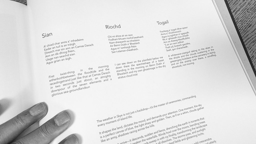
I have never knowingly spoken to a poet, let alone commissioned one to create some poems for something so close to my heart. I need not have worried. Rody understood the assignment straight away, and started making copious notes as he looked at some of the photographs I had selected.
And wow, the results are breathtaking. Rody created twelve sets of poems for the twelve themes in Glas. Some very short, some longer. All in Scottish Gaelic with English interpretations. They give so much flavour to my images, like a great seasoning or spice mix.
Even just reading the English versions, you get a super appreciation for the beauty and deep nature of Gaelic. The way Rody has created the English verse uses something he called “intertonguing”, where a single Gaelic word has multiple English meanings, which is fascinating and gives a great insight into the Gaelic language.
A dozen themes
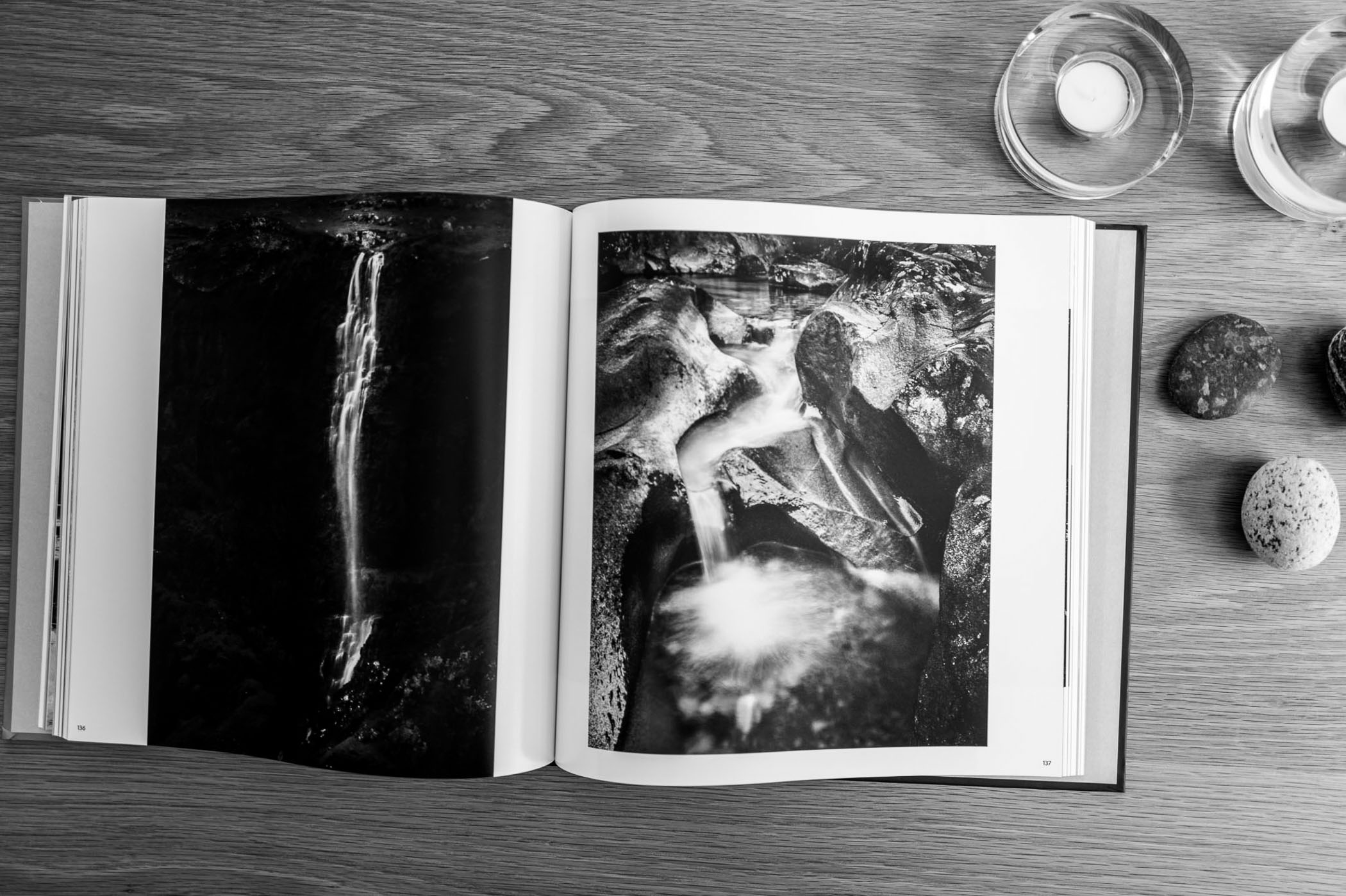
I wanted Glas to be epic. A thing that is worthy of being studied, and to be cherished as a valuable possession. I have a few photography books like this, and they are such beauties to own. This meant that Glas would be a large book (it is 30×30 cm and weighs about 2 kg, with over 220 pages). Even with a number of double-page spreads, where a photograph is spread across facing pages, this means many images.
The challenge then became how to organise the book so that it makes sense and isn’t just a collection of randomly assorted pictures.
Early on, I was photographing scenes that seemed to naturally fit into certain categories. I decided to expand on this, and design twelve themes. These themes gave me permission and purpose. They helped me to organise my photography and my mind. Each theme became a chapter in Glas, and each has a more profound meaning beyond the obvious, being analogies for human nature and behaviour.
Here are those themes:
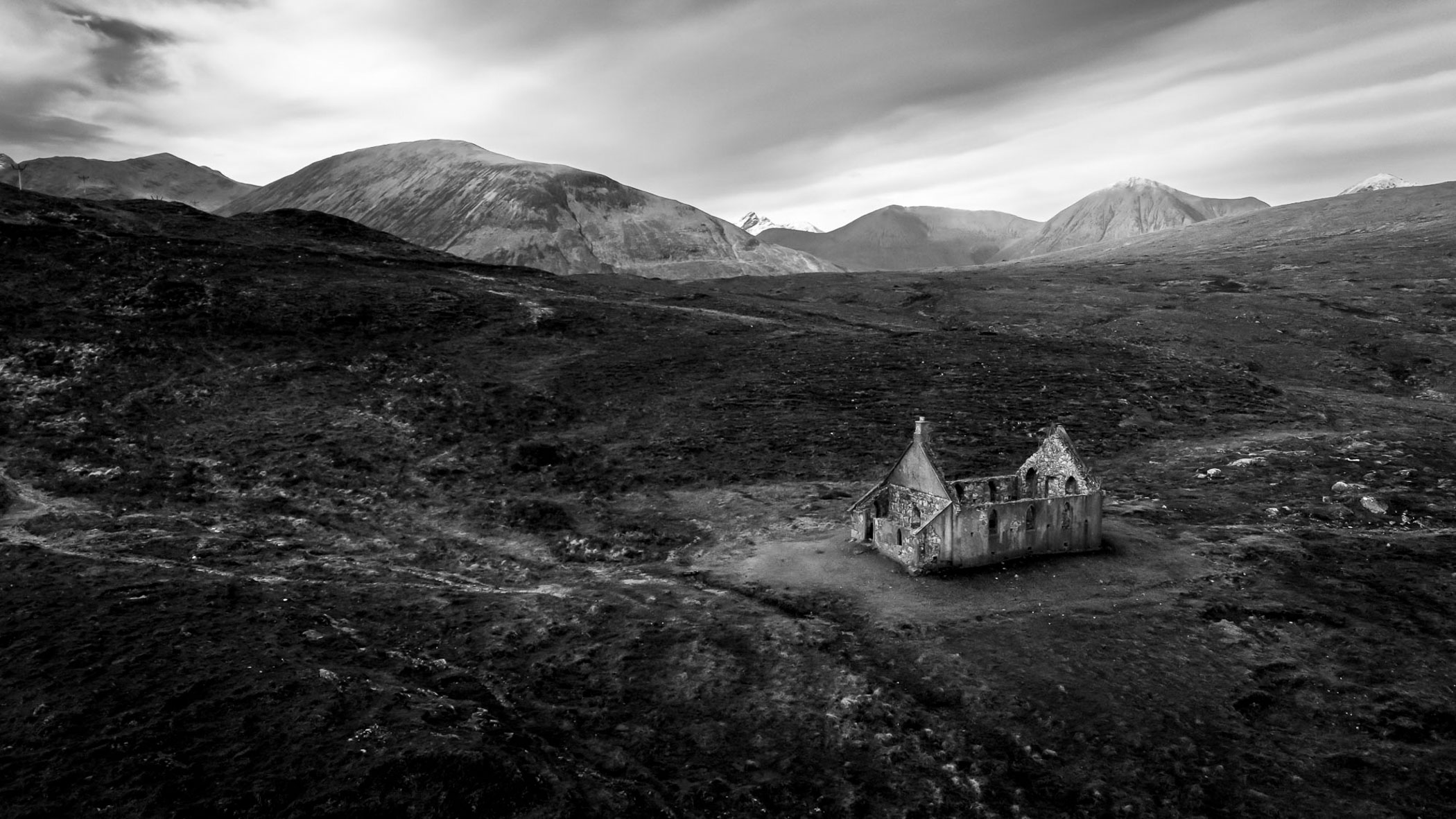
Small Houses: The contradictory desires for company, and for being alone.
Sea Views: How our moods change and control us.
Signs: Deliberate and unconscious signs that say so much about us.
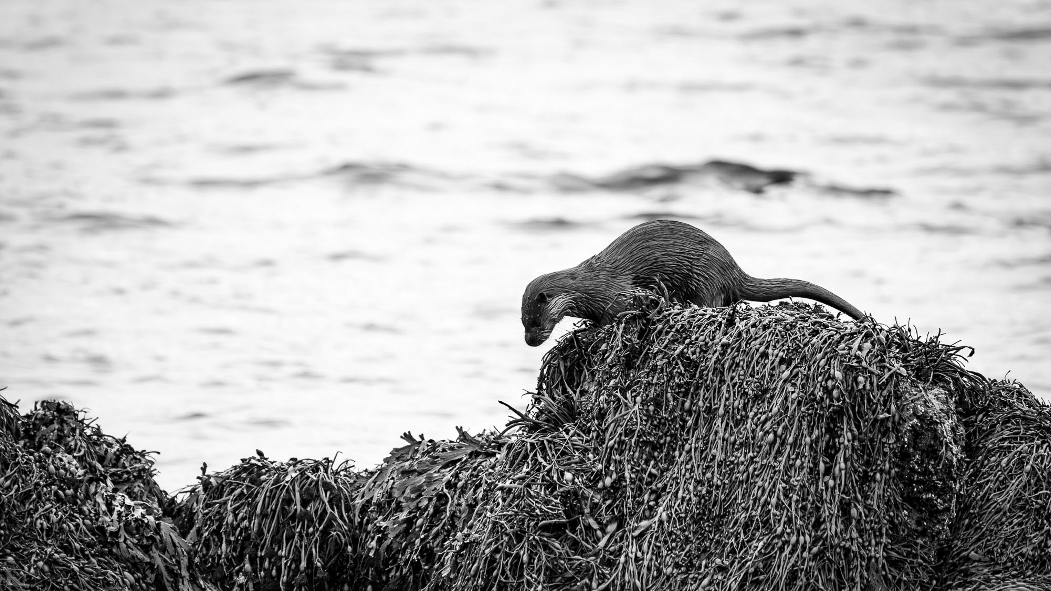
Trees and Beasties: The beauty and splendour that surrounds us every day.
Benches: The public outward, and private inward personas that we cultivate.
Decay: Our impermanence, and imprints of our past experiences.
Fences: The barriers we build, and those that are built for us.
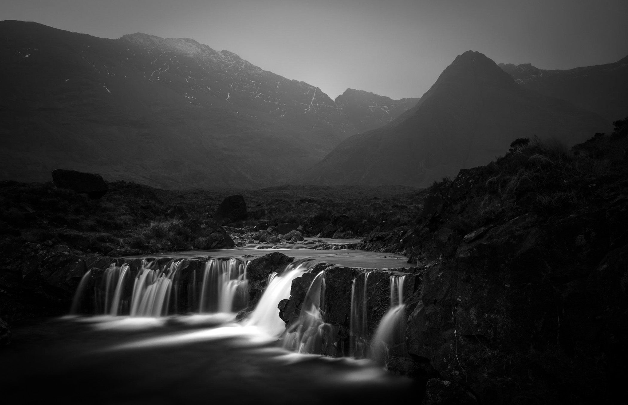
Water Features: Like water, information flows around us, sometimes coalescing into ideas that become reality.
Poles: The importance of the unattractive and mundane.
Observations: The rewards of looking carefully at the small details.
Weather: The unpredictable nature of our emotions.
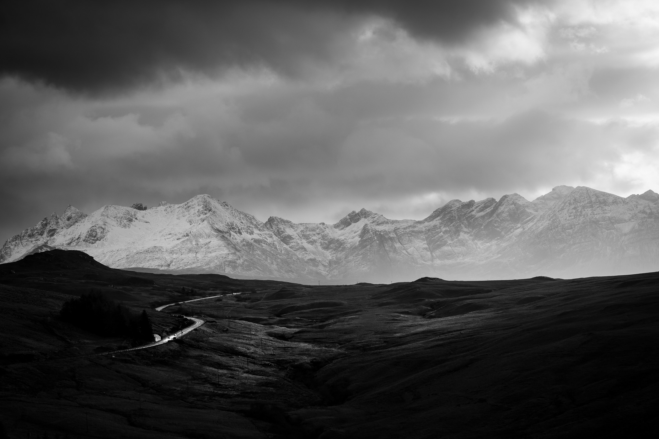
Roads: Life doesn’t have a “Google Maps”. Fulfilment comes not from the speed of the journey but enjoying the trip and navigating the unknown.
Organising around these themes
By organising my work and my brain into these themes, I felt I had given myself permission to try different things and work differently. I allowed myself to leave the house for the day to find and photograph fences or signs, for example. Saying to my wife Suzie, “I’m off to photograph 100 Passing Place signs” definitely raised an eyebrow but released me from the normal self-imposed constraints of photographing a “typical” epic sunset with nice scenery type shot.
From a photographic perspective, this made things fascinating and significantly improved my creativity. I would be looking for compositions that not only fit one of the themes, but also made what could be an otherwise mundane subject like a power pole look intriguing. This would also fit into the overall narrative of the theme and Glas itself.
The themes also dovetailed into Rody Gorman’s poetry, as his poems introduce each themed chapter in the most delightful ways.
From ingredients to gourmet meal
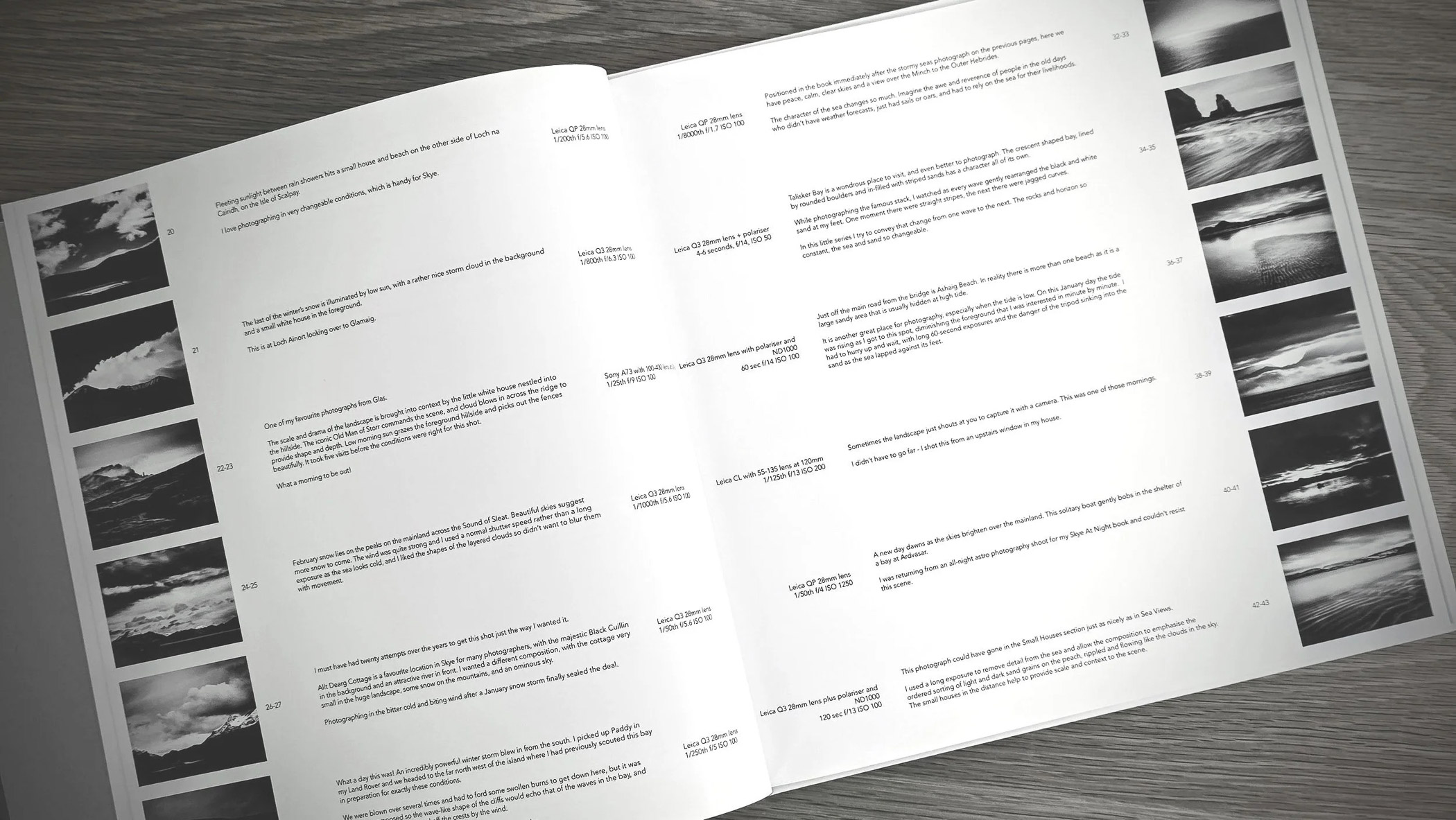
I am now in the final stages of the design of Glas, and the accompanying Photography Index book that holds the technical details of all the images in the main book. It also contains little stories and anecdotes of their creation. Once that is done, the next step is printing, creation of the slip case, and the packaging. After seventeen years, it feels like a massive milestone is in sight and about to be reached.
Thank you for taking a moment to look at this preview. I believe Glas will be a book that a discerning photographic audience like Macfilos readers will truly appreciate. I’d love to hear your thoughts on projects like this in the comments below, and look out for part two where I walk through the more technical side of the photography, design, and printing process.
How to pre-order Glas:
To fund these final steps and organise pre-orders, I am running a Kickstarter campaign. This is a great way to handle the finances, as people only hand over money if the Kickstarter target is reached. It helps me to know how many to print which is really important as printing is very expensive for a book like Glas.
Glas is a very high-quality item, reflected in the price, which is still very well-placed when compared to similar books that are significantly pricier. Very few will be printed, maybe just 100 or 200. Every copy will be signed, numbered and stamped with a Glas Original embossing. Kickstarter contributors get Glas discounted to £140, compared to the price it will sell for on my website of £170.
If you’d like to make sure you get a copy, please support the Kickstarter campaign and get your pre-order in.
More from Andrew Tobin
Make a donation to help with our running costs
Did you know that Macfilos is run by five photography enthusiasts based in the UK, USA and Europe? We cover all the substantial costs of running the site, and we do not carry advertising because it spoils readers’ enjoyment. Any amount, however small, will be appreciated, and we will write to acknowledge your generosity.

Dear Andrew, what a wonderful project. I have wonderful memories of Skye where I was several times during my abroad year at Glasgow University. I never managed to come back to Scotland since but there is still hope. Can the book also be ordered for shipping into the EU? All the best and congratulations to this magnificent project with a stunning outcome (it will be even more stunning when you can physically read the book). Jörg-Peter
Many thanks Jörg-Peter. Skye is indeed incredibly memorable and I hope you can make it back.
Yes, Glas will be shipped to the EU and I already have some pre-orders for Australia, USA, Canada as well as the EU. You may pay inbound customs depending on where you are, but it will find its way to you.
Hi Andy. With an inevitable gulp at the cost – relax, I know how expensive it is to produce something like this – I’ve gone for it – it looks fantastic. Really frustrated that Shirley and I are going to miss your Guildford talk, but we have the rather good excuse that we’ll be watching an Ashes Test in Brisbane. All the best of luck for talk and book.
Thanks Paul, much appreciated. You could always spot good value! Enjoy Brisbane.
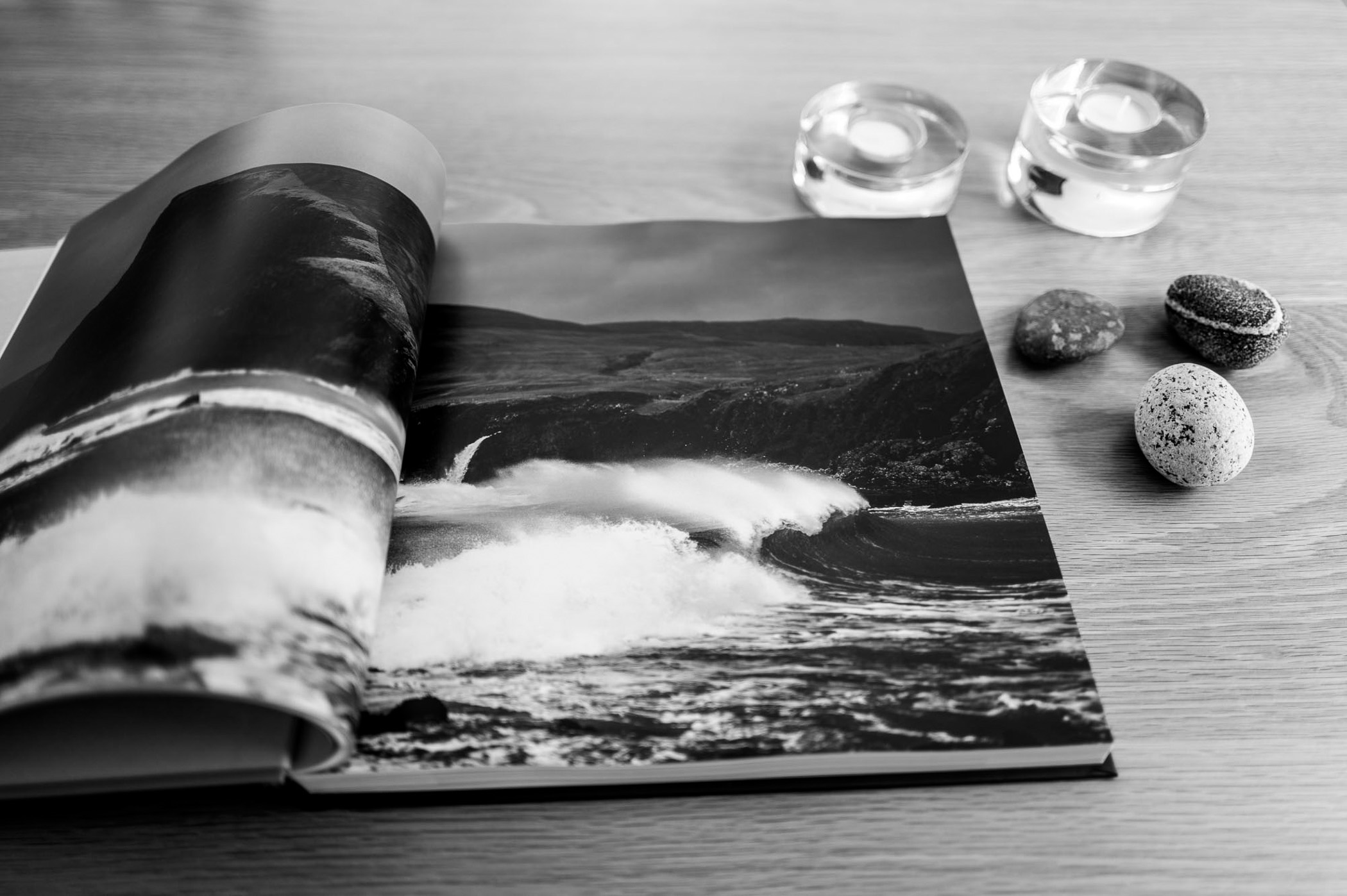
The images and concept are great, but printing images across the binding destroys them. This may look good on a widescreen monitor pre-press, but in the printed form it breaks the mood of the scene. Please print one image per page.
Hi Donald, thanks for your input and your valid concern about spreads. Most of the images in the book are single page. There are also many matched pairs of images. For the double page spreads, the images were composed specifically taking into account the position of the fold, and the printing allows for the binding. I printed two prototypes to check 🙂
I am definitely looking forward to part 2 and a description of the printing process. Two decades ago, I went to a book signing with Bill Atkinson, the man who wrote half the code in the original Macintosh, and after retiring as a programmer, devoted his time to photography. He published a book “Within the Stone” with astonishing production values, where he pushed the limits of what the printing process can do, working hand in hand with the printers and developing his own color-management software to do this.
Thanks Fazal. I haven’t triggered the first print run yet, but it has been a complex process getting to the point where I have settled on a method.
Thankfully there is no colour management as it is black and white, but in retaliation the gods of printing have thrown colour casts at me. Colour casts are the bane of black and white printing. Just use black ink and you end up with a washed out looking print. Use CMYK (plus some light grey and light black additional inks) and you get a deep, rich print, but the calibration of the printer has to be just right.
Many samples later, and I’m nearly there. For such small print runs, I am going with “digital offset” which is like litho but without the horrendous setup costs. See you in part 2.
Lovely work, Andrew. I really like the shining road picture leading the eye to the mountains behind. There is some cognitive dissonance for me in the title. I won’t argue with Rody Gorman, but on my side of the pond ‘glas’ means ‘green’. Our Irish word for ‘grey’ is ‘liath’ which is pronounced ‘lee-a’. I am sure that Rody will know that.
Congratulations on the lovely book. I will have a look at your website to see how I might contribute/order.
William
Hi William – thanks for the comment. I have been thoroughly sheep-dipped into the world of Gaelic, and the many meanings a single word can have. Rody uses this in the English interpretations of his poems very effectively. In Skye, glas is grey, grey-green, ashy, pale and wan over here. Add in some nouns including dawn and lock.
I did have some moments of horrifying uncertainty about the translation but Rody did indeed confirm al was good.
Here in Ireland 100% of people would say that ‘glas’ is ‘green’. It is our national colour and it would have been beaten into us at school in the old days. So people here in Ireland would expect a book with ‘Glas’ as its title to have something to do with green. This is not an opinion, it is a fact. Things may be different on Skye, but here in Ireland there is no doubt about the matter. Interestingly, the Gaelic used in your book for the short poems is very similar to our language eg. “Direach mar sin ann an Camas Darach.” I first learnt to speak Irish in 1956, so I have quite a few years of it under my belt. I am Chairperson of Photo Museum Ireland and we have a bookshop where we do a large trade in photo books, we would be the largest specialist seller of photo books in Ireland. I will ask our staff there what they would think of a book called ‘Glas’ to get their reaction.
You are right that in Ireland and Scotland some words have multiple meanings which greatly confuse people who only speak English, but in Ireland there is no doubt about ‘glas’. We call vegetables ‘Glasraí’ pronounced ‘gloss-ree’, which in other jurisdictions might be called ‘greens’.
Good luck with the book.
William
That’s very useful info William, thanks. I am not doubting your Gaelic prowess whatsoever, and note the differences between Scottish and Irish Gaelic which seems to be extensive.