

A few weeks back, I wrote about using the in-camera composite function of my Ricoh GR IIIx HDF to create impressionist-style photographs. In that article, I described the technique, using London as my muse. Since then, I have become rather enamoured by this approach to photography to capture the idea of over-tourism.
It isn’t new — others have done similar things — yet I find it entrancing and engaging. It is like learning photography afresh, with an entirely different vision and method required, and with a similarly high failure rate.
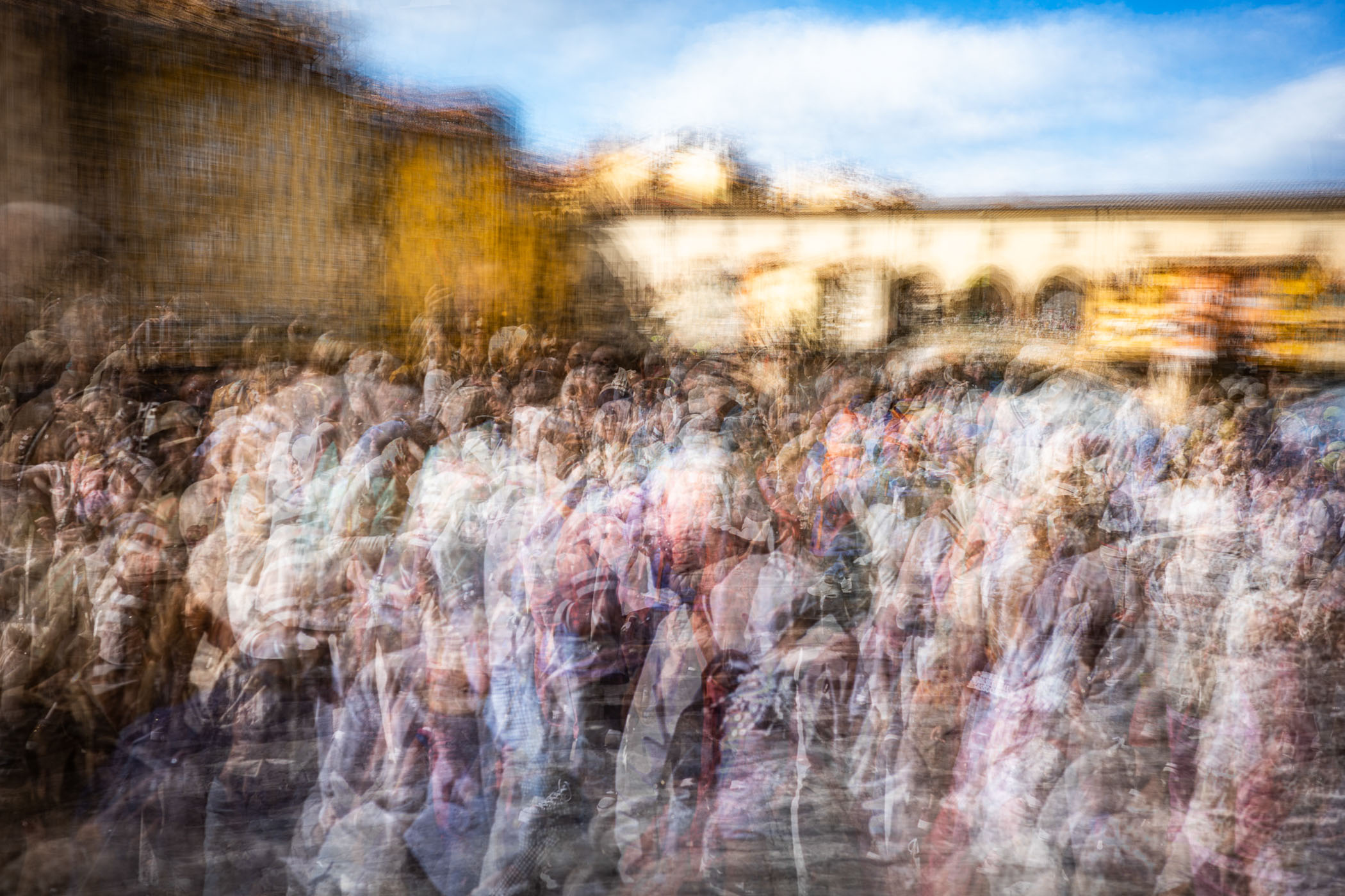
Humanity spilling out onto the pavement
I won’t be describing the technique in this article, as I did so comprehensively in the earlier one. So please click the link in the table at the end of the article if you would like to understand in more detail how I do it.
What’s the message?
The most memorable (best?) photographs have a message or meaning behind them. Sure, a nice sunset looks great, and a carefully timed street shot with a shaft of light illuminating a lone commuter can be dramatic. But they don’t “say” anything in particular. That’s the same for a lot of my composite images in my earlier article.
They look cool, but there’s nothing behind them compared to, for example, Kevin Carter’s heart-rending photograph of a collapsed child in Sudan with a vulture standing over them or Thomas Hoepker’s View from Williamsburg.
OK, those two may be rather extreme examples, but you get what I mean. Such images create an instant feeling and an emotional reaction. And wow, you don’t half remember them as a result. Photographs like this can change opinions and galvanise action.
Madness on the Ponte Vecchio
Forty years into this photography thing, I have started to think more about the meaning behind my images. I shoot plenty of landscapes, which can convey peace, beauty and gentleness, or drama, fear and oppression.
But too frequently, my photography is devoid of a deeper message or purpose. Does that matter? Generally not, but it would be nice if I had a few collections that did.
While I am unlikely to ever reach the lofty heights of Carter and Hoepker (there’s always hope though), I decided to try combining my enjoyment of composite photography with my new-found exploration of deeper messaging and meaning.
The trigger
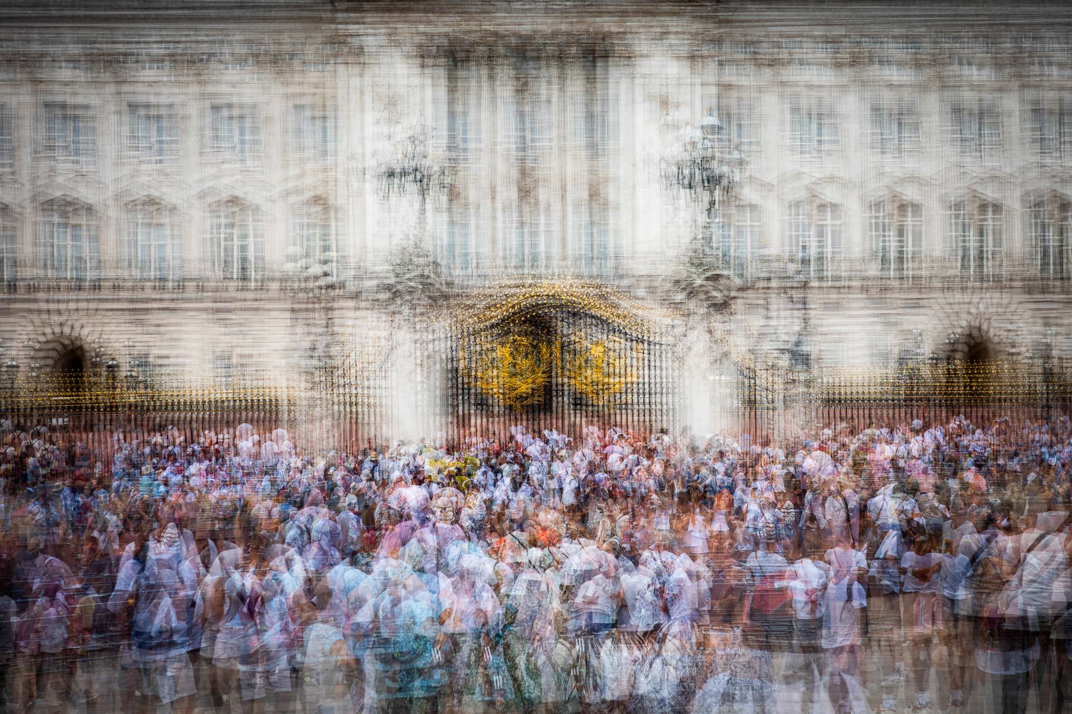
Looking again through my London composites, I found myself studying this one of Buckingham Palace, which didn’t make it into my Macfilos article.
A few of the images in my London series had crowds of people in them. At the time, I had noticed the throngs of tourists in many of the scenes, and deliberately included them in some of my photographs. I was simply reflecting how busy the city was.
By using this composite approach, I could enhance the feeling of activity to communicate the passing of time and movement. Each image is made up of 30-50 individual photographs, using an in-camera multi image composite method. These are overlaid upon each other in-camera. The result is photography that looks like impressionist paintings.
With an upcoming romantic long weekend getaway to Florence in Italy with Mrs T on the schedule, I was keen to explore this a bit more.
Anti-tourist sentiment
Reading about Florence before we set off, I found countless references to over-tourism, crowds and the impact on residents. Florence had 15 million visitors in 2024. Increasing pressure on the city from industrial-scale sightseeing continues to take its toll.
Residents decry the decimation of traditional artisan workshops, gentrification, a housing crisis, and ever-increasing prices. The council has banned self-check-in key safes from short term rental buildings, and is cracking down on licensing of rental accommodation. There are even guides on how to avoid over-tourism in the city. It couldn’t be that bad, could it?
Hmm… that would be us, contributing to the problem by visiting. In my weak defence, we did go in the “off-season” hoping things would be quieter, and I seldom do city breaks to tourist hotspots. So please note that by our actions we were also part of the concern, and I am conscious of this.
We arrived in the city after the usual appalling air travel disasters, and I was immediately struck by how stunning it is. The golden stone buildings, azure sky, incredible architecture. They all smash you in the face as if to say, “Check this out, we know how to do this in Italy.”
Still gorgeous
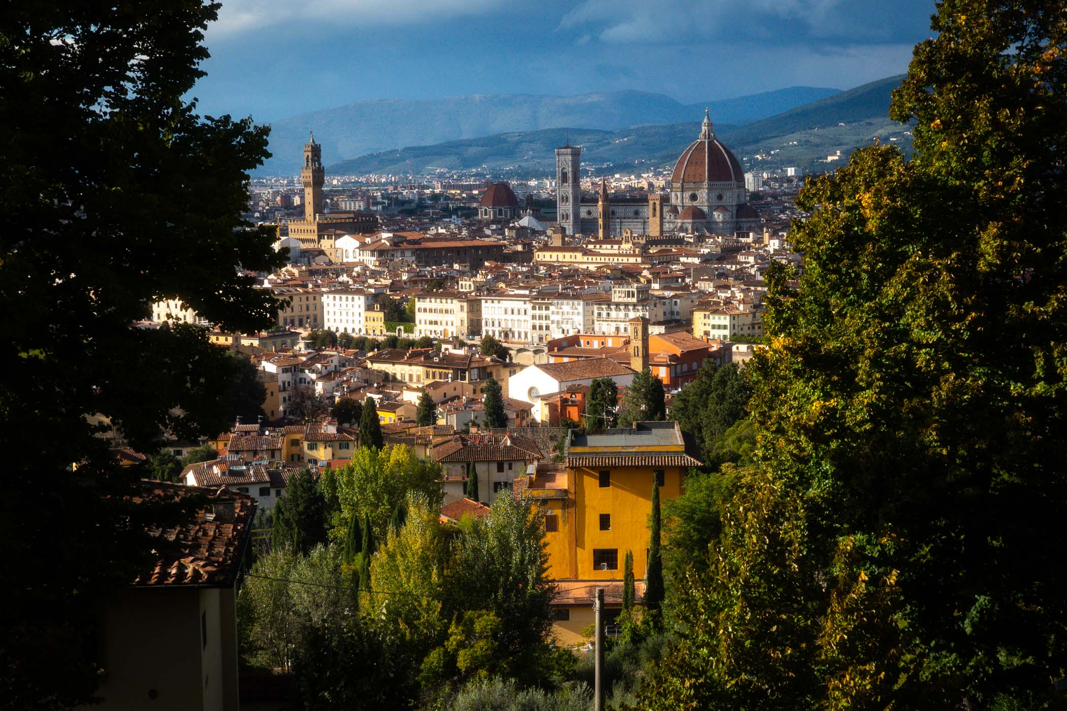
Despite it being a “quiet” part of the season, on day one I was astounded by the massive press of people everywhere we turned. Walking tours took over pavements. Throngs queued to get into the Duomo. The Ponte Vecchio laboured under the weight of the masses crossing it.
Wow! Just madness! Yet ideal for what I had in mind — how to communicate over-tourism when you’re in the middle of it and what that feels like. Was there a new and innovative way that I document this issue?
Idea to action
I turned to the task of capturing the masses of people on the streets of Florence using this compositing method. The first challenge as with all photography is to find a good composition. This meant being at the main “attractions” of the city and figuring out how to create a compelling image. A challenge that aimed to simultaneously show both the beauty of the city and the press of humanity.
Compared to my earlier attempts in London, I made much more of an effort on the composition of my images in Florence. I would take 60 to 70 shots from different angles and positions and combine them into a single composite.
Trying to piece together shape, light, shadow, and movement is both a fascinating challenge and also like assembling a complicated puzzle.
Dimension of time
A single frame can easily show a crowd. It can show how big it is, what people are wearing, and where they are. By using compositing, I can add the dimension of time to better communicate how it feels to be there.
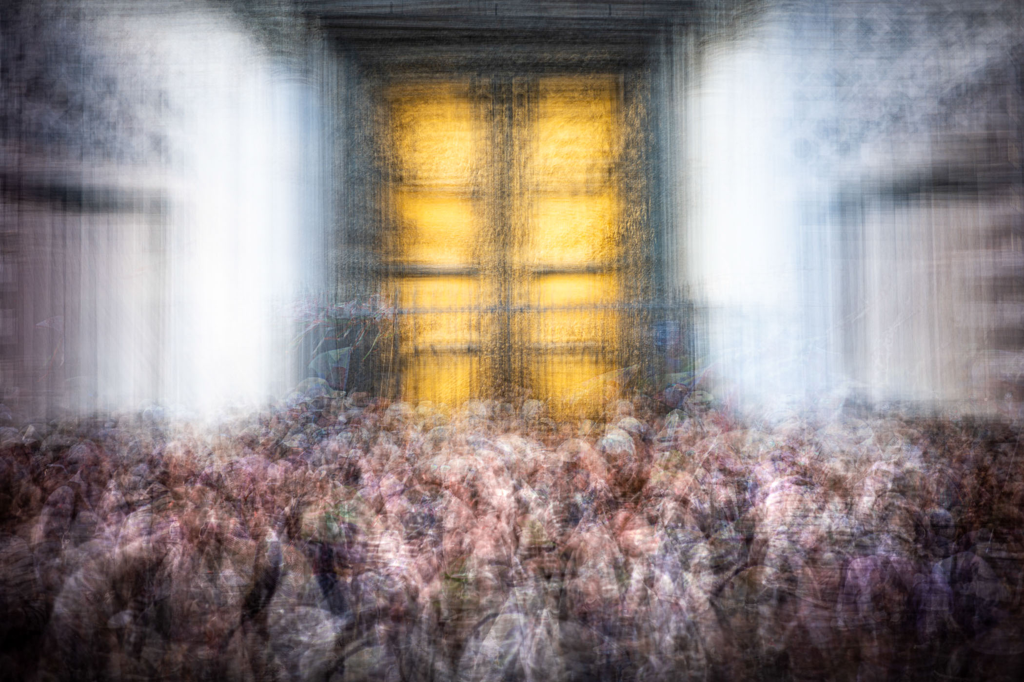
Walking down the Via Ricasoli, home to the Galleria dell’Accademia di Firenze (above), home to the statue of David, is an ordeal of shuffling, shoving, and surging. All while avoiding treading on the garbage “paintings” offered by illegal street vendors and dodging delivery cyclists.
The beautiful yellow stone of the gallery glows under morning light, while people move to-and-fro queueing or buying tickets to queue or whatever else.
On the move
I did a couple of compositions of this location, both created by taking a shot, moving a step or two, taking another shot, as I kept out of everyone’s way in doorways along the wall. The best one is the shot above. The other is looking in the opposite direction looking towards the Duomo.
The shot is more successful, with the left to right “flow” of people being easy to follow by the viewer. If you look carefully you’ll see the individual people’s faces, clothing and so on, which makes these pictures really engaging to spend some time with.
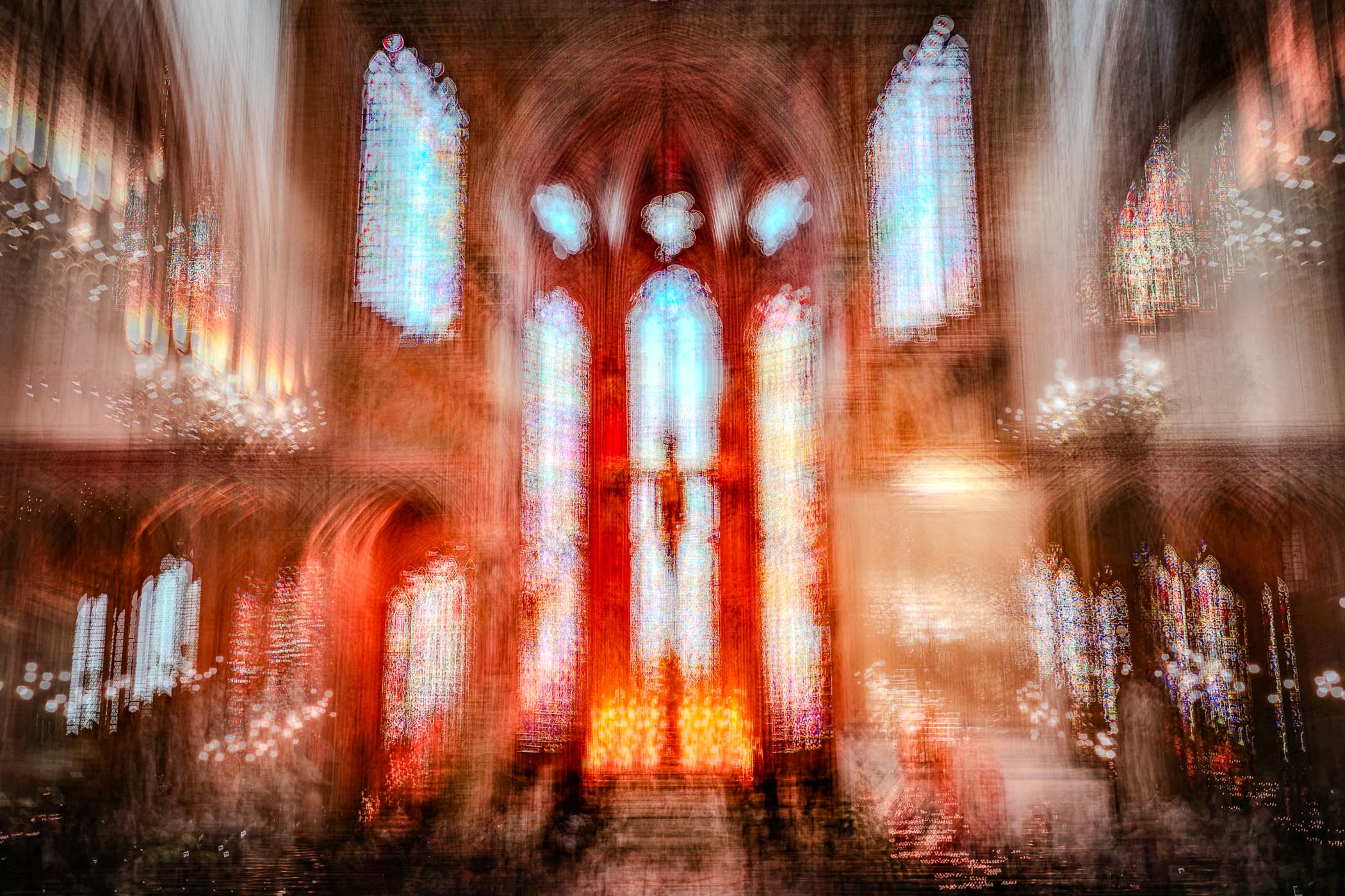
Crowds gathering
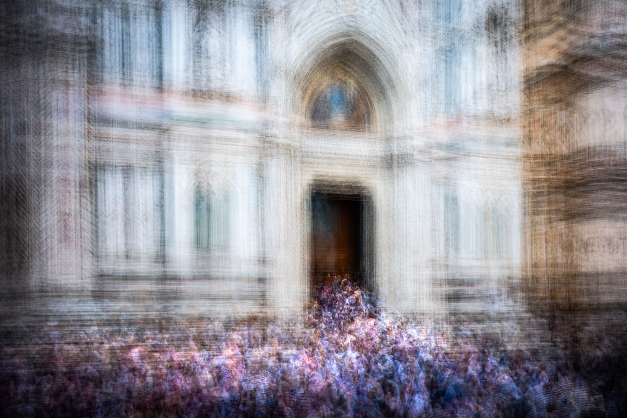
Reviewing images on the back of the camera, I found that I was getting the best results when there was a clear and obvious setting in the background to be the “stage” for the crowds that moved around it.
This is particularly the case for the first image in this article of the entrance to the Duomo. While the shot shows the throngs of visitors going into the cathedral, the impression is very much one of the cathedral vomiting out an endless spume of human detritus. Maybe I’m reading too much into it, but that is how it feels to me when I see that particular image. One viewer said “it looks like World War Z”, the Brad Pitt movie about invading hordes of zombies.
Closer and personal
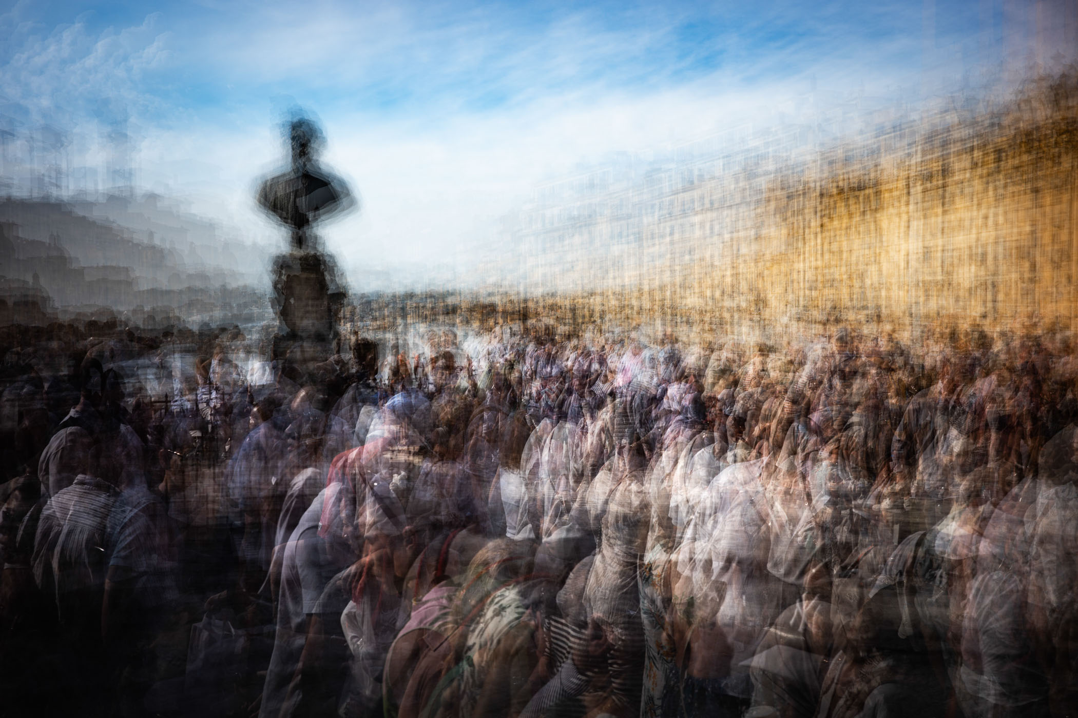
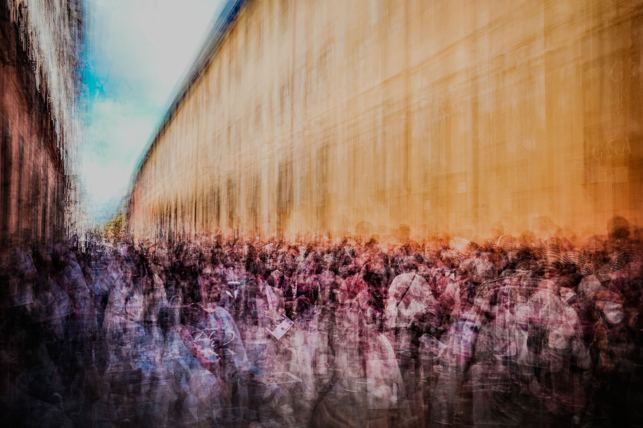
Getting a bit more up close and personal, the following image is rather more in-your-face. I had several tries at photographing the crowds on the Ponte Vecchio, the famous bridge over the Arno River. According to the guide on our walking tour the bridge was once the home to the butchers of Florence during the Great Plague.
It kept them and their products’ smell and guts away from the residential areas of the city and allowing the waste to be disposed of straight into the river. In 1565 a decree was made to clean up the bridge by banning butchers and only allowing jewellers and goldsmiths, resulting in the collection of shops we see there now over 500 years later.
Capturing the hordes
This shot takes away the anonymity of a mass of people, and makes the image a lot more personal. It is also a much better composition than my other attempts at getting a shot on the bridge itself. This is because there are large areas of bright sunshine and shadow along the bridge.
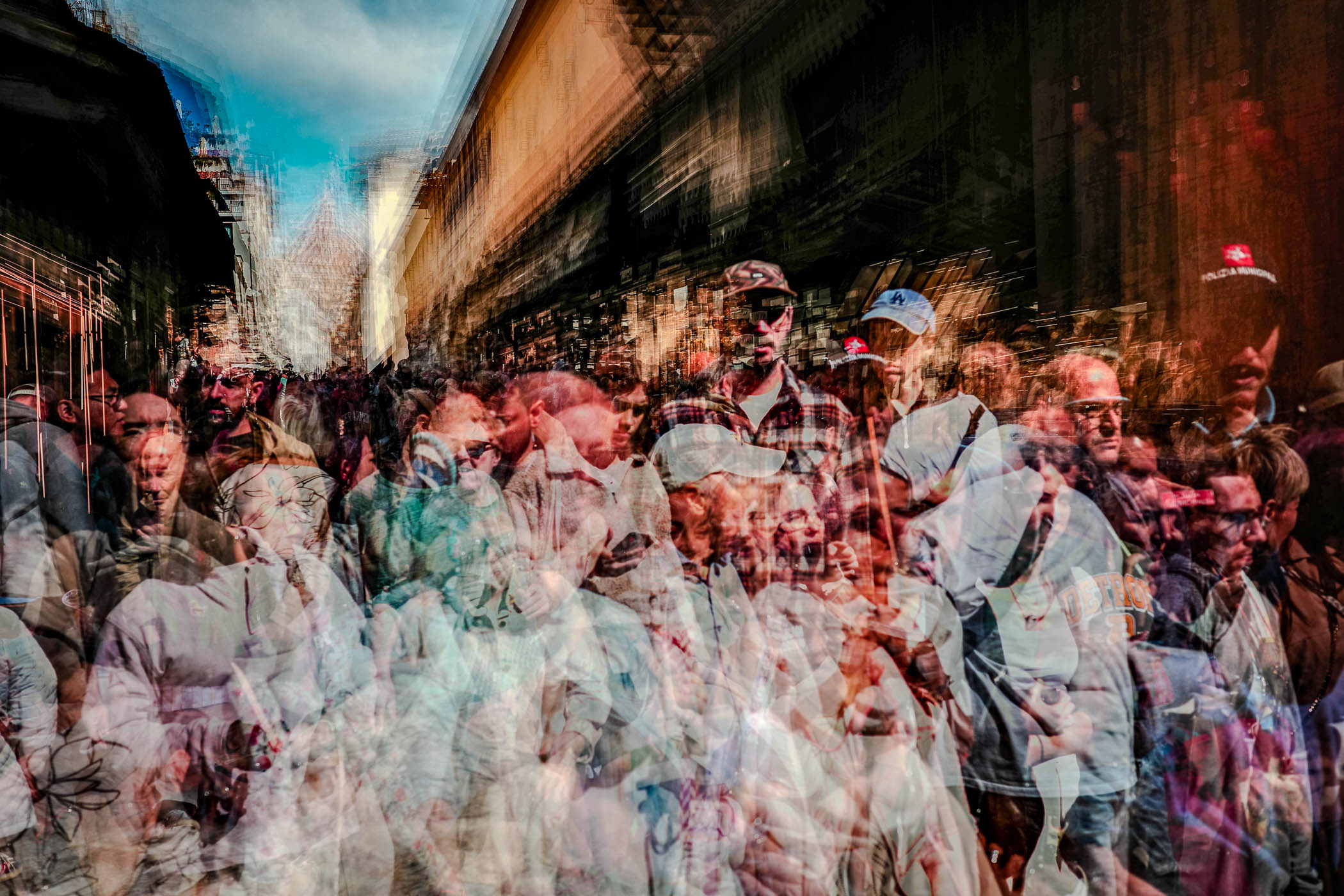
I was finding I was losing the “people” in the shadows. By moving further towards the end of the bridge, I was able to shoot at a point where a shaft of sunlight crossed the walkway. As people emerged into that shaft of light, they stood out really well against the shaded backdrop.
In your face!
Again I tried to create a dynamic composition with strong angled lines, positioning the brightest area off to the left side with the lines of the buildings shooting off to the right. This resulted in a feeling of emergence of a huge number of humans being disgorged by the bridge.
The golden light and the deep brown shadows help to lend an air of richness to the scene, befitting all the gold and gems on show in the shops along the bridge. The overall feeling is one of closeness, claustrophobia, movement, and pressure.
Now I am getting more familiar with this compositing technique, I find I can concentrate more on compelling compositions, which improves the result significantly.
The composite shots in this article demonstrate the pressure on the city from the tourist industry. As always, there are pros and cons with such things. The money spent by tourists must be astronomical, employing thousands in the city. Life for residents must be a misery, though, as industrialised sightseeing has seemingly taken over the place.
Creating each of these pictures is rather tricky and time-consuming, and I have many rejects that won’t see the light of day. I am very pleased with the small selection that I have come away with.
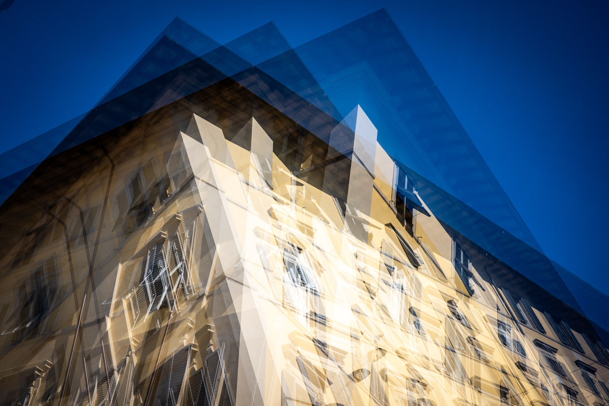
Right angles
They do the most difficult thing — despite being just two-dimensional, they get across how the centre of Florence feels. Your other senses are activated. You can feel the press of the crowds, hear the noise, even smell the mass of humanity.
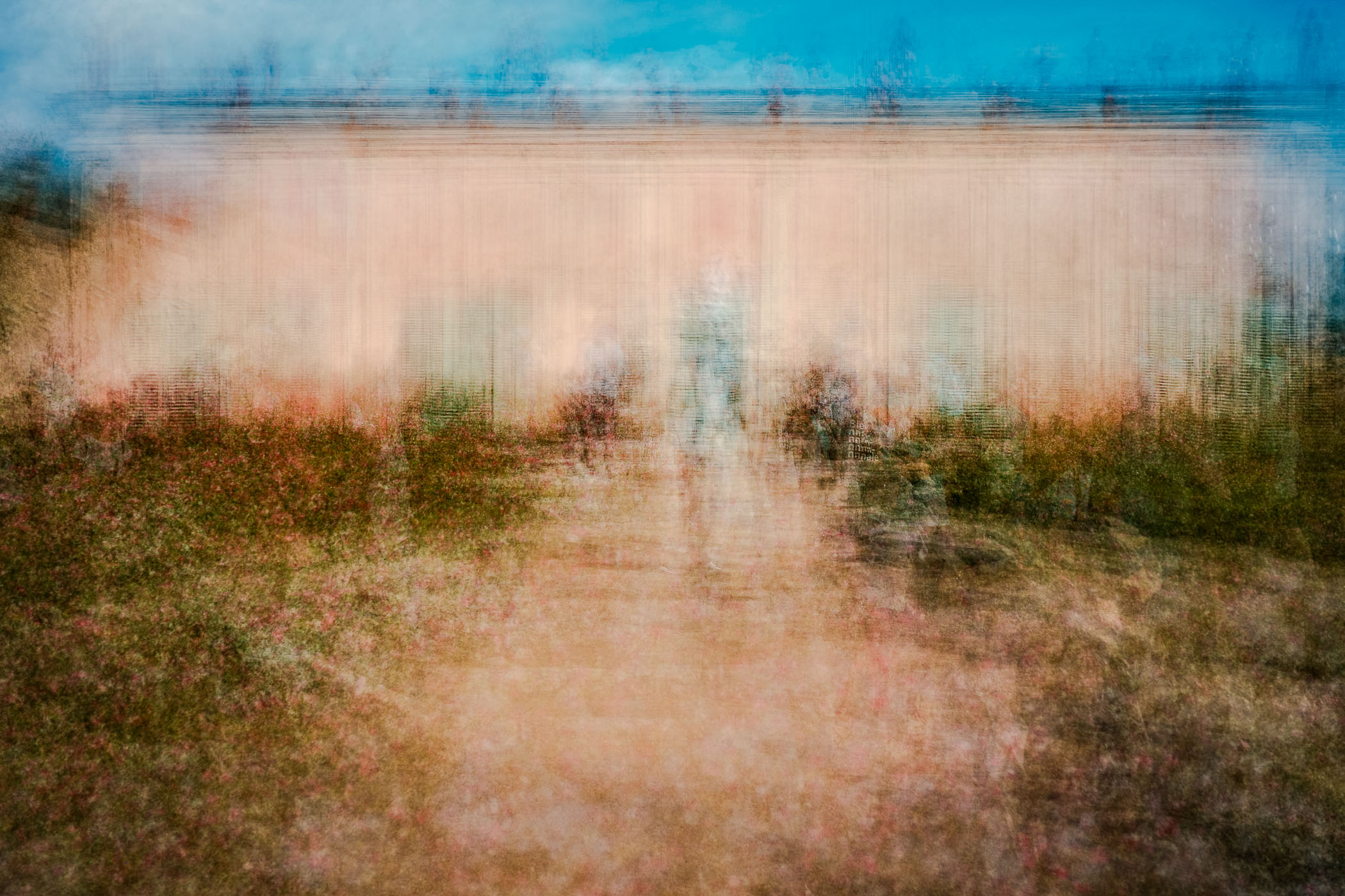
As well as the over-tourism images, I made several other composites, always cognisant that this was a romantic trip with my lovely wife, so I was careful not to over-indulge.
What do you think? Drop a comment below with your thoughts, whether this approach works, and whether you’d do anything differently.
| More: | |
| And now for something completely different | Capturing life with a Ricoh GR on Macfilos |
| Leica Q2: The perfect full-frame travel camera? | George James: Street photography at its best |
| Lens 57 |
Make a donation to help with our running costs
Did you know that Macfilos is run by five photography enthusiasts based in the UK, USA and Europe? We cover all the substantial costs of running the site, and we do not carry advertising because it spoils readers’ enjoyment. Any amount, however small, will be appreciated, and we will write to acknowledge your generosity.
Wonderful ! I could see JMW Turner capturing those images on oil on canvas
That comment makes me wonder what Turner would do with the tools available today. Fascinating thought experiment.
I loved the concept Andrew! Lovely photos to show the scale of the crowds.
I cannot wait to try it with my GRIV!
Thanks Venkat. You’ll enjoy experimenting with the technique.
Unique and beautiful, my favorite images are impressionistic. That you did this with such a diminutive camera is more impressive.
Re: crowding in European tourist areas, it isn’t enough to go in the off season any longer, the crowding continues despite many attractions and places closing.
Yep – it seems like Florence, Venice et al are busy at all times of the year now. London is bonkers at the moment too. Thanks for the lovely feedback.
This is very different from the ‘long exposure’ take, isn’t it? There, the monument would be sharply defined, but the crowds woud be a blur.
Here, its as though you’re showing that the mass of visitors distorts the monuments themselves…
That’s it in a nutshell. I wanted something very different to the “usual” long exposure. Having lots of freeze-frames overlayed with the slight movement helps to enhance the feeling of chaos that you feel when you are there in person.
Great concept and images Andrew, they really do convey the sense of crowding.
Thanks Richard – much appreciated. It’s definitely a fun technique.