
John Shingleton’s heartfelt denunciation of the of the Sony a7 last week rings a bell or two in my head. Perhaps John was a bit unfair on the a7; it is undeniably a good camera if you can live with its menu and control system and if you can resign yourself to built-in obsolescence. But I agree in general with his conclusions.
The fiddly and complicated menu system is one the main reasons I do not own a Sony, either one of the a7 range or the RX100 series. I just do not like the layout, and in particular I object to the arbitrary groupings which make navigation a trial.
Other manufacturers, especially Olympus, are not far behind in over-egging the menu pudding. Panasonic’s approach, on the other hand, is nearer to Leica’s simplicity and is all the better for it.
If, however, you are a dedicated Sony or Olympus fan you will eventually become so familiar with the menu layout that adjustments will become second nature. To this end, users really familiar with the camera may not recognise the criticism. The trouble is that many of us have been spoiled by the relative simplicity and intuitiveness of Leica’s layouts.
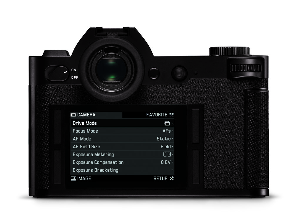
All recent X and M cameras have had easily understandable linear menu screens with relatively few sub-sections. The oddball T is an exception — a totally different touch interface that some love and many hate. Of the recent cameras, the SL has by far the best arrangement of buttons and menu screens I have yet seen, and the new M10 comes a close second. Both are inspired designs.
As John says, the a7 is more computer than camera and, in my view, is a fiddle to use. Only Leica has made a conscious effort to wind back the tendency to digital bloat. Unfortunately, since Leica is an expensive brand, the lower end of the market is dominated by the computers-that-think-they-are-cameras brigade. Apart from the little Ricoh GR and some Panasonics (the GX8 isn’t too bad, and the LX100 seeks to satisfy Leica owners in the guise of the D Lux), the general market is a sea of complexity.

Our views on this issue of complexity are by no means universal. The Sony A7 range has an enthusiastic following and there is no denying that, for full-frame cameras, they are reasonably priced. Not everyone wants to sink £5,000 into a Leica, plus lenses of course. For many, also, the computer-like complexity of modern cameras is something they have learned to live with and accept. I respect that view and would not suggest that the simpler approach, as exemplified by the Leica M0 or SL, is the only way forward.
For the past 15 years the digital camera has been growing in complexity as it has blossomed in capability. It can now produce results to out-strip film — whereas at the beginning of the century digital was definitely a poor second to film/ To a large, extent, digital is now a mature product.
Leica, pummelled by its enthusiastic rangefinder following, has sought to rein in the worst excesses of feature bloat. That, quite apart from the other virtues of the cameras, is as good a reason as any to own a Leica.
________________
I have to agree Mike. I’ve just come across to the Leica T system and I find the UI a breath of fresh air compared to my Nikon D3x. I really appreciate the simplicity of the menu system, especially how I can customise it to just have the handful of items I want, and I can generally get anything done with 2 quick taps on the screen, rather than faffing about with dpads, OK buttons and DOS-era menus.
The simplicity frees up my mind to think more about the shot.
Adam, I agree entirely. There is a tendency to think that a touch-screen interface must be complex and I suspect that puts off many people who have technophobia. In reality, though, this interface is simplicity itself. The camera is easy to learn and easy to use. My main concern is that the screen cannot be turned off (nor is it possible to switch to viewfinder-only view because there is no physical toggle switch). I would have just one button to enable/disable the screen. Ideally I would reprogramme the video button which I never use.
When individuals with experience shooting film go the way of the dinosaur, then the only market will be people brought up on IPhone photography. So where’s the future market for cameras like the X, Q, SL and M ? Like it or not, the TL might be the future of digital photography.
Looks like my first comment without name didn’t appear . All i was commenting was that I found SL boxy and confusing when I rented it. On other hand it was easy with A7ii when bought and m10 when I tried at leica shop. Oddly they were not interested in showing me the m10 at Mayfair shop.
Sorry about the missed comment, Mahesh. I didn’t see anything. The comparison between the SL and A7 is interesting, given that both cameras have the same size sensor. As you say, the SL is boxy and I also think it has a rather unappealing flat front, all a bit too angular. But the control system is actually very intuitive and easy to learn. It must be the only digital camera with only one engraved legend — for the on/off switch. The rest just follows.
Hi Mike not a problem. I think I must’ve done something wrong as I was sending the comment From my phone.
I love the X layout, having come from the complexity of Nikon’s system, which has lovers and detractors in equal measure. But nothing prepared me for the Leica systems simplicity inside my X 113.. I love it, and wish all manufacturers followed the same route.
I agree with you on this. X, Q, M, SL all have simple and uncluttered interfaces.
That’s a nice angle Mike, and one to which I subscribe.
I really like the SL, but the M is already too big for me…
I am interested to see what is coming regarding APS-C, a TL with a viewfinder would be very interesting to me. I realise that I haven’t used them and I don’t know how well they work, but in concept I am interested in the iPhoney type software interface, it’s different, at least, but still relatively sparse compared with something from the manufacturers that you mention.
That was me by the way!
Regards, Mahesh