Last month I just happened to have examples of all Leica’s current mirrorless cameras in one place at the same time. It provided the ideal opportunity to check out the new Leica menu family. It was shortly after I’d finished reviewing the Leica D-Lux 8 and while I was preparing the next article on the SL3. These two were fresh in my mind, but the Q3 made up the trio for the purposes of menu comparison.

Leica’s decision to simplify the menu system into, effectively, one contiguous list of headline functions is proving popular, not just for its simplicity but because of its universality. After using cameras from other manufacturers, most recently from Fujifilm, Ricoh and Panasonic, the simplicity of Leica’s approach is refreshing.
I was forcibly reminded of this while assessing the menu system of the D-Lux 8 a few weeks ago. As I was writing in glowing terms of the menu’s simplicity, along came the Fujifilm X100VI, which we had had on order for some months. I collected it eagerly and immediately started the set-up process. I believed everything would be easy since I had reviewed the X100VI only a few weeks ago. How wrong could I be? I had forgotten everything and had to plough through the menu system in some confusion. The Leica solution is so much more logical.
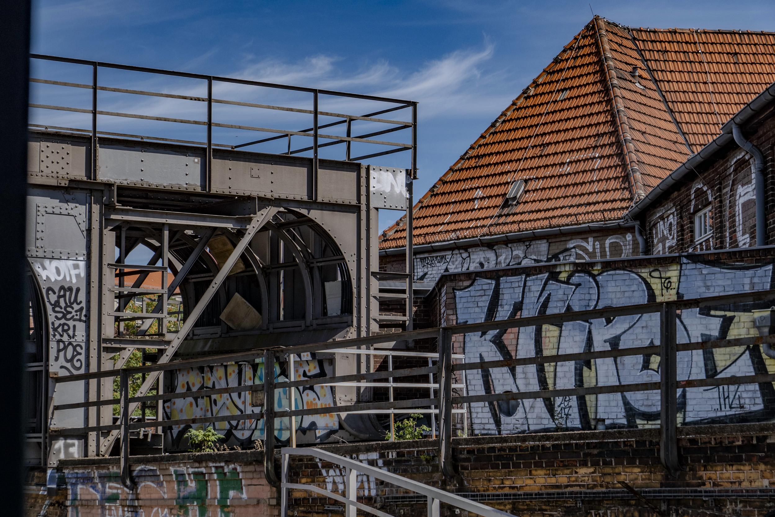
Leica Menus: Know one, know ‘em all
In theory, if you are familiar with one of Leica’s mirrorless cameras, you will know them all. Even the M11, although it differs to some extent, also follows the new company style. But I’m looking here at the mirrorless cameras. I’m calling them Daddy Bear, Mummy Bear and Baby Bear.
Let’s start with the baby of the family, the little D-Lux 8. This camera, interestingly, is not that much different from its predecessor, the D-Lux 7, but it has benefited from a Leica makeover and the new menu system. We published a full review of the camera in August.
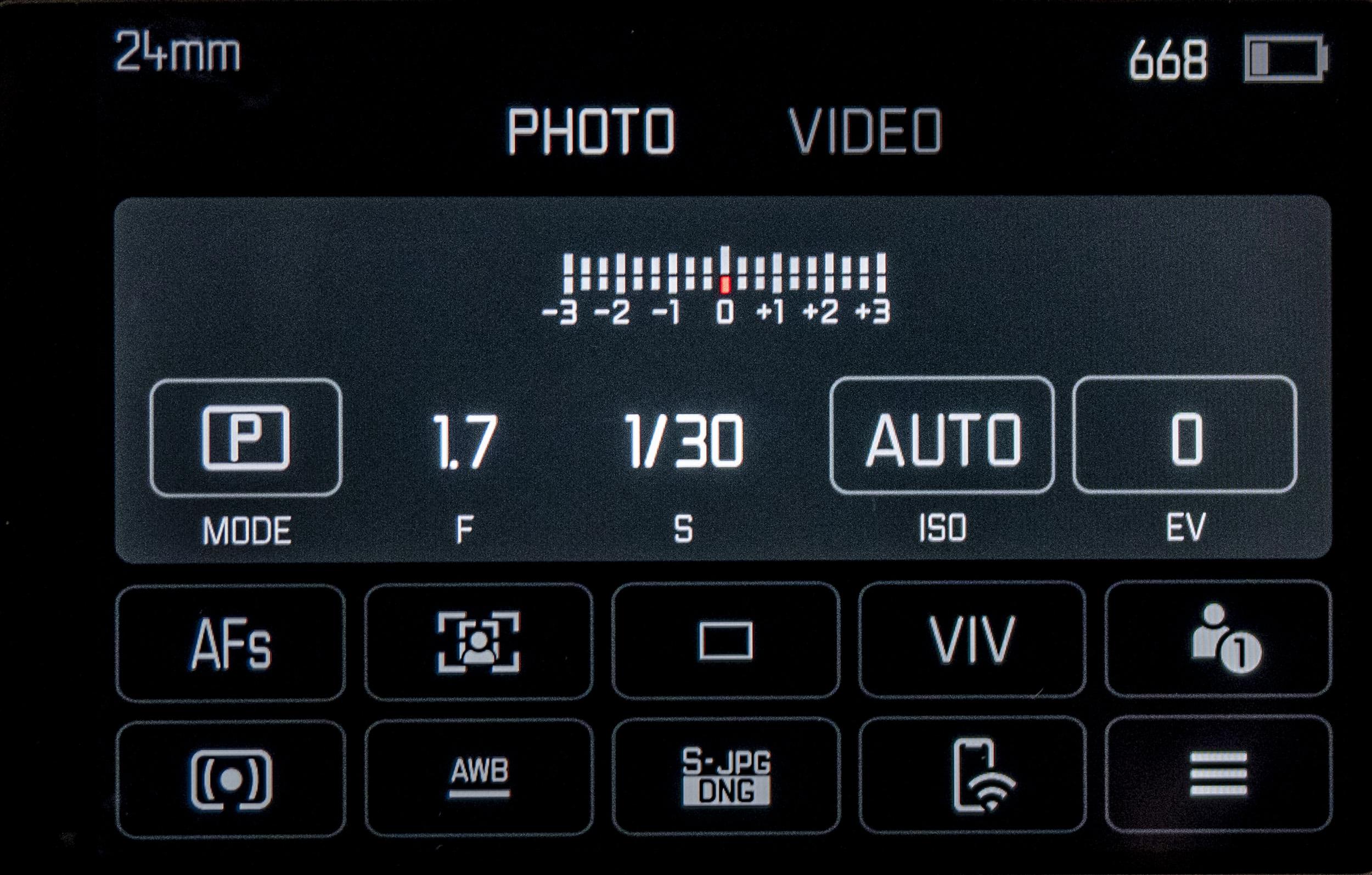
The D-Lux set up is obviously based on the menu system of the Q3. It follows the same design, both typographically and in layout. Both start with the Control Centre, which offers the primary choice between PHOTO and VIDEO and a range of most frequently used options. This is the first screen you see when you press the MENU button, and it takes the place of the quick menu on other systems.
In both cases, there are three rows of options, with the fixed top row being dedicated to Exposure Mode, Aperture, Speed, ISO, and Exposure Compensation. Below are ten further variables which allow instant change of functions. On both the Q3 and D-Lux 8, the bottom right button takes us to the full menu. Or you can press the MENU button for a second time to get to the same point.
Pagination
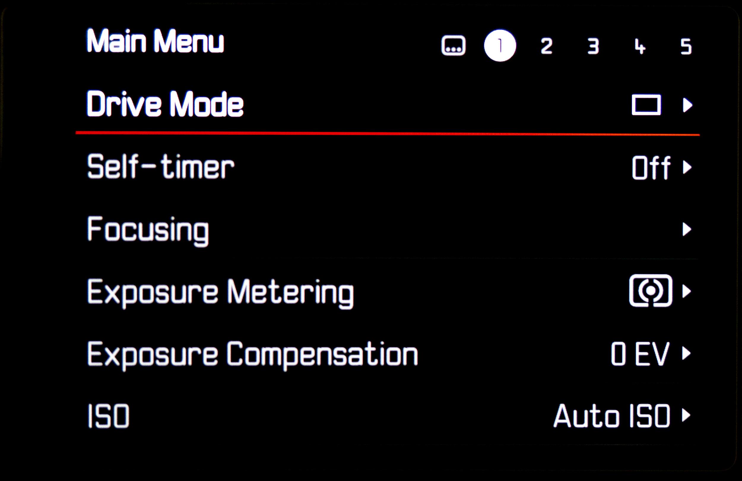
The main menu of both cameras is arranged over numbered pages, although you can scroll right through what is in effect a list of 30-32 top-level options. All this is easy to assimilate, and the user benefits from the conformity between phraseology and placing, which makes setup easier. If you have set up your Q3, the D-Lux 8 follows the same method.
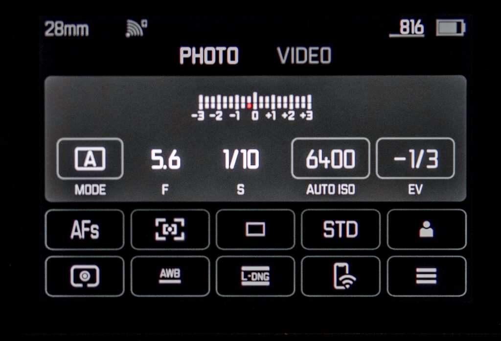
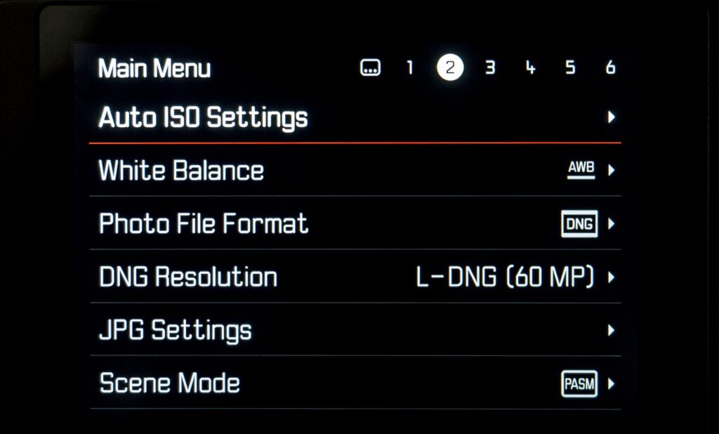
The menu system on the Leica Q3 is the oldest example here, and it is surprising that the D-Lux 8 is almost identical since it was announced recently, some six months after Daddy Bear, the SL3, which introduced significant differences.
The SL3 menu system incorporates several refinements that, I feel sure, will also appear in future cameras — although development is taking place all the time. I truly appreciate the SL3 system, and its main improvements add another layer of simplicity and usability.
Leica SL3: More space
The first obvious difference on the SL3 is that the Control Centre is less cramped than before, thus ensuring that the icons are easier to press without mistake. As a result, there are fewer options on display. The top row of fixed adjustments is easier to read (and to adjust). The options are Aperture, Speed, ISO, and Exposure Compensation. Exposure Mode (PASM) is relegated to the first position in the middle row, although it can be moved.
Instead of ten options on the bottom two rows, as with the Q3 and D-Lux 8, the SL3 offers eight larger icons. But the big change is that the function of these buttons can be reassigned by performing a long press on the icon, then choosing from available alternatives.
This is a big step forward in customisation and ensures a more personal approach to the initial menu. The cleaner layout with larger buttons is much easier to use than the older versions on the Q3 and DL8. In effect, these eight buttons supplement the assignable function keys which are a feature of the SL3.
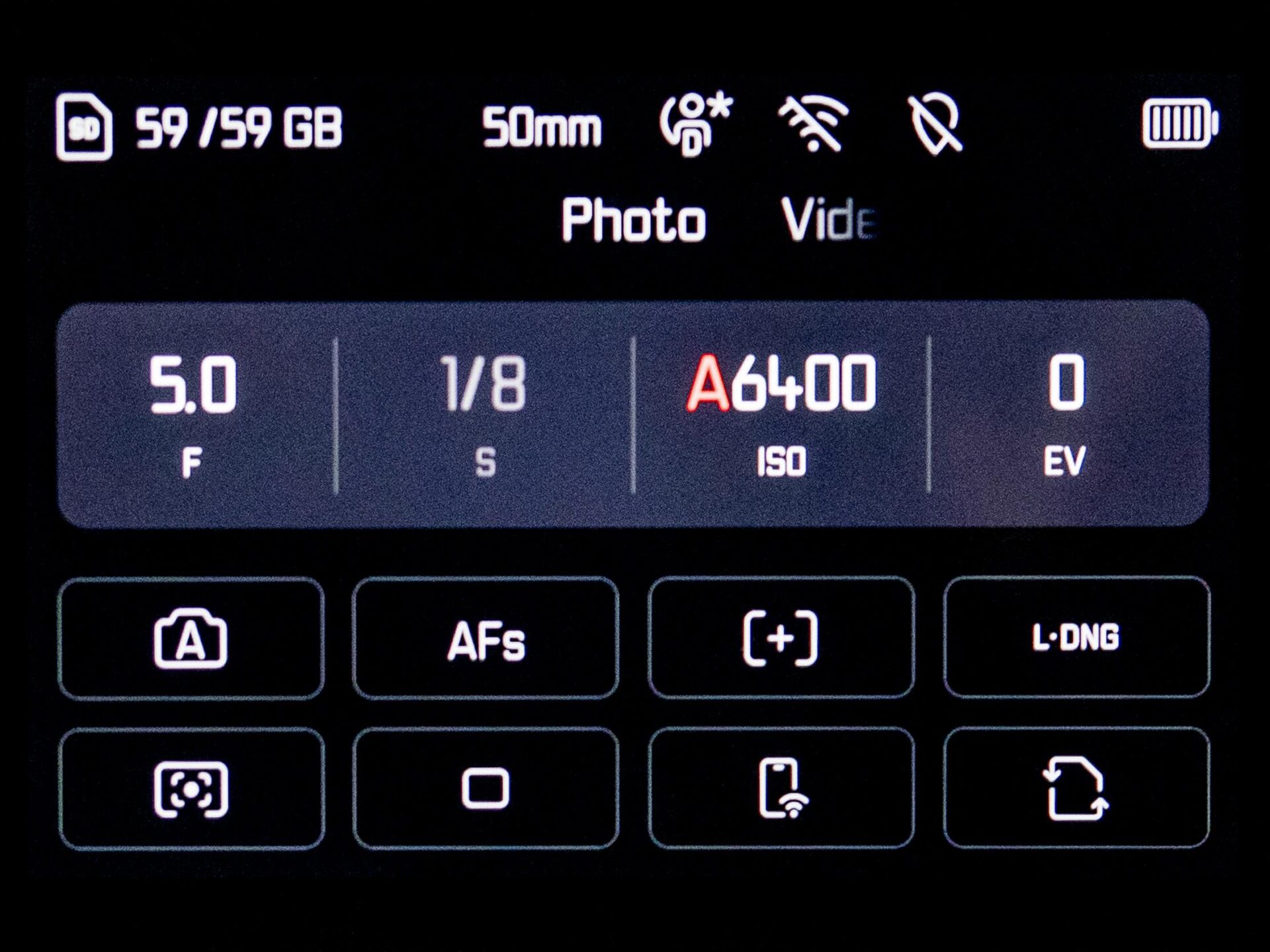
One of the fixed options on the two earlier designs of the Control Centre, a button to access the main menu, no longer appears on the SL3 screen. Instead, a second press of the MENU button is required to bring up the menu. This is straightforward and no one will mourn the loss of this dedicated button. If we exclude this redundant button, the difference between the SL3 with 8 buttons and the Q3/DL8 with 9 (useful) buttons is of no real concern. The ability to customise your choice more than compensates for the slight reduction in number.
A further refinement on the SL3 is that you are never fumbling when switching between landscape and portrait orientation. The icons on both the screen and the electronic viewfinder in Live View change with the orientation. So, if shooting in portrait mode, everything is the right way up and is just as informative as it is when the camera is in normal orientation.
Leica Menus: Logical approach
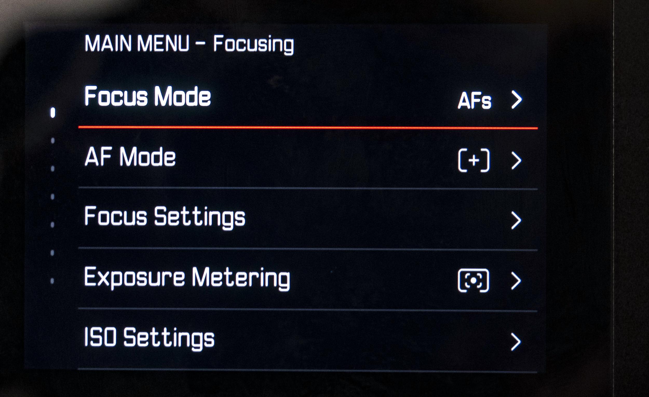
The second big change with the SL3 is the main menu itself. Instead of being arranged over five or six pages (each with six functions), the SL3 menu adopts a more logical approach. There are now five items per screen, but the top headline row shows the relevant section: Focusing, Exposure or Photo, Customisation, Connectivity, System.
Since the sections are of varying lengths, this is a logical arrangement which avoids the arbitrary splitting of the 33 menu items into pages of equal size.
Overall, the SL3 menu system is cleaner, more spacious and easier to follow. Dig deeper, however, and you will find that the customisation of dials and Fn buttons has also benefited from a major makeover. With the earlier design, controls had to be set up individually with a selection of the many functions available for assignment.
Thus, when specifying the use of a particular control, the choice of options was limited to those you had previously selected for that particular button. It works, but it is rather long-winded and cumbersome.
Frequently, after initial set up, you find that the selected options for a particular button are missing something you wish to use.
Central control
With the SL3 system, selection of Fn button options is a central operation. There is a long list of options (67 in fact) which can be switched on and off through a slider control. If they are switched off, they remain accessible via the menu, but they cannot be assigned to buttons.
In reality, there are only so many functions that you would ever consider important enough and frequently used enough to warrant such direct access as a Fn button.
A breeze
The result is that you have selected all the functions that you might remotely wish to assign to a button, and these options then become available to all buttons. Once the initial cull has been made, setting up Fn buttons becomes a breeze: Long press in the usual way, scroll through the list of options and set. There is a bit more scrolling to be done, but the convenience is paramount.
I will go into this in more detail when I review the Leica SL3’s handling in the forthcoming review of the camera. But I am very impressed with the appearance and functionality of the latest version of the Leica menu and look forward to its implementation across the range (no doubt with further refinements).
Conclusion
As I mentioned earlier, the odd thing is that the D-Lux 8 menu layout is more or less identical to that of the Q3 and not that of the SL3. The SL3 preceded the D-Lux 8 and the basic Q3 menu (which is carried forward to the D-Lux) was launched in May last year.
Possibly, Leica felt that it was more important to ensure as much similarity as possible between the “baby Q” D-Lux 8 and the Q3. The SL3 is the “professional” camera in the range, and benefits enormously from the changes that have been made to the menu system. It would probably have been overkill for the Baby Bear. But I think it will be the SL3 version which will percolate through to forthcoming models. It’s just so right and logical.
Despite these detail differences between the three versions of the Leica menu system, the overall concept remains a triumph. I believe it is the simplest, easiest and most intuitive menu system of any digital camera on the market. It provides a strong incentive to adopt Leica. And, if you already own one Leica, there is strong logic in staying within Leica’s comfortable ecosystem. But perhaps I’m biased. Amateur Photographer, Fstoppers, The Phoblographer and PetaPixel all take issue with me.
What do you think? Do you like Leica’s menus and appreciate the uniformity across the range? Or do you prefer the Canon, Nikon, Fuji or (even) Sony approach?
Jono Slack spends six months with the new Leica SL3
Claus Sassenberg’s first impressions of the Leica Q3
Jono Slack’s verdict on the Leica Q3
Mike Evans takes the Leica D-Lux 8 for a spin
Make a donation to help with our running costs
Did you know that Macfilos is run by five photography enthusiasts based in the UK, USA and Europe? We cover all the substantial costs of running the site, and we do not carry advertising because it spoils readers’ enjoyment. Any amount, however small, will be appreciated, and we will write to acknowledge your generosity.



I’d love a baby SL with an even simpler menu.This, so I can spend more time photographing than navigating menus, but Leica’s current menu system still beats the competition for me. I could (and to my surprise) sometimes actually find seldom used settings when I needed them on location which I miserably failed to do with other systems. I mean, if a pink tractor suddenly appears you’ve got to be ready! No time for fumbling about.
Better than average but still the basic underlying tree-hierarchy structure that everyone uses. Actually Sigma had a similarly clean design many years back.
In my opinion the only true innovator in menu/UI design is Hasselblad. The UI design on the X system cameras is truly excellent. It’s a pity the bar to entry is so high.
Something I haven’t tried, David. but I am now curious.
I recently have been disappointed by the oversight on the new M11D where one cannot format either the SD card nor internal memory via the Foto app. Instead Leica is suggesting one use their PC to format memory of the M11D.
In the interest of keeping it simple on the M11D, the formatting process has become complicated unlike formatting all the other M11 variants.
How ridiculous.
I was not aware of this, although this was the practice on the M10-D and the M-D as far as I can remember. I wonder if Jono Slack noticed this during the test. I agree it is inconvenient.
I currently have an M240, CL, SL and SL2-S. Every one has a different interface and control layout.
I appreciate the more recent models are all similar now, but my stable is definitely confusing.
Of all of them I prefer both the control layout and menus of the original SL, in fact I think the four button long/short press setup was genius, yet only ever used on the SL and S system.
I do think the menus are a real plus for Leica and no question that Sony and Fuji menus need a total makeover.
Thanks for this article, this is something I see little coverage of.
Thank you, Mark. Leica seems to be making a real effort on this. The SL3, in my opinion, is the next step forward, both in terms of the linear layout and the ability to custom controls on the Control Centre screen. I hope that this improved system will percolate through to new models as they appear, starting with the M12 and Q4. However, I suspect any variants of the Q3 will retain the same layout and operation as used on the current Q3 and DL8 for the sake of conformity,
Thanks Mike,
I agree that other camera companies’ menu systems are often cluttered, illogical and confusing. UI and UX have been developed in theory and in practice for centuries, so there are no real excuses.
For example: Back in the days of the Roman Empire it was considered critical to have all forts and mile stations conform to a standard design. What has this to do with Leica and camera menus?
The Roman military understood that when they transferred soldiers to a new location that standardization of design helped decision making. The mile station is under attack – where is the armory? Seconds saved = lives saved and victory.
In addition those soldiers could come from anywhere in the empire, so a soldier from southern Italy might end up at Hadrian’s Wall. The majority would not be able to read and write, so symbols/icons again meant soldiers had a standard understanding of where the armory was as opposed to the latrines.
Leicas menus may not save lives but the same principles of providing a standardized level of comprehension and ease of use still applies.
..But only if you’ve already used and known another current Leica, Jon.
If I’ve come from an old Nikon compact which has just died, like a P7700 (..great little camera..) then the Leica symbols are gibberish. Ditto coming from Sony compacts. If Leica is hoping to win over converts from other brands, then unintelligible symbols isn’t, I’d have thought, the way to do it.
What’s the curved-corner, or the right-angled corner, rectangle? There’s a dot, within a square, within a rectangle – that’s presumably small central focusing point ..but then what’s a circle, within a circle, within a curved-corner rectangle? ..Or a circle within curved lines within a curved-corner rectangle?
This is supposed to be photography, not deciphering the Rosetta Stone or hieroglyphics. It’s gobbledegook to people who have not yet used a similarly obtuse set of Leica symbols.
What does the instruction manual say?
When I try a camera in a shop, the instruction Manual isn’t usually there, close to hand – it’s often (if they can find it) in the original box in a store-room somewhere.
Sometimes I read the instruction Manual online before going to the shop, and jot down notes. But if the camera seems too complicated to understand while I’m actually trying it I think “Why do I need this incomprehensibility?” ..and just don’t bother with it any further.
Why should photography be a struggle?
Good analogy, Jon. The standard design of forts, barracks and way stations was a real help for soldiers as they moved around the Empire.
Great article Mike
It had never occurred to me that the symbols in the quick screen were a problem, but perhaps I have spent too long looking at them to be able to forget (even though I seem to manage to forget everything else!).
The ability to change the quick menu on the SL3 is a real game changer in my opinion – especially as you can then save that setup (together with everything else) to a user profile. . . . . . . . Which means you can effectively have a different menu system with each user profile, which I find pretty useful.
All the best – great article!
Jono
Thank you Jonathan, much appreciated. My review of the SL3 follows later this week and I fully agree with you on the improvements they have made to the menu system in that camera. Mike
Ugh. I’m far better with WORDS rather than with ☀️ (symbols), because a menu with ☀️ or ♨︎ on it means that I have to stop and think “W-what does ♨︎ mean?”
So I far prefer camera menus with WORDS on them, not symbols. Having symbols means that I have to learn something new, whereas, if the Menus are in English, I already know what the options mean, because I already know and understand English. Having symbols means that I have to learn a new language ..almost like learning Japanese, say.
So I MUCH prefer the Menus on Sony, Nikon, etc, cameras ..I mean it took some learning to understand what ♥︎ and ♦︎ mean in Olympus menus (..er, silent shutter and, er, stabilisation, I, er, think, or maybe electronic first curtain, or something).
So for all the Ooohs and ahhhs about “how much simpler..” Leica menus – supposedly – are than those in other cameras ..No; it just doesn’t work for me, and I find it a silly affectation. ‘Focus Mode’ – in words – I can understand. Same with ‘Drive Mode’ or ‘ISO settings’. But weird symbols ..No. They need an extra layer of attempt-at-comprehension when I see them. My response is “what does this mean?”
So I’ll stick with WORDS, thanks, not 🁣 or 🀆 or ♒︎ or ⦿ or ➰ or ⚩ or ✛ or some such.
In your first example (D-Lux 8 Menu) I can understand AFs, VIV [Vivid?] and S-jpgDNG and AWB (..but why is it underlined?) ..but the other symbols are just incomprehensible ..to me, anyway. (Three horizontal lines possibly means ‘Menu’ ..but why not just use the word ‘Menu’? ..It’d fit in the available space.
(Perhaps it’s because suitable words in other languages wouldn’t fit in the same little spaces, and so Leica uses, maybe, the same symbols in ALL languages; you could try swapping the Language on any of these cameras, Mike, and see what happens to the Menus ..that’d give us a clue.)
So, “Leica Menus: The quest for the perfect system” ..sorry, no; it just isn’t anywhere near “perfect” for me!
David,
While I don’t disagree with you on your preference for words instead of symbols, I am prepared to let Leica off the hook on the question of the hook for the icons on the so-called control panel. Ideally, they would be accompanied by a word in the appropriate language, but it would look cluttered. The good thing is that there are only eight to memorise, and some are self-explanatory to any photographer.
As for the general drift of Leica’s menu system, I am happy with what they are doing. Most readers of Macfilos are Leica users in one form or another, so I suspect they will also be content. But let’s hear your views. Do you agree with the article and its theme, or do you prefer an alternative? Note, incidentally, that the headline refers to “the quest for the perfect system”. I didn’t suggest it is perfect. And of course, that would be a dangerous statement, knowing that you are lurking in the wings!
Agree that words are better than symbols. But I do see a lot of words on the screen shots Mike provides. You mentioned you prefer the Nikon style of menus. My Df uses symbols on the info screen that displays when I am not using Live View or playback of images. I have not tried to learn the meaning of those symbols (the one that are not obvious) for the same reason as you, I suppose. But as soon as I press the menu button. the menus come up in words. I checked, and the camera has 28 languages built in.
It’s all a matter of personal preference, I agree. The main point I was making was the system across all Leicas. Agreed that other manufacturers adopt a common style, but Leica is now on the right track. Actually the motivator for this article was the change in the D-Lux 8 from Panasonic to Leica menus. Previously, the D-Lux and V-lux were outliers.
Hi David, I agree that I hate the symbols in general. I cannot remember what most of them mean. But after I have set up my camera essentially as a film camera they become luckily irrelevant However, they do make camera setup very painful without simultaneously studying the manual.
Set up as a film camera – yes! that is the way I use my Nikon Dfs. Except, they are much better than film cameras.
Après Kodak, Nikon, Fuji et une incursion ratée chez Canon, j’ai enfin pu utiliser les menus de mes appareils (CL et Q3) ! Et je ne lis pas les menus du Ricoh GRIIIX ( ai-je tort?)
Nul retour en arrière n’est envisagé !!!
Un grand merci pour vos articles passionnants
Cchristian
Glad you agree on the Leica menus, Christian. I am also a fan of the Ricoh GRIII menu layout. It is clear, businesslike and designed by a photographer rather than Disney illustrator. Mike