

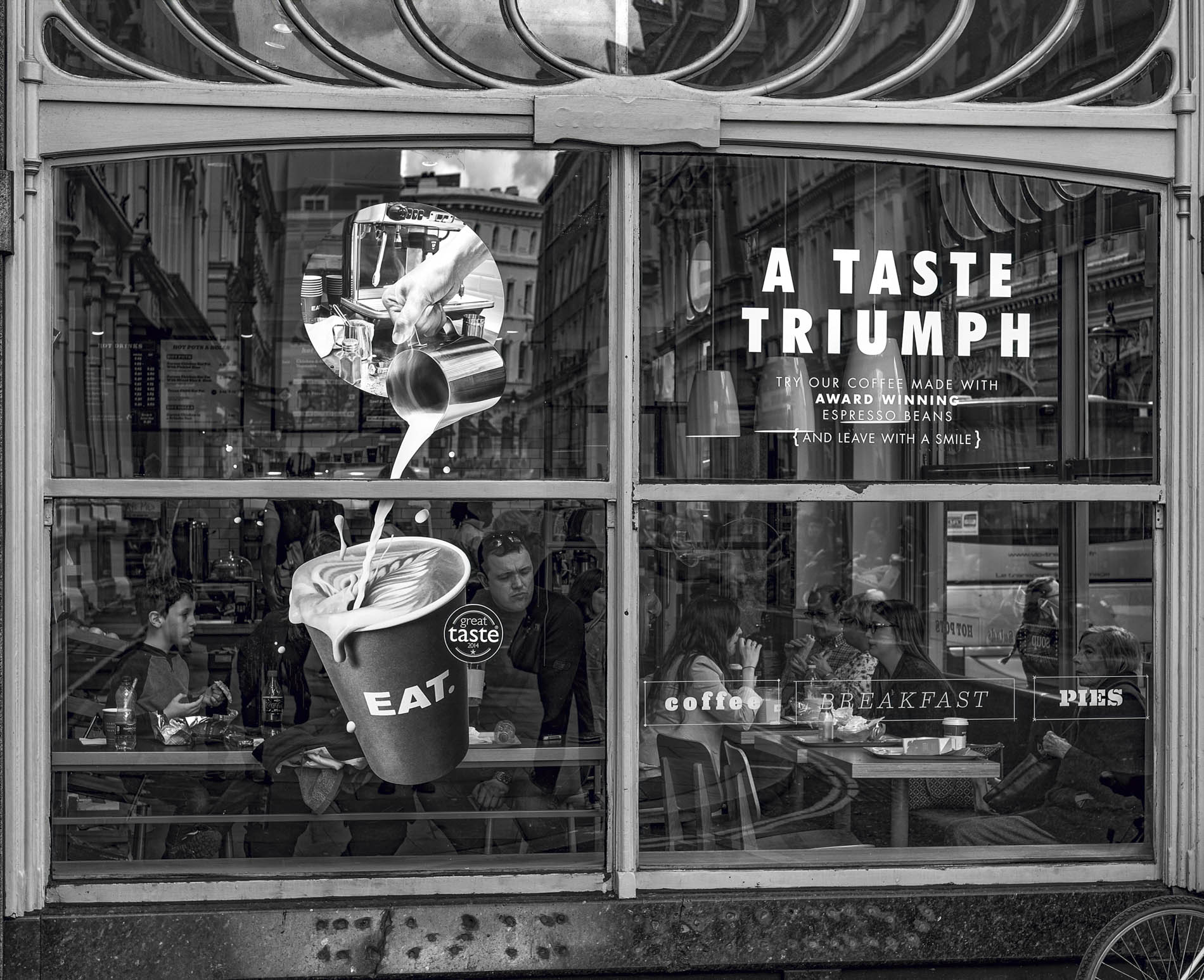
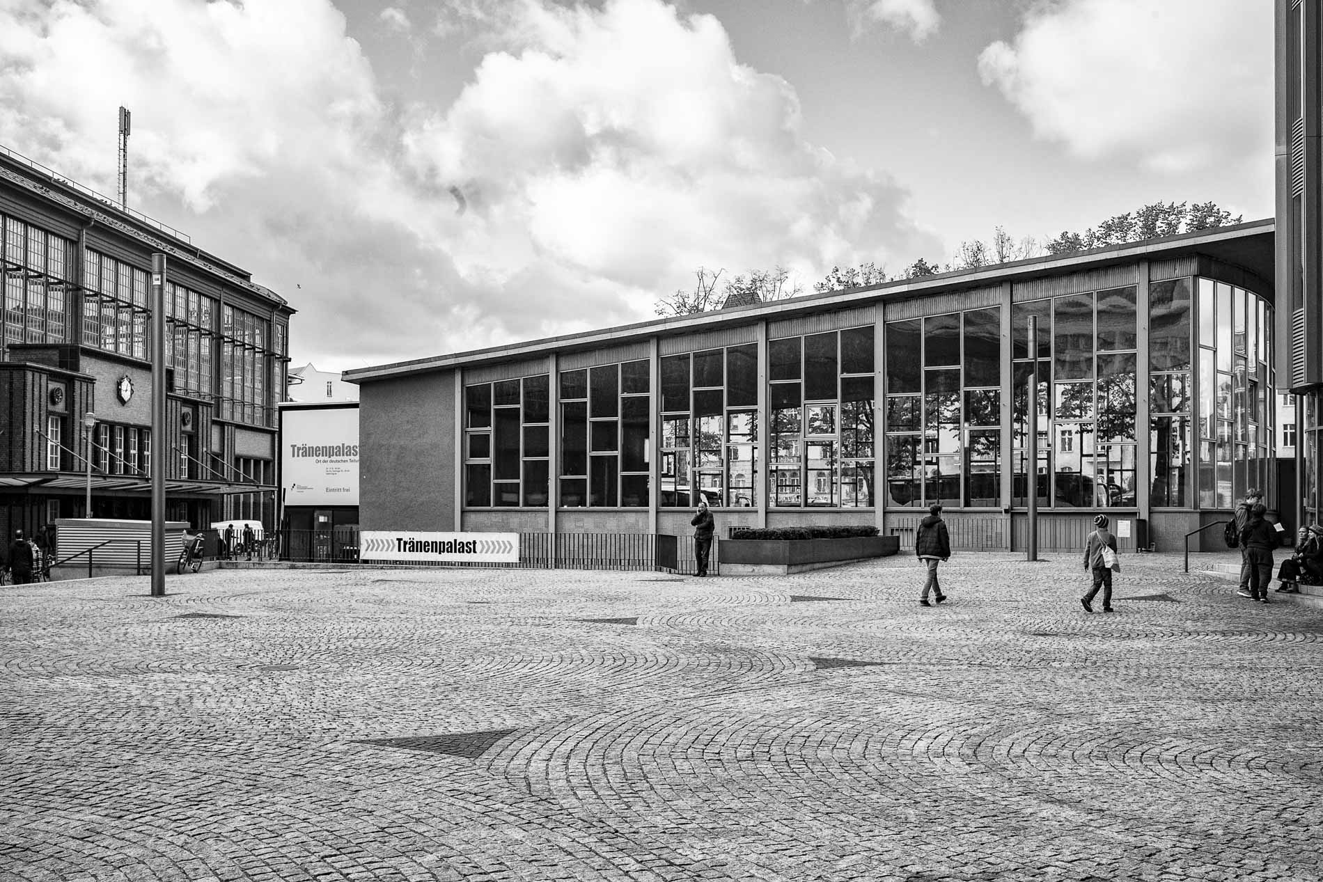
My article on volcanic viniculture on the Canary island of Lanzarote resulted in an internal discussion on black-and-white versus colour. But it was a comment by our regular reader and supporter, Kathy Davis, which made me think more about my almost instinctive predilection for monochrome images.
When I visited the Lanzarote vineyard I had the Leica Q3 43 in hand and, of course, the RAW images I used were in colour. The landscape was pitch black, with green sprouting here and there. I decided to convert the images to monochrome on a whim. But, after publication, several readers, including David Askham, suggested that colour might have been better.
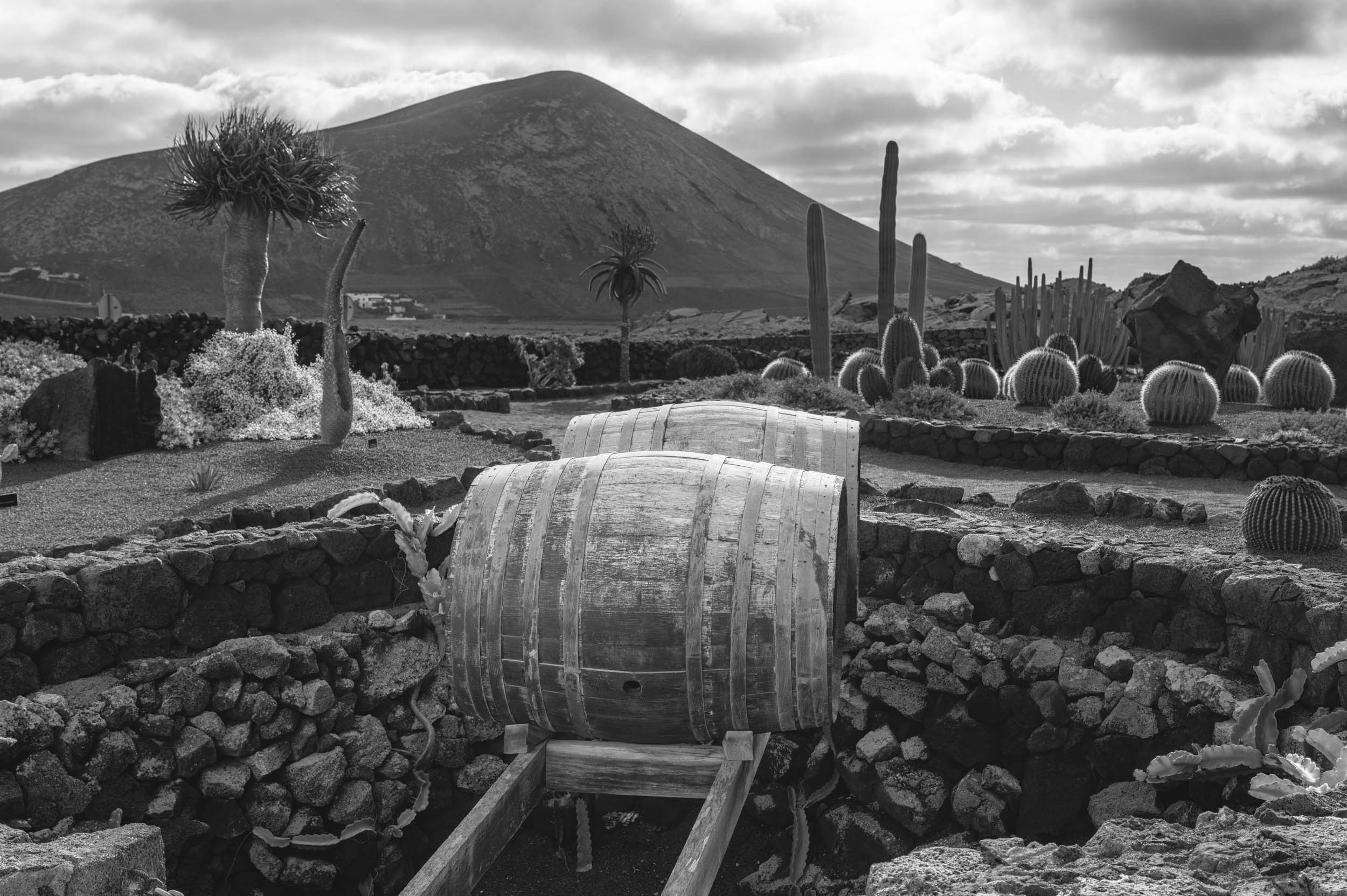
So I added a gallery of original shots beneath the article. Even I was then convinced that I’d made an error of judgement. Just because the landscape was almost entirely monochrome, the flashes of colour stood out all the more. Lesson learned.
Motorcycling heritage
After this episode, I began to reflect on why I find black and white photography so compelling. It all started in 1962 when I moved from my childhood home in south Lancashire — where I had worked as a clerk at the National Provincial Bank for four years after leaving school on my 16th birthday. Because of my love of motorcycling and my founding (at the age of 17) of the national Honda Owners’ Club, I had been noticed by a great personage in the world of motorcycling.
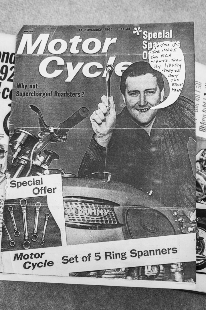
This was Harry Louis, then editor of “Motor Cycle”, who later became an important mentor and lifelong friend. Harry had been following my activities and had read some of my articles for the club monthly newsletter. As a result, he invited me down to London to join the team.
That was in March 1962, when I moved to London, where I have remained ever since. I was paid £8 (then $24, now $11) a week — to cover accommodation, running my motorbike, food, and everything else. However, it was a massive step up from the bank’s £3.50 weekly stipend, and I felt that I had really arrived. I paid £3 out of my munificent salary for a nice room in Muswell Hill, North London, including breakfast and dinner for seven days.
Amateur Photographer even
Our motorcycle magazine was a minor, but venerable (founded 1903) cog, in a staggeringly large empire of technical magazines, which included Autocar, Amateur Photographer, Flight, Wireless World, Motor Transport, The Electrical Review, Yachting World and Farmer and Stockbreeder, and Poultry World.
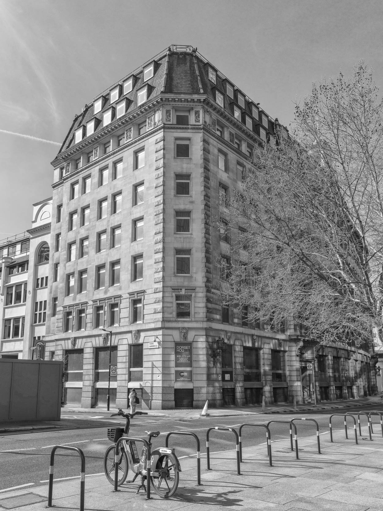
There were pickings for everyone. Every passion, every hobby, every foible known to the (respectable) human world. Here, among all these magazines at Dorset House, was where I was first introduced to the world of professional photography at a turning point in the history of press photography.
It was then a predominantly black and white world that I entered. All the magazines were produced in the hot-metal letterpress factory behind our imposing HQ at Dorset House near Waterloo station. Black on white(ish) paper was the age-old publishing repertoire.
Colour was an expensive luxury for publishers in those days, and was used only sparingly for special occasions — especially by relatively impecunious trade and technical publications.
Hot metal
Indeed, most of our magazine was black and white. Every week, we would run a couple of colour pages as a foreword, which were printed elsewhere on shiny paper, using the photogravure process.
For the main, though, the galleys of typeset proofs arrived at our office for proofreading before they were pasted laboriously onto printed double-page layout sheets. Spaces were left for photographs to be added in the print works behind our offices.
Black-and-white negatives and prints were the common currency of the editorial floor. I soon decided I didn’t like the few colour shots that crossed our desks, and I became something of a monochrome bore (although, of course, we didn’t use the word “monochrome”: It was just black and white).
I was able to follow the full process, from professional photo sessions, to inspection of contacts and choice of prints, to “sizing” the print for processing (involving drawing pencil borders on the back of the photo) and the despatch to the platemaker.
Vintage stuff
Alongside the modern stuff, vintage black-and-white photographs from the archives became something of an obsession. A room in the office was set aside for the archives. There, on shelf after shelf, rested the huge “guard books”, consisting of every photographic print that had been used in the production of the magazine.
The Motor Cycle had been in business for sixty years, so we had an impressive array of massive guard books at our disposal. It was a treasure trove of amazing interest, and a constant fascination to turn over a print and see the pencilled crop marks added by colleagues from before the First World War.
Every photograph was sized on the back in pencil and, often, the background or offending distractions had been painted out by the retouchers. In the early part of the century, it was fashionable to remove all the background from, say, a motorcycle and its rider. The retouchers’ work was preserved for eternity in these wonderful guard books.
Sixty years later, we were still following the same process.
The Photographic Department
All the technical magazines at Dorset House shared the communal “Photographic Department”, which existed in a row of ramshackle terraced houses on the opposite side of Stamford Street. SW1.

Here resided the staff photographers who became our fellow conspirators at remote locations in the countryside where cars, cameras, motorcycles and all manner of technical products would be captured in the wilds of normal life.
One staff photographer was a youthful Don Morley, who later went on to greater things in press photography, but has remained a friend for 64 years.
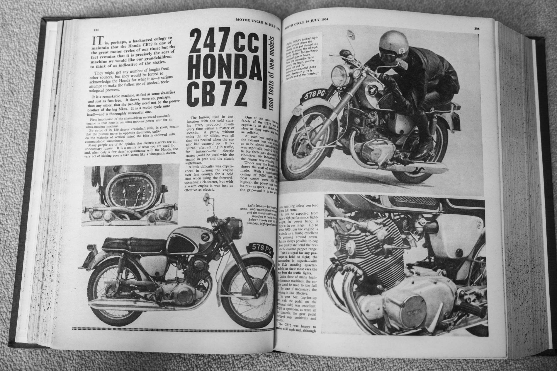
It was a time of enormous change in press photography. The traditional press plate cameras such as 5×4 inch Speed Graphic Press Camera were beginning to lose their dominance. They and their large format output were unwieldy at best.
Pentax and Leica
Some staff photographers acquired tiny personal 35mm cameras, such as those from the upstart Japanese Pentax company. Some, including Don, even owned Leicas, although in 1962 35mm was just becoming acceptable for publication. The old guard was fighting a bitter war of denial.
Wooden plate cameras still ruled the roost in the studios, buried in the dingy basements of the Photographic Department’s terraced premises. It was a rabbit warren, with all the usual studio paraphernalia — backdrops, hissing lights, enormous plate cameras. Most of the equipment dated back to the 1920s, at least.
We’d swelter down there in purgatory during product photography sessions — motorcycle leathers, boots, winter furs, helmets and much else. I believe the studio staff took a particularly perverse delight in making us volunteer models suffer.
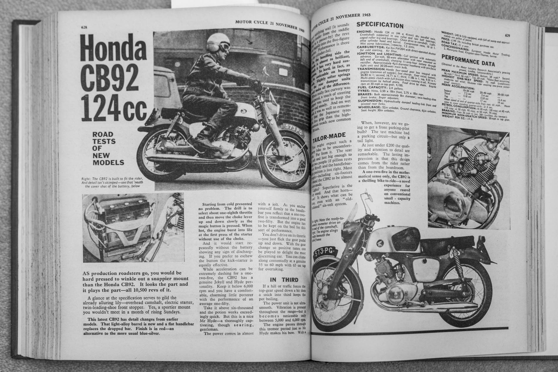
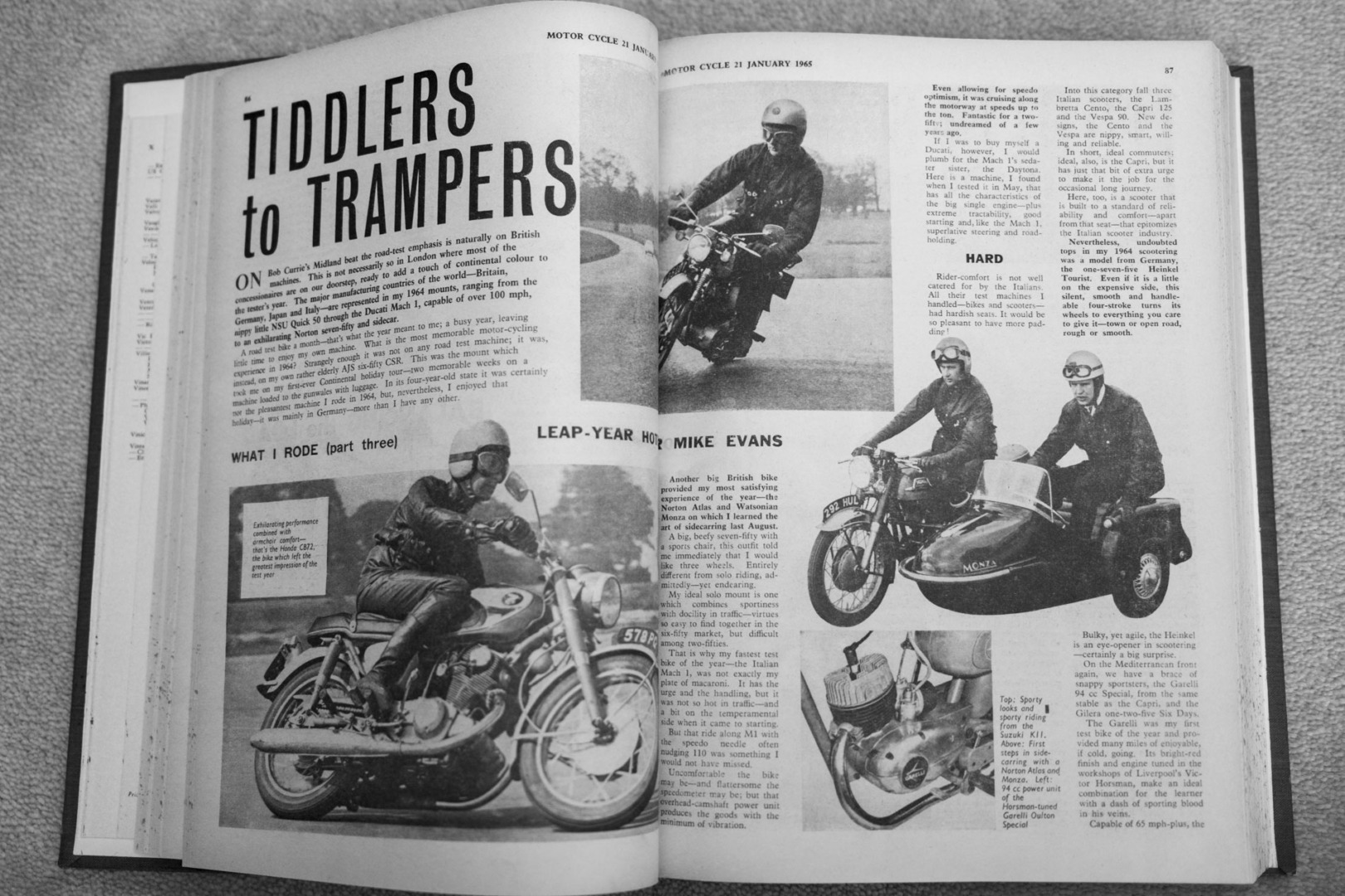
Our outside expeditions produced endless collections of contact prints, which we would inspect using a huge magnifying glass. In our case, as a motorcycle publication, the subjects included me riding the latest BSA, Triumph or Honda at crazy angles on country corners.
Road testing
I would spend at least a whole day every week out testing bikes, supping two-penny cups of hot tea in transport cafés and riding around in a wide variety of conditions, depending on the season. The big freeze of 1962 put some much-needed hairs on my chest, and I enjoyed close encounters with the icy tarmac on several occasions.
We would ride our test bikes to MIRA (the Motor Industry Research Association) in the Midlands, where the banked circuit and electronic testing equipment saved a lot of effort in checking quarter miles and calibrating speedometers. For smaller machines, up to 250cc, we had commandeered a quiet stretch of public road in Hampshire where we carried out our 0-60 mph acceleration and standing quarter-mile tests. Illegal, even then, I suppose. But nobody bothered us.
The standing quarter
My colleague Peter Fraser, a former police constable, was responsible for the Hampshire “quarter”, on the military road near Liphook in Hampshire. A fire-warning sign signified the start of the timing session, while a yellow tree was the clue to click the timing clock. Yellow tree? This was because Peter, every Spring, would throw a can of yellow paint at the poor tree.
On one memorable occasion, I was with him in the local Liphook hardware store searching for a quart of suitable paint. The elderly proprietor, perched on his ladder, asked if he should hand down mustard, canary, or perhaps banana yellow. “What’s it for?” he asked helpfully. Tree painting, however, was beyond his long experience.
Location shooting
Quite apart from the onerous task of riding wonderful bikes around the countryside, there was always a location shoot for the machine under test.
The staff photographer on the duty rota (sometimes it would be Don, or David Nash, or Geoff Riden, or one of several others) would park up the Ford Anglia in some remote spot and stand by an appropriate corner while we had a great time emulating racing poses (again on the public road). Back at the office, we’d wait impatiently for the contact prints to come up from the photographic department so we could make a selection for publication.
The review prints from the studio plate cameras were more life-size and much easier to deal with, but a good part of every day was spent evaluating and selecting black-and-white photographs from smaller contacts. I thought monochrome was marvellous, and the entire process captivating.
The sports angle
Sport played a vital role in our weekly magazine output, although I was mainly focused on handling the bikes and accessories. We had to contend with a full schedule of racing, scrambling (now motocross) and trials events every weekend. This involved riding out to the major venues and then, back at the office on a Sunday night, taking down copy over the telephone from stringers entrusted with the lesser events.
Most of the sporting activity was recorded in our standard black and white process. But international grands prix and, above all, the annual TT Races on the Isle of Man, often involved colour. I’d regularly be tasked with riding all the way to Watford on a Sunday evening, where the colour printers resided, with physical prints, then bringing back proofs to the office in Waterloo.
At the Coo Press
The crowning achievement of my photographic dabbling at the Motor Cycle was the mysterious affair of the Coo Press. Our coverage of the June TT Races in the Isle of Man was jeopardised by a simultaneous strike by the Isle of Man Steam Packet workers and the island’s airport staff. This would have been in the early 1960s.
Our editor was glum as he asked for ideas. Young Mike, always one to have a lateral solution, suggested racing pigeons. Surely, a few crucial negs could be strapped to a vacant leg and transferred from the Isle of Man to London? “Good idea”, said Harry. “But how?”
After some research (no internet, of course) I discovered The Racing Pigeon magazine and, over the phone, the editor showed interest. So I was despatched on my staff motorbike to butter up the editor and propose a mutually convenient cooperation.
Pigeon Post
I found the paper’s offices in Doughty Street, almost opposite the Charles Dickens House. The brass plaque on the door read: “The Coo Press Limited — Publishers of The Racing Pigeon”. The editor was sitting behind a gigantic partners’ desk in his office on the top floor.
He sported a gold watch chain and flat cap, de rigeur regalia of a pigeon-fancier of the day. From the loft above came a cacophony of coos. I realised I had found the answer to our problems. But, just in case, I left my helmet on.
The editor was only too keen to help. After all, it would also make a full-page story for his magazine.
A wicker basket full of eager pigeons was despatched to Douglas, Isle of Man, before the strikes started. Then, after the race had finished, I rode over to the Coo Press and collected the TT Race negs from the diligent avians.
The result was a great success. We beat our arch rivals, Motor Cycling, to the finishing post.
Some years ago, I wrote a more comprehensive narrative on the pigeon negative story with several interesting illustrations.
Black-and-white heritage
My love of monochrome has never wavered, and it provides an unconscious influence on my attitudes even after sixty years. I don’t suppose I’ll ever rid myself of it.
Oddly enough, though, while I have dabbled with various Leica Monochroms, I have never completely bonded with them. I’ve owned three, and sold three after a short time.
Nor have I felt the need for a Q Monochrom. Strange, that, but I do enjoy black-and-white conversions, such as the ones in the Lanzarote viniculture article. Yet, now I’ve looked up some of my old efforts with the first Leica Monochrom, maybe I should try to lay hands on, say, an M10-M. It’s a thought….
| More: | |
| The full story of the pigeon negative | Choosing the best camera for black and white |
| The Art of Emptiness: Marco Roncini | Leica Monochrom: Living in black and white |
Make a donation to help with our running costs
Did you know that Macfilos is run by five photography enthusiasts based in the UK, USA and Europe? We cover all the substantial costs of running the site, and we do not carry advertising because it spoils readers’ enjoyment. Any amount, however small, will be appreciated, and we will write to acknowledge your generosity.
Mike – What a great story and the accompanying photos to remind us of the power of black and white photography. Technical advances may have made things easier or more convenient but it the awareness to take the photograph in the first place that makes these shots so interesting across time.
Many thanks, Roger. I think it’s important for experiences like this to be recorded for future generations. When I started my career in journalism, over 60 years ago, I remember meeting a contributor who had been writing a weekly column for the magazine since it had been founded in 1903 — again, sixty years previously. It seemed like an impossible span of time in my 19-year experience of the world. Sadly, much of these publications are not widely available outside the British Library and private collections. You need to find a physical copy of an old magazine. But, contrary to fears, I think the stuff being written today will be around for much longer and in a more accessible form. Mike
A fascinating article and a reminder of the way life was in older times. My wife has one of the last flongs (papier mache print of the page from the hot press-set type) at home.
Ted Grant, the Father of Canadian Photojournalism, used to say that if you shot in colour people were distracted by the colour, if you shot in B&W you showed the soul of the subject. To prove it he would point to Don McCullin’s “Shell-shocked US Marine, Hue” as well as some of his own shots. He had a point!
Thanks, Peter. Very true!
A lovely trip back to simpler times and when work was fun!
Although like yourself a great fan of b&w I have never felt need for a Monochrom as conversion software is so good and in some ways advantageous.
Many thanks, Keith. I’m not so sure things were that much simpler back then. We tend to forget the inconveniences of having to rely on public telephones and protracted postal communication. But work (at least my work on the magazine) was great fun, and I enjoyed some of the happiest years of my life as a rookie journalist.
Motor Cycle Magazine 11 November 1965 – price 1/3d = 6.25 New Pence. I was addicted to buying the mag. every week – it was ‘great value for money’. I’d read up on the latest bikes and acquire some verbal ammunition in favour of Japanese machines. My pals rode BRITISH bikes and outside the local cafe in Gorleston-On-Sea, the ‘Rocker’ fraternity parked their ‘clip-ons’ modified mainly 1950s machines. I was vastly out of place when I turned up on my Honda 50 C102 with its electric starter. I recall the owner of a Honda 50 ‘Sports’ model (with a ‘proper’ petrol tank) immediately PX’d his bike for a Velocette Thruxton 500cc as soon as he obtained a full m/c licence. We all envied him. At college, nearly all the m/c’s parked outside were British – plus the Italian Vespa and Lambretta contingent. Japanese bikes were often frowned on – especially by a friend who was so proud of his Excelsior Consort with its Villiers 98cc two stroke engine. However, times were changing and Japanese bikes’ successes in the Isle of Man TT races fuelled the UK’s Honda, Yamaha, and Suzuki bike sales. At that time, Japanese cameras commenced their European sales and included Canon rangefinders, and Nikon and Pentax SLRs. The Japanese ‘new kids on the block’ boys’ toys onslaught thus fuelled sales of some Associated Iliffe Press magazines. To a certain extent it was a symbiotic relationship!
Thanks, Dunk. I hadn’t realised you were a rocker! It’s fascinating that you were reading my articles over 60 years ago, and it was only through Leica, many years later, that we actually met. You mention the 98cc Excelsior, and I can confirm that that was my first motorcycle in 1958. I used it to commute to the banking branch in Manchester and, on many occasions, I slid off on the ice en route. And I was forever having to stop with whiskered plugs on the East Lancs Road.
I worked on the magazine through the final years of the supremacy of the British motorcycle industry and met all the movers and shakers (not that they shook much, they were more interested in the status quo), including the great Edward Turner of Triumph. I can keep you supplied in anecdotes for a week, so we should bring up motor cycling next time we meet.
Mike